


Task
Today's task was of transforming one's own CV into a dashboard version, publish it on Tableau Public until 16hrs. and present it to our collegues in the office and MS Teams room.
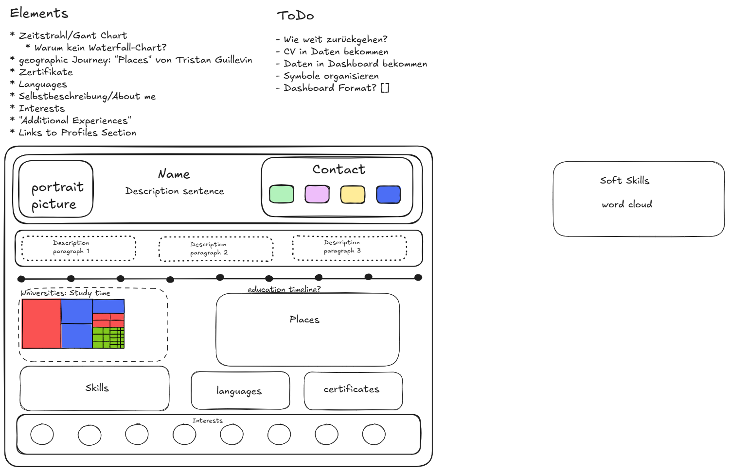
I started the process by gathering all send resources, searching for more and noting important points down on Excalidraw. I continued with reading more CV dashboards from other people on Tableau Public to get an idea how such a dashboard could look like and also continued to add to my sketch iteratively whenever I came across an important or interesting point.
Sketch
Process
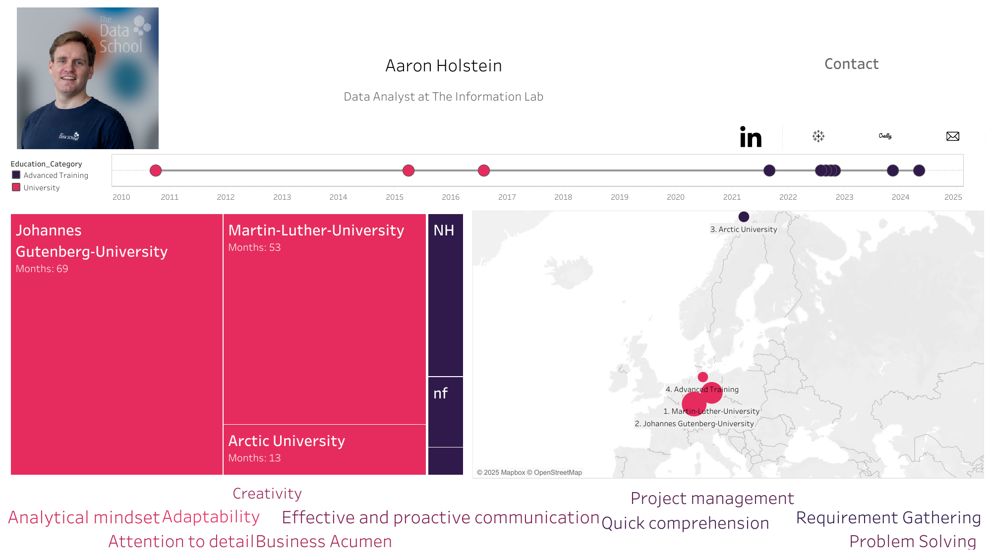
I also had to understand the necessary data structure and how to get my CV "data" into such a schema. I started with a small mock data file to get a grip on the process first. For me it is much easier und faster to actually play through once and then add to it than to just imagine everything and at once. In the end I created two CSV files as real datasets from my CV and fed them into Tableau Desktop as separate data sources.
The first one was for all analyses concerning the time aspect of the CV plus education institutions. The second one was for softskills. Then I worked through the sketched elements one after another.
Result
Challenges
I arrived at this version at the end of the deadline. So obviously the amount of elements differ between sketch and dashbord. In the end I lacked the time for the lower half of the sketch and therefore the sections for:
- Skills
- Languages
- Certificates
- Interests
Also I forgot to include already finished timeline elements in the dashboard which were applied life during the Q&A session following each presentation.
Positive Experiences
So there are enough elements for an updated version of this dashboard. I did not quite anticipate that a rather dry topic such as CVs could lead to such a multitude of visualisations and combinations.
Also it was a great opportunity to practically think and understand the relationship between data structure and visualisation type in Tableau.
Some visualisations can look like daunting challenges on the outside when you have not created them before but are fairly easy to actually build. Today the metroline chart was such a case and it has been a rewarding process to create it.