


The Brief
Day 2 began with a discussion about accessibility and inclusivity in data visualisation. We talked about how we never know who will be viewing our work and the various impairments, conditions, and disabilities that can impact how people interact with visualisations.
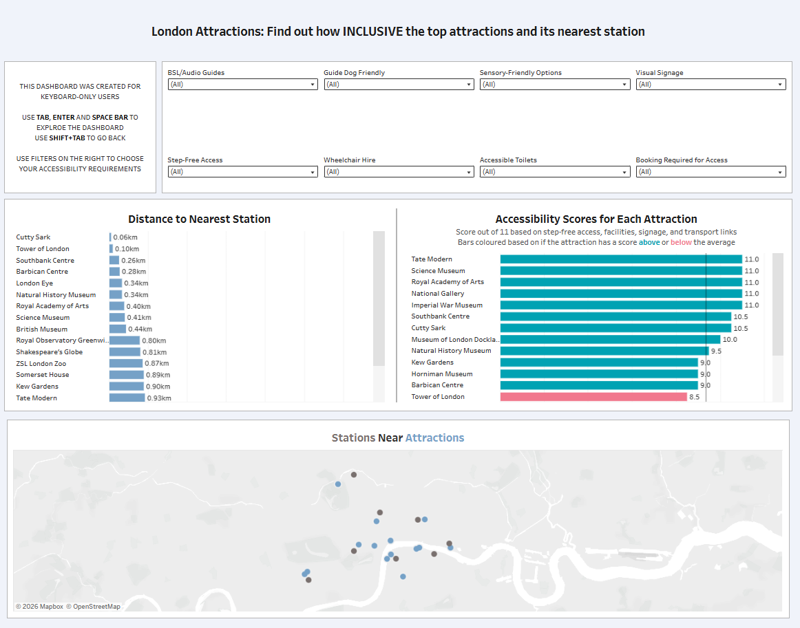
The Task was to build a dashboard for an accessibility expert (with visual impairment) who relies solely on keyboard navigation with screen magnification to assess how inclusive London's top attractions and transport links are.
Requirements:
- Fully keyboard-navigable dashboard
- Tab through filters and attraction lists with no mouse interaction
- Use London Accessibility Dataset (Attractions + TfL Stations)
- Present at 3:30 PM
My Approach
I felt overwhelmed by this task as we had less time than Day 1 and the added challenge of designing for keyboard-only navigation, my planning sketch was very basic. Before building, I looked at some blog posts from previous cohorts when they did this task and found a Tableau keyboard shortcuts visualisation which helped me understand useful navigation patterns.
Data Preparation
The data included London's top 19 attractions and over 500 TfL stations with accessibility features. I created a spatial buffer join to connect attractions with nearby stations within 2.5km, thinking I'd build a map showing transport options.
Building the Accessibility Score
The main challenge was that each feature was scored differently in the data - some had True/False, others 1/0, some had Yes/Partial/No, and others had variations like Yes/Some areas/Limited/No. Trying to find a way to standardise these took time, and I also had to decide which features to include and how to weight them appropriately. Once standardised, having a single score made comparisons much clearer.
Final Dashboard
The Challenges
Like yesterday, I got overwhelmed with the size of the task. Planning a dashboard while thinking about accessibility and working with less time felt daunting. I tend to freeze up when overwhelmed, and my knowledge seems to go out the window.
The buffer join and map took time, but in hindsight weren't the right use of limited hours. The map didn't add much value compared to simpler bar charts, and maps are inherently harder to navigate with a keyboard anyway. I struggled with deciding what to build, constantly second-guessing whether my choices were actually helpful for a keyboard-only user.
Feedback
What worked:
- Overall design was clean
- Keyboard navigation functioned properly
- Accessibility score approach was solid
What needed improvement:
- The map wasn't adding value - it's okay to just have bar charts
- Font sizes should be larger for screen magnification users
- Focus on what insights the user actually needs
Personal Reflections
I'm happier with today's design than yesterday's, but I know I can do better. If I'd had more time, I would have spent longer understanding the data and thinking through what this specific user needs.
The most important lesson wasn't technical, it was about privilege and perspective. It's a privilege not to worry about accessibility daily. As someone building visualisations, I need to remember we're trying to create a more accessible and inclusive world. Everyone deserves to engage with data regardless of their abilities.
Key takeaways:
- Keyboard navigation in Tableau works well - tabbing through filters and charts is robust
- Sometimes simpler is better - bar charts are more accessible than complex maps
- Don't add features just because you can; focus on what helps the user
Looking ahead to Day 3, I'll take the feedback forward: plan more intentionally, focus on user needs rather than technical skills, and remember that good design is often simpler than you think.