KPI Dashboard in Power BI:
By the second day of dashboard week, I realized something: it's not as stressful as I first thought. Actually, I'm having fun making dashboards and using the skills I've learned. There's still not enough time to do everything, and I'm writing this blog a bit late, but I managed to deliver a complete dashboard on time.
The task was to choose a dataset from 8 datasets in Power BI. Each of us, the 4 members of DSDE 5, had to pick a different one.
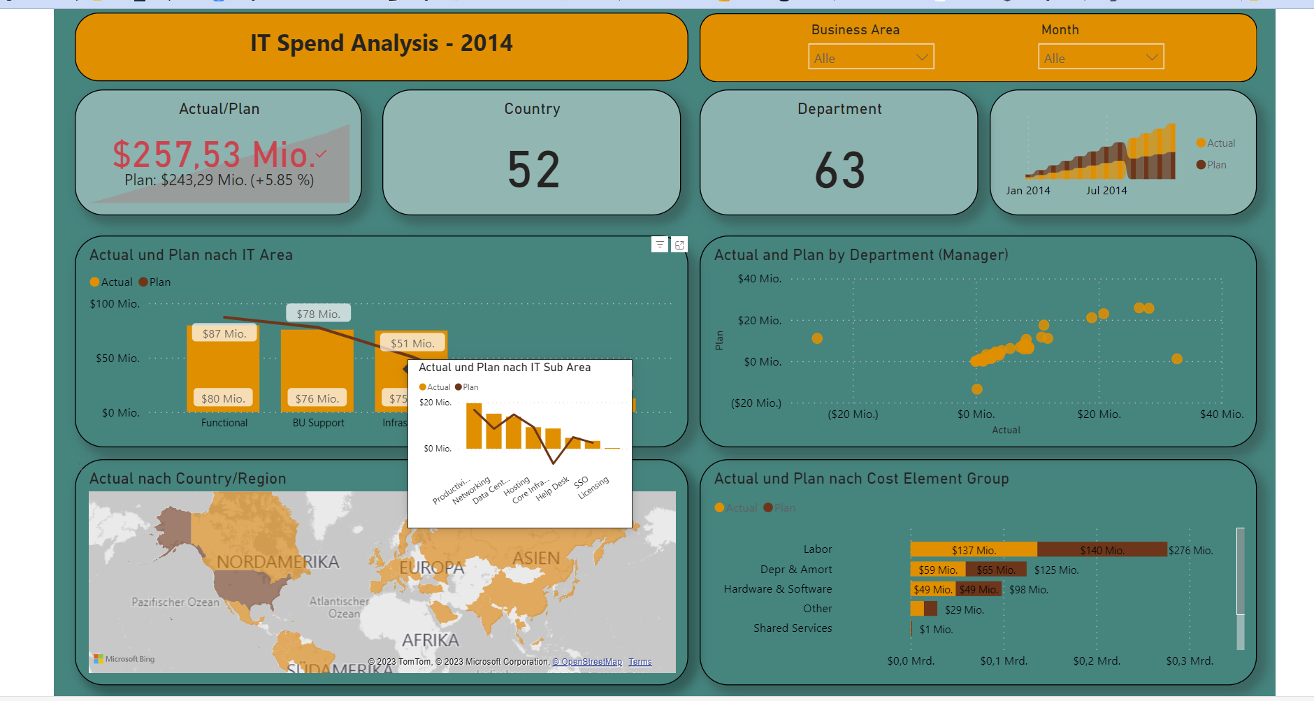
I chose the "IT Spend Analysis" data. With Power BI being such a great tool, I didn't have to do a lot of data cleaning or modeling. Power BI is really good at preparing data automatically. I just needed to understand the data and the calculations that were made. The data lists the company's expenditure for the IT department in detail, covering all departments, categories, subcategories, and periods.
One issue I faced was that some data had negative values, which didn't make sense in terms of costs. Due to time constraints, I couldn't investigate the entire dataset, even though I wanted to understand every detail of it.
Building the dashboard was truly enjoyable for me. I like Power BI as much as I like other tools, such as Tableau. I could spend hours exploring its features. I made a dashboard with 4 charts, and two of those charts have tooltips for the subcategories. I also added two filters at the top and included 4 KPIs. One interesting feature in my dashboard is the chart tooltip. I created this for the first time in Power BI. I had to create another dashboard page to specify it as a tooltip and define the columns in the main dashboard that would use it.
This experience with the tooltip has piqued my interest, and I'm eager to explore more in the future. I can't wait to learn more and create additional Power BI dashboards.