Yes, we are already here, it's the third day. Today we had only half a day (3 hours) to build the dashboard because we had a training session.
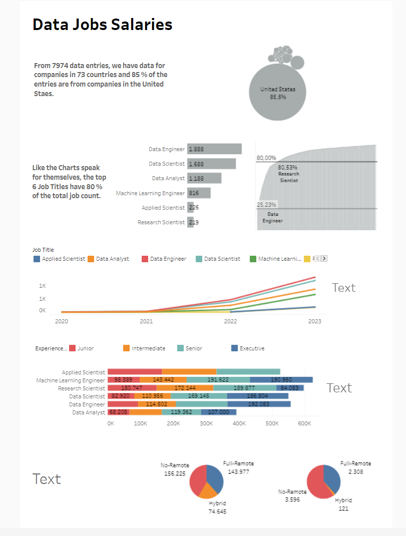
Today's task was to analyze Data Job Salaries. It was clean and clear. I had to do a bit of cleaning and change some of the aliases. I also created a list of country names and joined it with the dataset so that Tableau could recognize all of them.
The task was to create a static Tableau dashboard with no interactivity. I was thinking about the story to make the analysis easy to understand. So, I made an A4 dashboard layout and included text with the charts. I overscoped the project and wasn't able to finish on time. There were still design and coloring issues to address, and texts were missing for some of the charts.
My idea was to create a story that starts by filtering the data in the first charts and then moves from broad analysis to narrow it down to the main goal: showing the most relevant analysis of job salaries for the most common job titles. One of the interesting and slightly challenging things was the Pareto chart I created to show the job titles that make up 80% of all titles. I used annotations and a reference line to clarify it for the reader without using a tooltip.
Even though the dashboard wasn't 100% finished, I was satisfied with the outcome given the 3 hours. I learned things, practiced working under time pressure, and had fun at the same time. And so, the third day ended.