Here we come to the second week at the data school. It was the Tableau week and it is the time for Tableau Desktop. There is so much to learn about tableau and as we learned more about it I felt like I did not know anything before. We learned a lot of what tableau can do but not everything as it can do so much. We covered almost all chart types that tableau can create. I mean just the types but not all the possibilities as it needs a lot of training and more creativity. Anyways, we were able to build more than 40 different chart types for different types of visualizations.
Here are some examples of different charts with a small definition of what each chart is:
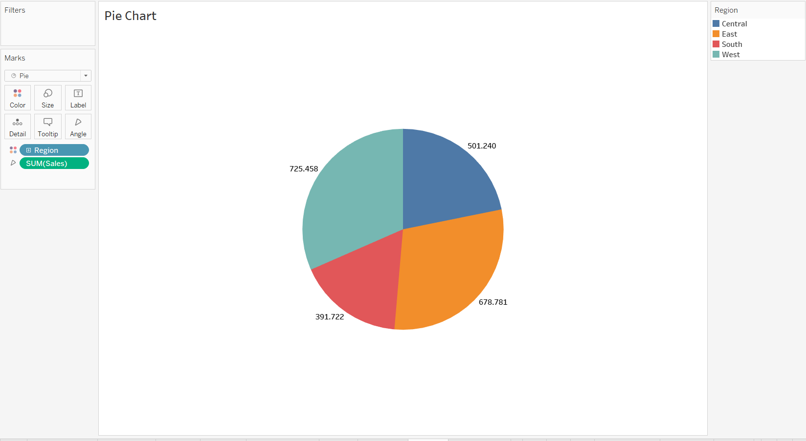
Pie Chart:
A common, but limited, visualization used to show how a few dimensions compare to one another and the whole.
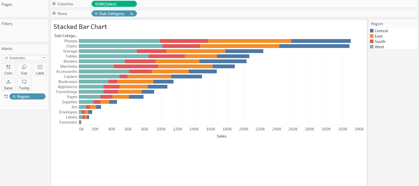
Bar Chart:
Used to categorize elements based on size. Can be ordered or unordered based on the nature of the dimensions.
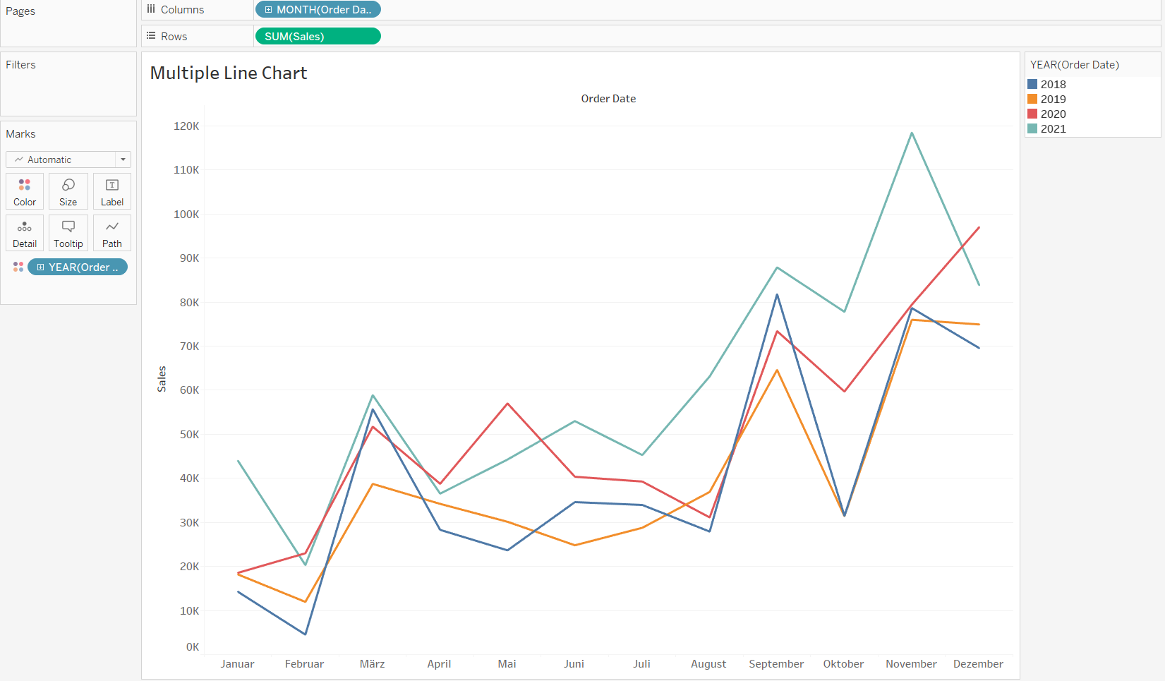
Line Chart:
Best used to show trends across time intervals. Multiple lines can be used to compare categories within a dimension.
Treemaps:
A treemap breaks the whole into its parts using a quantitative measure to determine the size of each square.

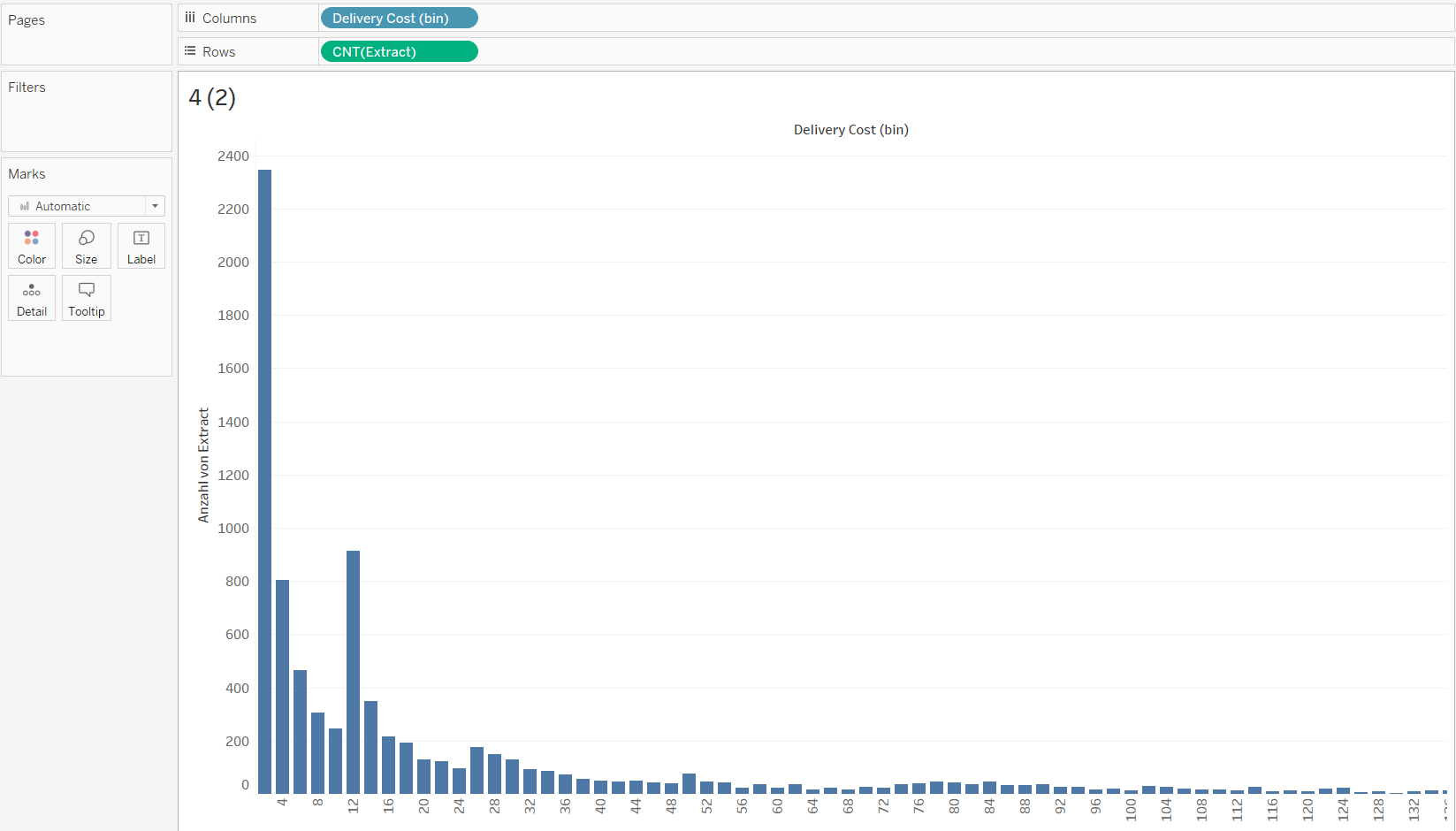
Histogram:
Histograms split a single continuous measure into bins, or groups, to analyze distribution.
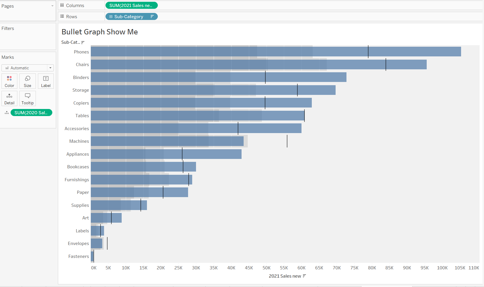
Bullet Graph:
A bullet graph takes a bar chart and adds additional elements to create a compact way to analyze performance against a goal or threshold.