


In this post, I want to show how we can use Field Parameters to add interactivity and save space in our dashboards. Let’s imagine we want to show Sales by Sub-Category and Profit by Sub-Category. Instead of creating two separate charts, we can create one chart with the possibility to select the desired measure. Let’s do it together!
1. Create measures for Sales and Profit
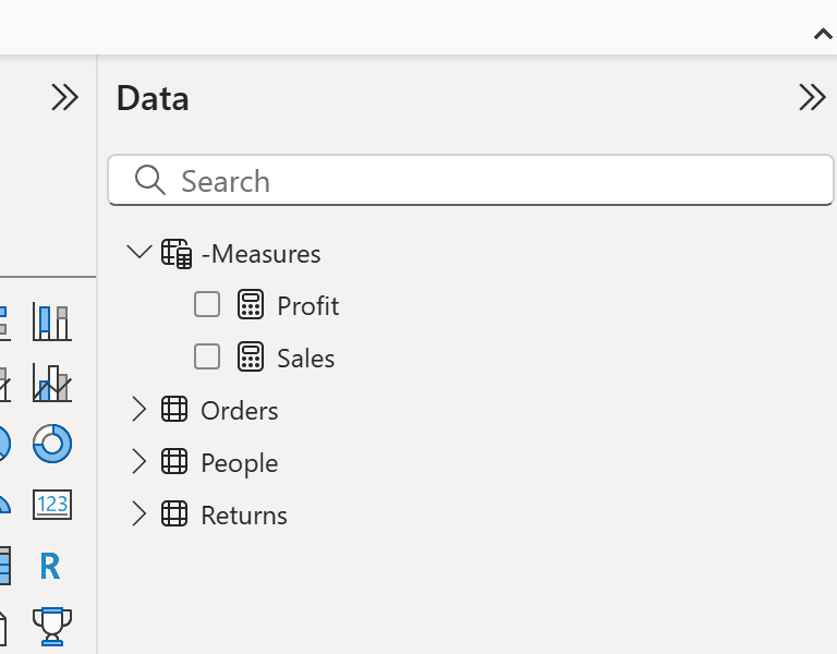
Field Parameters only work with measures, not columns. So first, create these simple measures:
Sales = SUM(Orders[Sales])
Profit = SUM(Orders[Profit])
💡 Tip: I usually create a new table called _Measures to store all my measures in one place. This makes it easier to find them and keep an overview.
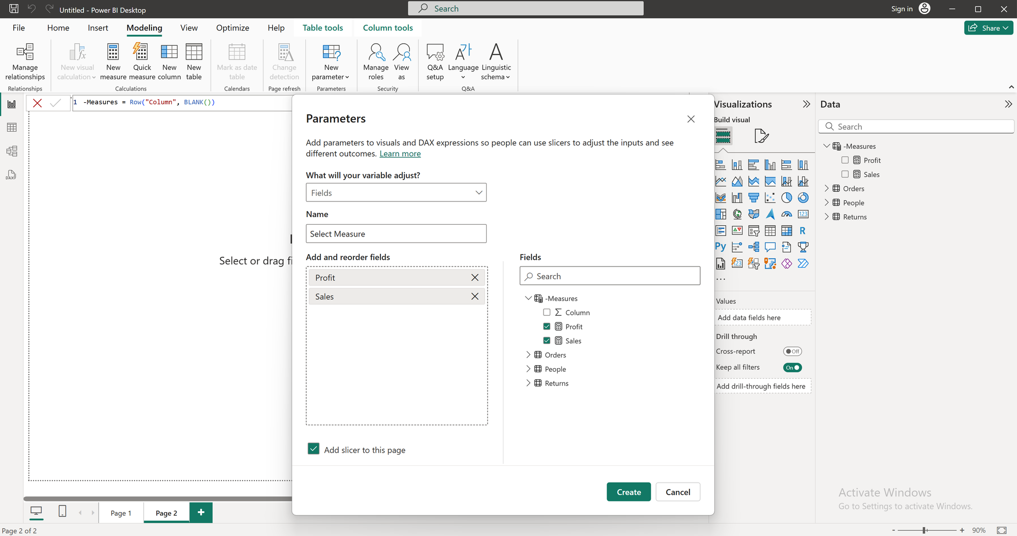
2. Create the Field Parameter
- Go to Modeling → New Parameter → Fields.
- Name your parameter.
- Add the new measures for Sales and Profit.
Power BI will automatically create:
- A table with the parameter inside
- A slicer to switch between Sales and Profit
3. Build the chart
- Add a bar chart to your report.
- Drag Sub-Category to the Y-axis.
- Drag your Field Parameter to the X-axis (Values).
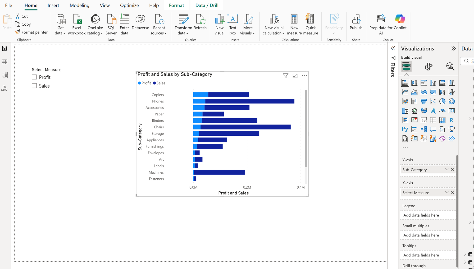
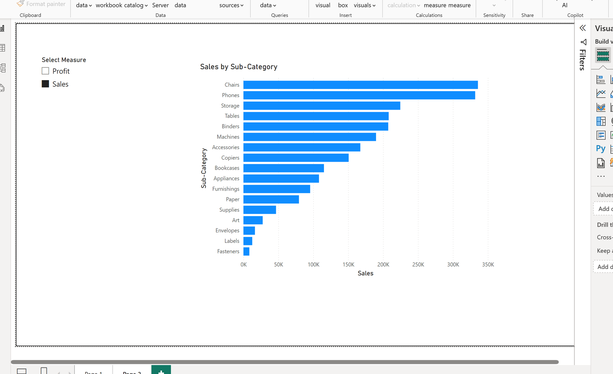
4. Switch between measures
Now your chart can show Sales or Profit by Sub-Category — just select the desired measure using the slicer.
See you in the next blog 🙂