


The first time I came across the term “UX Design” was during my part-time student job as a UI designer some years ago. Back then I hadn’t heard much about UX design, though intuitively some principles were already familiar to me. Since then, I’ve really enjoyed learning more and more about it, even after I transitioned my career.
When I designed my first dashboard, I realized the process and principles are very similar to creating an app, software, or website interface — since a dashboard is also a product we are creating.
These are the steps I followed during my UX projects, and the ones I also follow while designing a dashboard:
Step 1: Understand the user
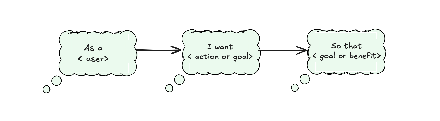
- UX Design: conduct user interviews, create personas, use cases and/or user stories.
- Data Visualization: talk to your stakeholders to know their pain points and metrics, create user stories.
💡 Don’t skip the research phase. Before jumping into a project, it often helps to do some secondary (desk) research: read about the company, industry, their product, or the domain they are working in. This domain knowledge will help you to understand your client or user better, to ask the right questions, and to understand specific terminology.
Why it is important: It is very hard to create a good solution without having a clear picture of who will be using your product, how they will be using it, and why.
Tips: During our second week of training we talked about a couple of amazing techniques that might help you. First is, as mentioned, user stories. Try to write them down as soon as possible after talking to your stakeholder, and get back to them regularly to always keep in mind who you are designing your dashboard (or any other solution) for. If multiple user groups will be using your product, I recommend writing one for each group.
Another very useful technique is the 5 Whys. The main idea is to keep asking more (and the right!) questions —but it shouldn’t always be “why” — in order to get to the real problem and need.
Step 2: Analyse
- UX Design: analyzing mostly qualitative information collected through interviews, observations, or surveys.
- Data Visualization: analyzing your data: checking data quality, exploring patterns, find interesting insights or anomalies
Why it’s important: Because our goal is to help people make sense of data.
Step 3: Wireframe the layout
- UX Design: rough sketches, on paper or some online board, to plan the layout before starting to design.
- Data Visualization: literally the same. After creating some sketches, show them to your client to make sure you are on the same track.
Why it’s important: It’s much faster to make changes on paper or on a board than rebuilding your dashboard later. This saves so much time. (and money!)
Step 4: Apply best visual principles
- UX Design: things like color, spacing, fonts (and much more) improve perception.
- Data Visualization: the principles are the same (for example, Gestalt principles). If used smartly, they help you communicate your findings much more clearly.
Why it’s important: Effective design supports you in conveying your message to your audience. It helps highlight what is most important, downplay secondary information, and make your dashboard easy to navigate and use.
As Dieter Rams said, and I can’t agree more:
Good design is as little design as possible.
Step 5: Usability testing and iteration
- UX Design: after creating your first prototype, you test it with users to find areas for improvement or things that are unclear.
- Data Visualization: same idea — gather feedback from your stakeholders, or observe how they interact with your dashboard. Notice if something is not clear for them.
Why it’s important: Very often it’s hard to see your solution with the eyes of your users. What feels obvious to you might not make sense to them. Testing helps you spot and fix these issues and improve your design. Just like in UX, iteration helps you avoid big errors before going live — and with dashboards, it also keeps your product relevant as business needs evolve.
Thank you for reading!