


The Morning:
To start off DS55’s Dashboard Week, we had our first day centered around accessibility. In the morning, we learned about how dashboards can be deliberately designed to accommodate different accessibility needs. Fortunately for me, this is something I’ve never been limited by before, so I was able to gain a whole new perspective about how specific design choices can either support or hinder users in interpreting data.
Following our session, we were divided into pairs (as one would work in Tableau - me, and the other in Power BI) and set off with our tasks!
The Task:
The brief we were assigned focused on improving accessibility for users with cognitive disabilities. More specifically:
Chloe from the Mayor’s Office is interested in promoting inclusive tourism, but she’s open about her dyslexia and dyscalculia. She finds most city planning dashboards overwhelming or unusable, particularly those filled with icons, percentages, and colours that blur together.
We first reminded ourselves of everything we learned in the morning, and began with some background research about ways in which we can cater dashboards for those with dyslexia and dyscalculia. These led us to form our focus points:
- Reduce visual/cognitive overload
- Clear, consistent colour palette
- Larger text, fewer marks where possible
- Remove unnecessary numbers/decimals
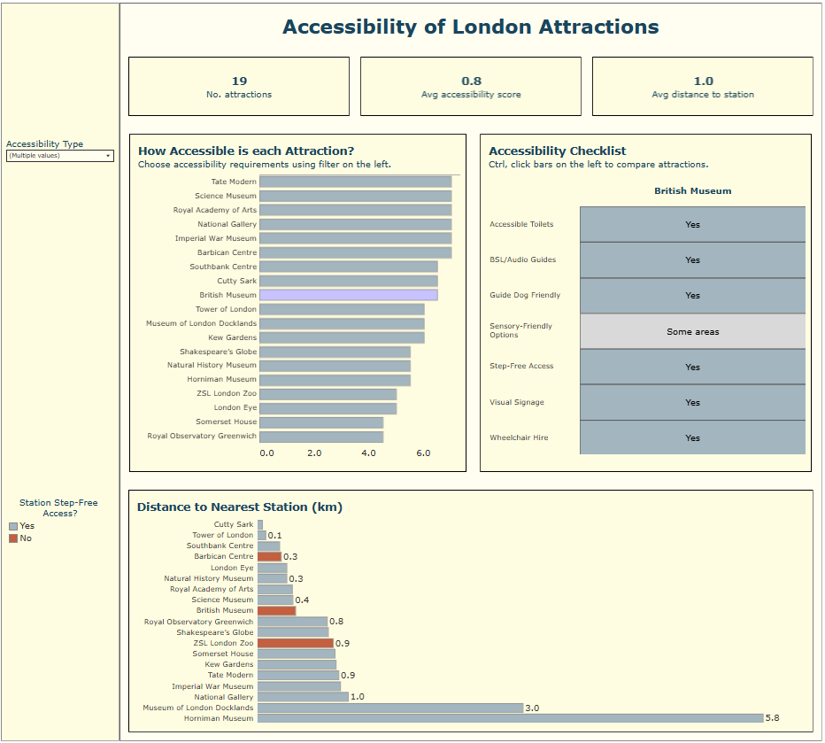
With both this and the brief in mind, we began sketching ideas. To give users an overall understanding of accessibility for each attraction, we developed an accessibility score based on whether selected requirements were met, not met, or partially met. Implementing this required pivoting some of the fields in the dataset, which proved to be a relatively straightforward data preparation step. Other than that the data was fairly clean, so no further steps were necessary,
As we also had data on the nearest station for each attraction, we wanted to incorporate this into the dashboard. We decided this, alongside the accessibility score chart, would be bar charts as they are clear and easily interpretable. Instead of adding another chart to show step-free access, we used colour within the bars to represent this, so we could include this detail without making the dashboard more cluttered.
(The Map...)
Since we only had coordinates for the attractions, we thought it would be useful to bring in additional coordinate data for all London Tube Stations and display everything on a map. The idea was that a user could select an attraction, input how far they are willing to travel (or for how long), and then see all relevant stations and other attractions within that range. We soon realised this would take more time than we had left, so we had to pivot. It’s something I’d like to revisit in the future, as I think it would add real value to the dashboard.
Back to the Task:
While users could see an overall accessibility score for each attraction, they couldn’t currently see the underlying breakdown, so we introduced a highlight table to show how each accessibility criteria contributed to the overall score.
Some key things incorporated across the dashboard to meet user requirements included:
- Grey, off-white as our main colour scheme to reduce visual strain and keep the dashboard easy to read.
- Intentional use of words, only including text where it adds value.
- Limiting numbers to 1.d.p to avoid unnecessary detail.
- Dropdown filter to limit on-screen text.
- Applying set actions so only selected attractions are shown in detail, reducing clutter and making the view less overwhelming.
See the Final Dashboard here:
Feedback received included :
- Checking the colour palette with a contrast checker.
- Improving tooltip formatting to make information clearer for users.
- Showing the nearest station alongside its distance.
- Adjusting sizing and padding to improve layout and readability.
I’ve already started implementing some of these changes and plan to come back and address the remaining points soon.