


When you think about considering accessibility in your dashboards, you might think about making sure you don't use red/green for those with colour blindness or using a font that is more legible for those with dyslexia. Those are important things to consider but not even the tip of the iceberg when considering accessibility. For example, had you considered that people with a tremor might struggle with the fine movement of hovering over a tooltip in Tableau? Or how people with dyscalculia might find it more difficult to process numbers at the end of bar charts? Factoring in these aspects was what day 2 of dashboard week (i.e. today for me!) focused on.
The Task
The scenario I received read as follows:
"Access London has hired an expert in accessible urban design to assess how inclusive the city's top attractions and transport links really are. They’re billing us £4.5k/day, but have a visual impairment and rely solely on keyboard navigation with screen magnification."
I also received the two datasets with information on the top London attractions and the London tube stations. To add, we were in pairs and as Aisha chose to do her visualisation in Tableau, I drew the perhaps more challenging straw of working in Power BI (as my experience and therefore my capabilities are more limited in that software!).
Charting
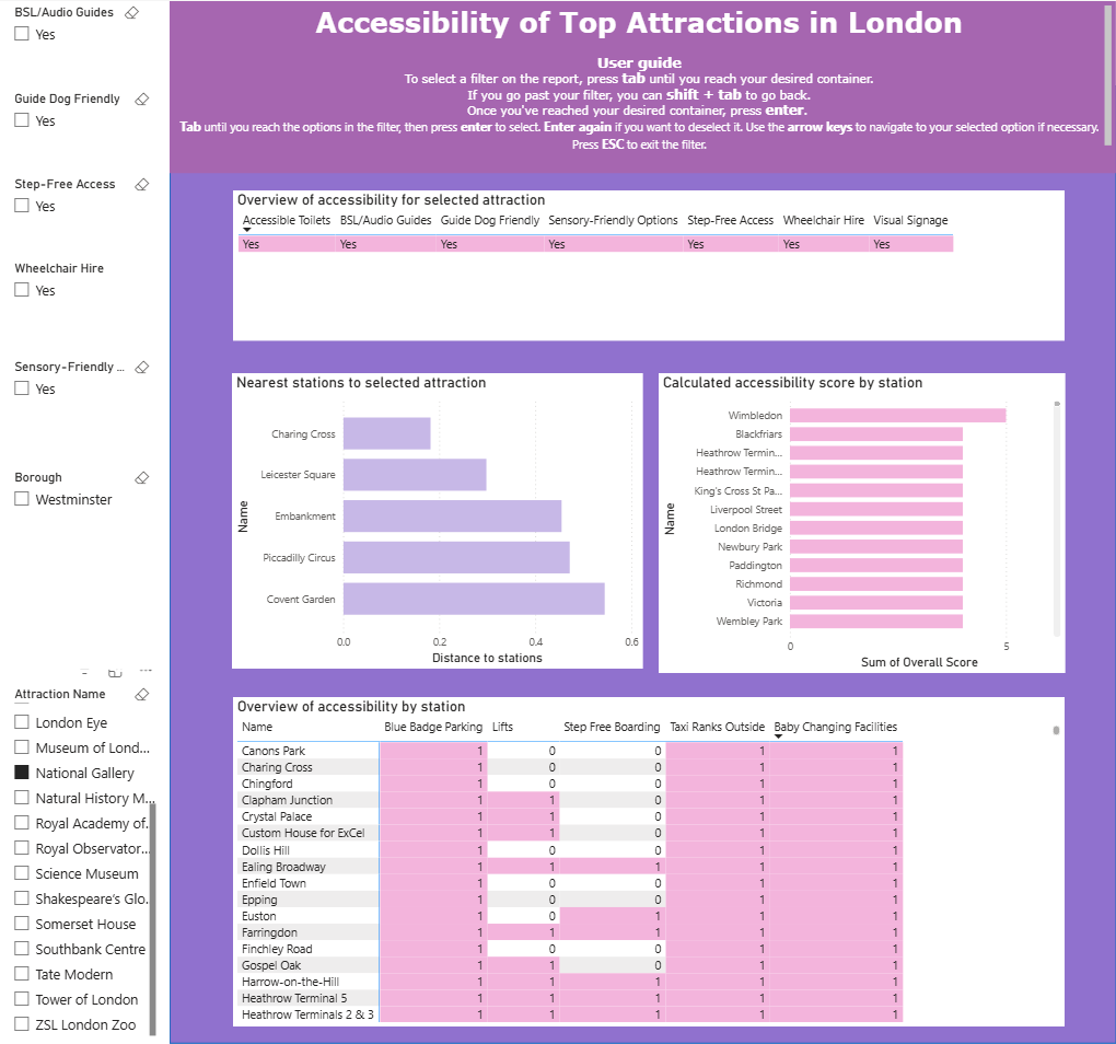
I sketched out a plan of what I wanted to show in my report based on the two datasets that we had and the scenario I was given. I tried not to be too ambitious after learning from my experience yesterday about the importance of scoping! I also had to remember that things that I know how to do in Tableau (mainly lots of the spatial stuff) may not be things that I am familiar with in Power BI so I adjusted my sketch accordingly. I decided against joining my two datasets which, in hindsight was probably an unwise decision. I think appending the two tables (or a cross join, I'm not sure what it's called in Power Query!) might have been more helpful with my vision further down the line so that's a lesson for next time. Putting everything together initially wasn't too difficult so progress was fairly smooth at that point, bar a few small bumps in the road like errors in my distance calculation that were eradicated by using the nearest 5 stations to the attraction as I had originally planned.
Dashboarding (Or do you call that reporting in Power BI)
Whilst in some ways, Power BI can be much simpler in terms of creating actions between charts because the software does it pretty much automatically within a report, there can also be some difficulties. For me, I wanted my 5 nearest stations to an attraction to filter a separate chart to only show those stations. After asking around, it seemed that the problem might be a lack of relationship between the two datasets that I was using and as I was quite far down that rabbit hole by that point, it was a little too late to take it all back into Power Query. So I had to accept that due to the time constraints (somehow even more constraining than yesterday!), this chart would not exist as I had originally hoped in my report but it could still provide some information. I then formatted everything (a little bit of an obstacle after my familiarity with Tableau) and set about the main part of the task.
My specific task for the day was learning how to navigate my report without the use of a mouse. That did not mean I could use a trackpad, only keyboard shortcuts essentially! As someone who started the day without much knowledge on the subject (I know ctrl + c for copy and my knowledge doesn't stretch much beyond there), this was a slightly daunting task. However, I got somewhat of a hang of it and added this user guide to the top of my report to ensure someone who had motor skills impairment could also utilise my report to its fullest extent.
Lessons Learned
- I should consider the accessibility requirements of my potential user more often. I'm very fortunate in being an able-bodied person who does not have any disabilities that might affect how I process a dashboard but that's not the case for many people. It would make me a much better consultant (and human in general) if I factor these conditions into my design process to ensure as many people as possible can get the most of my dashboard.
- There are so many keyboard shortcuts that you can use. My eyes have been opened to a whole new world and I hope that in the future, I can make my life a bit easier by simply using the shortcut rather than the mouse in some instances.
- I need to work on my Power BI skills. I focus on Tableau more because we work in Tableau more in training but it's important to be a well-rounded consultant, especially whilst in training. When we are more experienced in all platforms, we can make a better judgment of where we want to specialise and become true experts!
My report (I am aware much of the formatting is not my finest work, there simply wasn't the time!):
This is me, over and out for today. Until tomorrow, happy reporting!