


As part of our introduction to Power Query and Power BI this week, we were thrown into making different types of charts. Many of these were self-explanatory and ones that I'd seen or heard of before but sparklines were something new to me. A sparkline is essentially a small chart showing the change in a measure over time. It's used to show trends in data, often comparing multiple categories at once. Importantly, a sparkline provides a titbit of information rather than a detailed insight into the data so you would need to use a different visualisation for that. If sparklines are new to you too, then you've come to the right place. In this blog, I'll go through how to create a sparkline in Power BI as well as the different formatting options that you can use to emphasise aspects of your data as you choose. I'm using the orders table from sample superstore data if you wanted to follow along.
Creating a basic sparkline
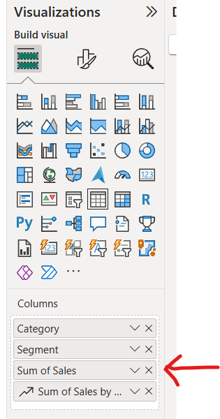
Step 1: Add a table visual to your report and add your measures/dimensions to your columns.
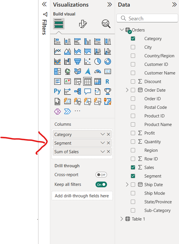
Step 2: For the measure that you want to have as your sparkline, select the dropdown arrow in columns and click add sparkline.
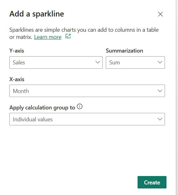
Step 3: A pop up window will appear where you can add your x axis measure and amend your y axis measure should you wish to do so. I have kept mine as sum of sales.
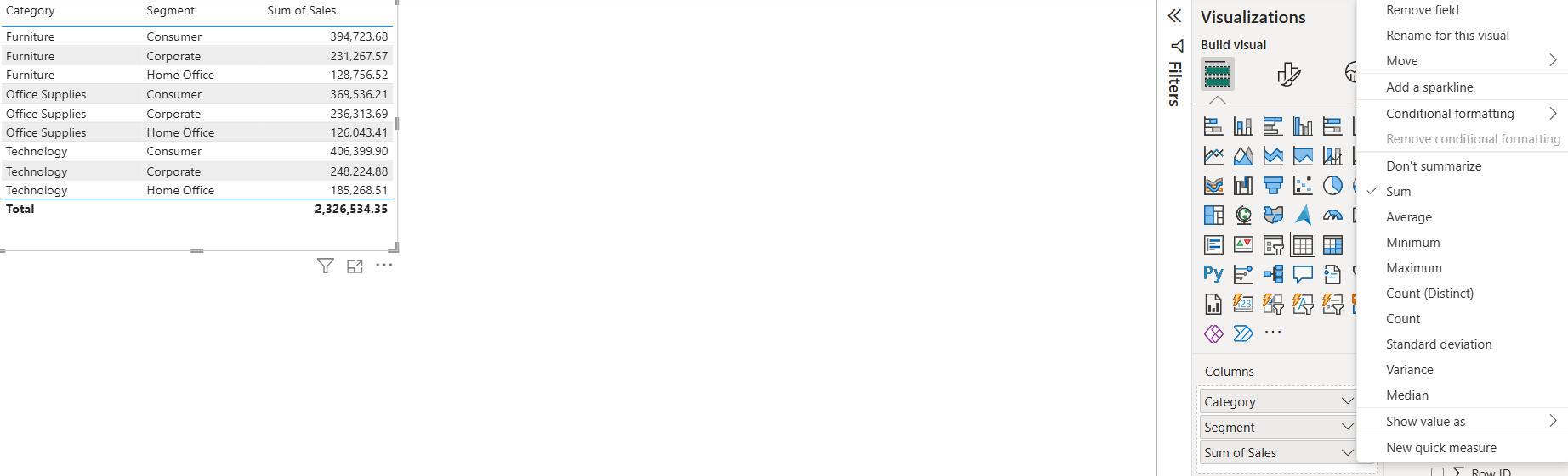
Step 4: Clean the table up by removing the column which only shows the values for your sparkline.
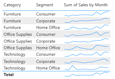
Now you should have the basic table with sparklines that was shown at the beginning of this section!
Adding to your sparklines
Whilst a basic sparkline does the job, there are several ways that you can add to your sparklines to make it more helpful to the user.
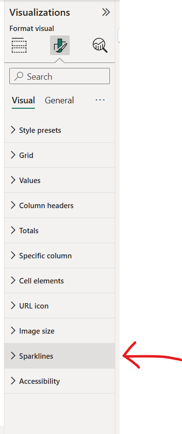
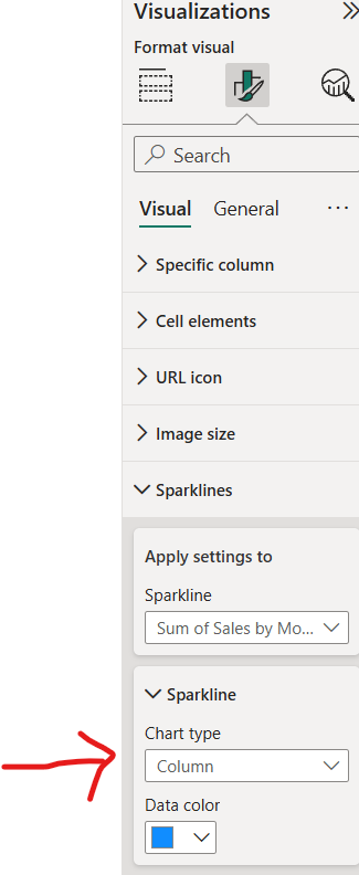
Step 1: Go to the visualisations pane and select format your visual (the paintbrush icon). If you scroll down, there will be a tab called sparklines.
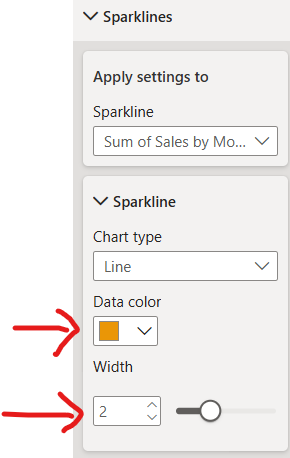
Step 2: Select the sparklines tab. Change the colour/thickness of your sparkline.
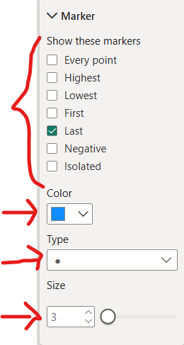
Step 3: Add markers to your sparkline. You can change the shape and size, identify what you'd like to mark (e.g. first or last data point, peaks or troughs) and change their specific colour to stand out from the sparkline.
Step 4: You can also change your chart type to columns to create a bar chart instead of a line graph. This is better when your dimension on the x axis is not extensive (e.g. using month instead of day of month as 31 columns will be more difficult to differentiate).
The 4 steps above are the key ways that you can edit your sparklines to give them that extra spark. There are also different formatting options you can use to edit your table as well and the best way to learn more about these is by exploring the software yourself. If you're ever lost, my top tip is to utilise the search function in the format visualisation pane. Just insert the key word you're looking for (e.g. title), and it will output all the related items so you can find your item more quickly. You'll soon get used to the format of Power BI though and before long, the search function will be a fond but distant memory.
I hope this blog post has given you the insight you were looking for on sparklines in Power BI and maybe even more than that. For now, onwards to week 5!