


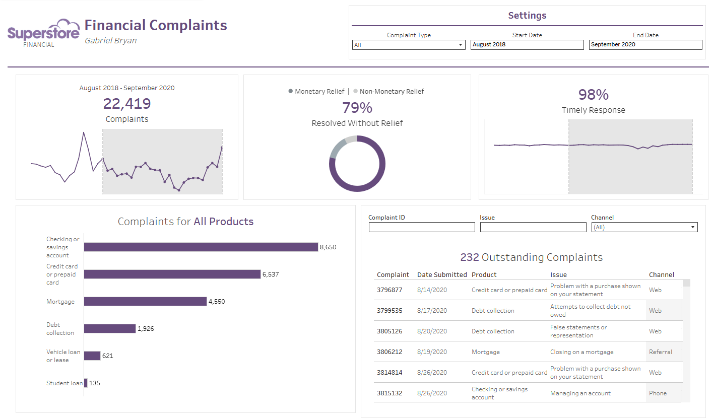
For the first day of dashboard week, we were tasked with recreating an earlier dashboard (made in Tableau Desktop) using Tableau’s newest product, Tableau Next. The dashboard I recreated uses data from Real World Fake Data, and it’s all about consumer complaints.
You can view it on my Tableau Public here.
I’ve had very little experience with Tableau Next, having only just been introduced to it a day ago. Working in the tool definitely has a bit of a learning curve, but once you get the hang of it, it can be fairly intuitive. While some features I’ve gotten used to from Desktop aren’t exactly the same (or simply aren’t implemented yet), the basic structure is very similar.
The Build
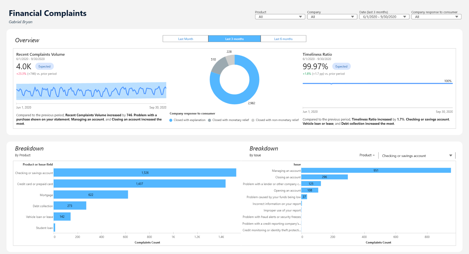
The first thing I set out to do was create some metrics. Metrics are the KPI cards of Tableau Next, and are built to be created on the fly. I wanted to turn the two line graphs from the original dashboard into metrics. This was fairly simple to do, except for one hurdle. Currently, there are some bugs when you attempt to aggregate a time dimension, so I was forced to keep the time dimension on a daily level. Additionally, I realized fairly quickly that I was not going to be able to recreate the dynamic timeframe selection from the original dashboard. On the original, a user could select a group of points on the line chart to ‘Select’ that time period, filtering other charts correspondingly. This was already a bit complex in Tableau Desktop, so I knew it likely wasn’t possible yet in Next. I’ll have to create some other form of filtering on these metrics. For the moment, I left the metrics filtered to the last month, but resolved to return to this later.
I then decided to create the donut chart. The ‘donut’ mark type is unique to Tableau Next, so I was really excited to try this out. It worked immediately without any bugs, which felt great. I added some labels and a legend, and threw it on the dashboard.
Next, I tackled the bottom left chart from the original, and I had to really think about this. In the original, it uses a combination of dynamic dimensions and parameters in order to create a really cool drilldown function that I was really proud of. I attempted to recreate this feature in Next, but the options for Actions are still a bit limited, so I abandoned this. Instead, I created two bar charts. The first bar chart measures complaints for all products, and the second has a dynamic dimension which can be changed using a parameter. The parameter contains all possible Products, and when you select one, the bars will represent the products corresponding Issues.
The only chart left is the table, which I did not create. Tableau Next does have a table feature, but this was not working when I tried it out.
Using buttons to filter the Time Dimension on a Metric
I decided to circle back to the original problem of filtering my metrics. After looking at some example dashboards built in Tableau Next, I really liked the idea of using buttons to select a relative timeframe.
This is more difficult than you might think in Tableau Next, at least for now. First, you need to make three different ‘Pages’ on your dashboard. Make sure everything in these dashboards is UNLINKED from each other. Next, add buttons to these pages and give them ‘Navigation’ actions. Finally, INDIVIDUALLY add filters to each of these pages, and give each of these filters different labels.
On your metrics, on the filters column, press Exclude. This allows you to exclude certain filters from affecting your metrics. Exclude the other filters so that only one of your filters is affecting this measure, and repeat the process for all other pages. This is still a bit of a buggy solution, as it will break in Preview mode and force you to re-configure.
Here is a screenshot of my completed Tableau Next dashboard.
Overall, this was a fairly fun project and a great way to learn about Tableau Next. It’s got so much potential, and I really love the visual direction the Tableau team is going in. Updates are coming out constantly, so I expect many of the bugs I experienced to be fixed given time. Excited for Day 2 of dashboard week!