Build your Team
Enhancing your data team with ours
Our consultants come armed with both technical and soft skills to support you to make the most of your data.

The Data School has been paramount to our success at JLL. It has allowed us to bring in highly skilled Tableau and Alteryx consultants. It saves considerable time trying to recruit contractors as I know their skills and training are to the highest standard. Over the past 5 years my team has developed analytical insights which have generated multi million dollar savings of which a considerable amount can be attributed to the Data School consultants we have had working on projects.
Paul Chapman, Global Director of Performance Management, BI and Innovation at JLL

Emerging Partner of the Year

Alteryx
Partner of the Year
EMEA
Tableau
Community Impact 2024
EMEA ESMB
DataIQ
Data for Good Champion
Finalist
DataIQ
Best Data Academy or Skills Development
Finalist

Alteryx
Partner of the Year
Europe

DataIQ
Data for Good Champion
Champion
What our consultants are working on
We believe that sharing knowledge and expertise is key to driving innovation and growth in the data community. That's why we're excited to share our latest insights, tutorials, and industry trends with you through this blog.
Written by our team of experienced data consultants, these posts aim to solidify their own learning while giving back to the community.


Thu 12 Mar 2026 | Francesca Plaskett
Back to Basics: Calculating ranks in Tableau Prep, Power Query and Alteryx
Discover how to add rankings into your data preparation across three key platforms.

Fri 13 Mar 2026 | Laura Brylka
Leaving the bubble, embracing the unknown: my first two weeks at the Data School
In my very first blog post, I would like to tell you about the impressions I gained during my first two weeks at the data school. But let me introduce myself a little bit. In my previous life, all I ever knew was academic research

Thu 12 Mar 2026 | Shabnam Dost
Endlich ist es soweit...
Liebes Tagebuch,
Heute war es endlich so weit. Es ist der 2. März. Für mich heißt das: Neuer Monat, neue Stadt und vor allem mein erster Arbeitstag. Ich bin heute Morgen aufgewacht mit einem Mix aus Vorfreude und großem Chaos im Kopf.
Kurz darauf hieß es: Willkommen in The Information Lab
Wed 11 Mar 2026 | Janina Grauel
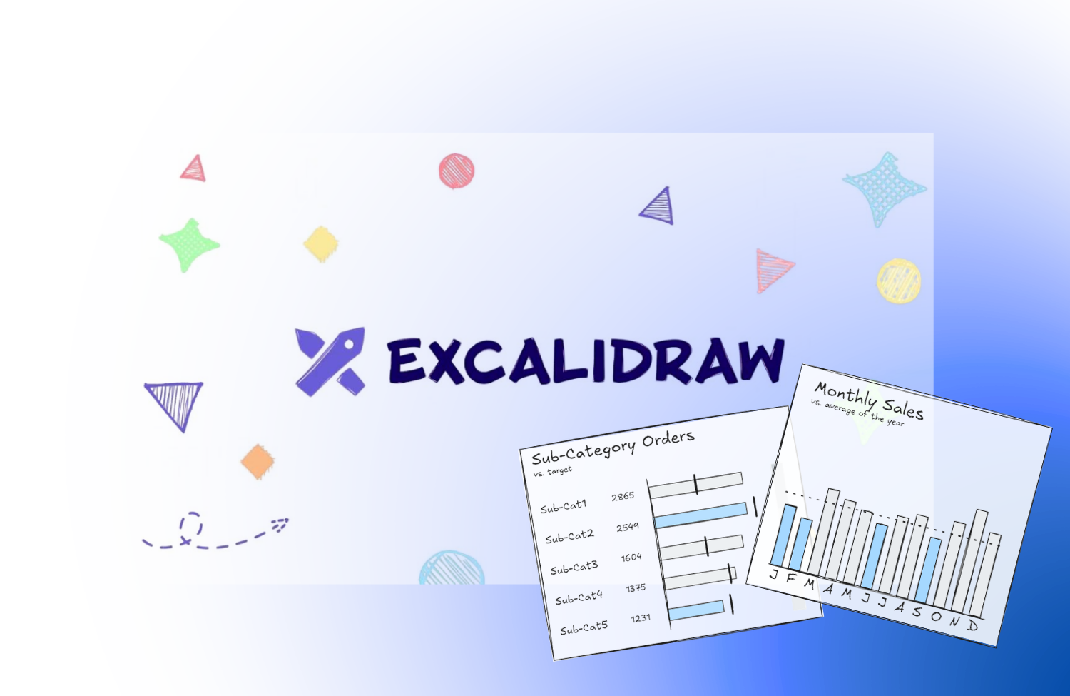
Why I Built My Own Chart Library in Excalidraw
In our first week at The Data School, we learned to use Excalidraw to wireframe dashboards. Sketching is a great way to align on a vision with the team and stakeholders early on, long before we start building anything in Tableau


Wed 11 Mar 2026 | Britt van der Poel
Using RegEx in Alteryx
RegEx (short for Regular Expression) is a sequence of characters that allows a user to extract a subset of a string from a field

Thu 12 Mar 2026 | Adil Ahmad
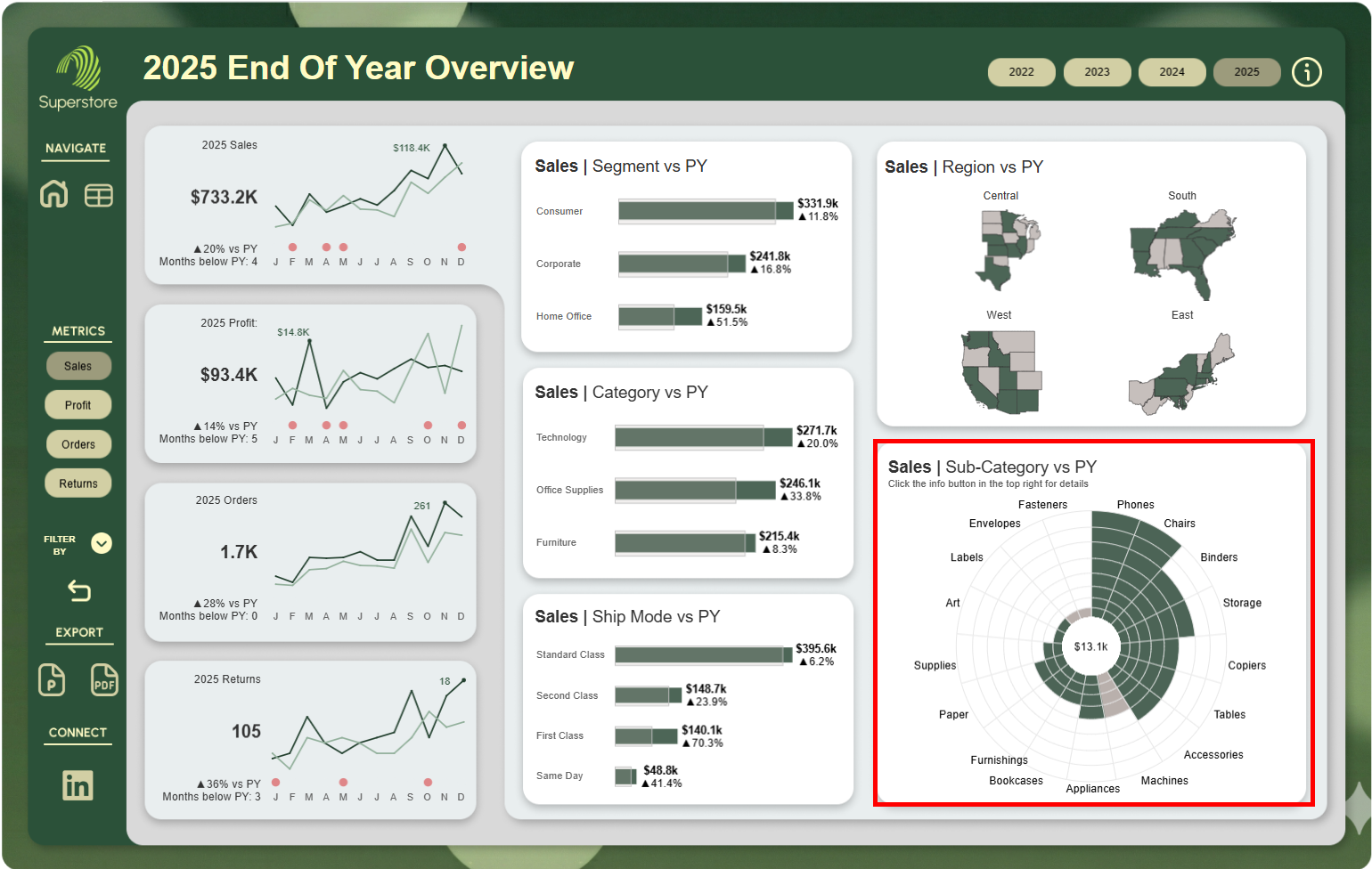
Sun burst
This blog will take you through how to create a sun burst chart as seen in my End Of Year Overview dashboard.
Take a look at it here.
Creating The Chart Structure
The first step to creating the chart is to create a calculated field that uses the makepoint function to create a point at 0,0
Wed 11 Mar 2026 | Francesca Plaskett
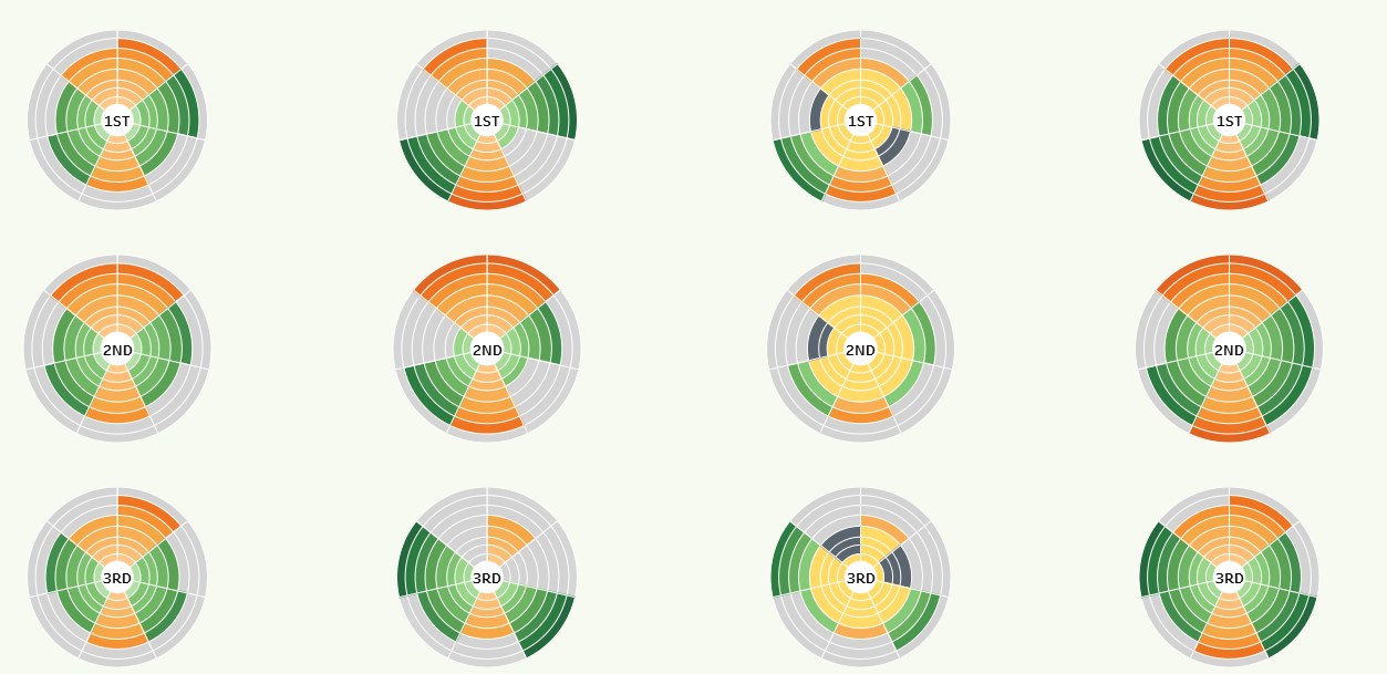
A step-by-step on creating sun burst adjacent charts in Tableau
Follow along in a beginner's guide to creating these fun sun burst style charts in Tableau.


Wed 11 Mar 2026 | George Chachkes
Extracting and Transforming my Online Chess Data using Python and Tableau Prep
Playing speed chess online is a fun hobby, but it does not necessarily lend itself to chess improvement. It is very easy to lose a game, and instead of doing the responsible thing and reviewing the mistakes, start another game


Wed 11 Mar 2026 | Tomo Mensendiek
Reg Ex 101
This blog will cover 1) why use Regular Expressions? and 2) how to use Regular Expressions?
1) Why use Reg Ex?
Say you had data about sofa listings online. You had the sellers name, product name, and the description that the seller left


Tue 10 Mar 2026 | Shivam Wadhia
Power BI Vs Tableau
Before diving in, it’s worth saying that there are many reasons why an organisation might choose Power BI over Tableau, or vice versa. Factors such as cost, existing technology stacks and organisational expertise all play a role

Wed 11 Mar 2026 | Britt van der Poel
Using Parameter Actions and Calculated Fields for Quadrant Analysis
Parameter actions are one of Tableau's most powerful features. In the walkthrough below, I'll explain how you can use parameter actions and calculated fields to tell a story with your data


Wed 11 Mar 2026 | Roshan Desai
Workout Wednesday 2025 W37 – Adding a Baseline Bar in Power BI
This week’s Workout Wednesday challenge focuses on a really practical reporting problem: how to show a baseline inside a bar chart as if it were just another category, rather than using a standard reference line
Want to know more?
Whether you're planning for the future or you have a project that needs to get started next week our team are more than happy to help.
Complete our contact form with your name, company email and a brief message and we will get back to you as soon as we can.