


Analysts typically summarize the distribution of a dataset using three kinds of metrics: center, shape, and spread. The center of a dataset is typically quantified by measures of central tendency, such as mean and median. A distribution's shape is usually boxed into a simple categorization, such as as symmetrical, skewed, or uniform.
Of the three, spread is the most unreliable and hard to parse. Its metrics take a bit of calculation and tend to be susceptible to outliers. In this blog, I will go through four ways to calculate the spread of a distribution and introduce some situations where they are more or less equipped to describe a distribution.
Range
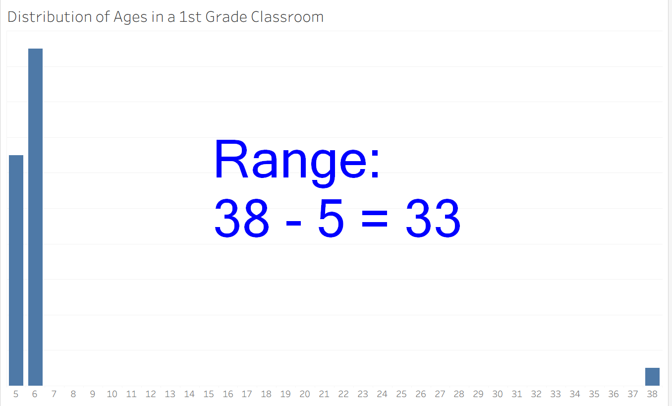
The simplest possible measure of spread is range, which is calculated by taking maximum value in a dataset and subtracting the minimum value. For example, in the dataset [1, 2, 3, 4, 5, 6, 7, 8, 9, 10], the range is 10 - 1, or 9. Range works well for condensed datasets without outliers. When there are outliers present, there is a risk of creating a false perception when using range to measure spread. For an example, consider the distribution of ages in a 1st grade classroom. In this artificial dataset, we have 13 five year old students, 19 six year old students, and a 38 year old teacher. From looking at it, I can tell this data is dense, with very little spread. However, using range to quantify spread gives the illusion of a much greater spread than there really is. After all, spread is primarily interested in the center of the dataset (what "most" of the data seems to do). The typical fix for this is to try to use a measure called Interquartile Range.
Interquartile Range
To build up to Interquartile Range (or IQR), I will first introduce some of its building blocks. If you have ever worked with a box-plot (otherwise known as a box and whiskers plot), these names might be familiar to you. The first is the median, which is computed by finding the middle number in your sorted dataset. For example, the median of the dataset [1, 3, 5, 7, 9] is 5.
The next two useful metrics are the 1st quartile and the 3rd quartile which are calculated by finding the median of the lower half and upper half of the data, sliced by the median (this is an oversimplification of the formula, see previous blogs for full details). These two numbers give the best estimates for the 25th and 75th percentiles of the data lie. This allows us to disregard extreme outliers and look at the main behavior of the data. The interquartile range is the 3rd quartile minus the 1st quartile (IQR = Q3 - Q1).
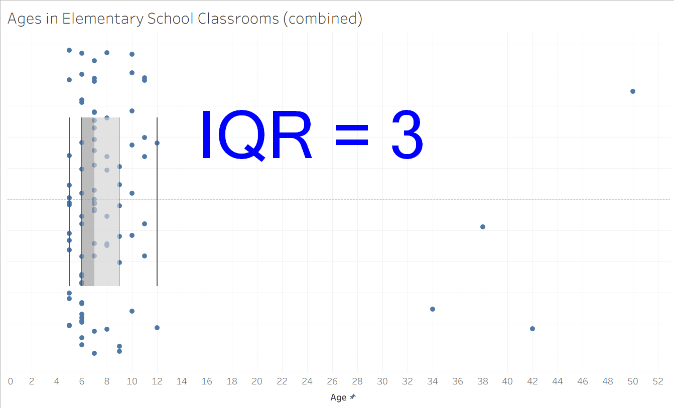
In this next example, I have mocked up some data from a larger elementary school ages dataset, including 88 students and 4 teachers across 4 classrooms. The ages are mostly clustered between 5 and 10, with the few outliers of the teachers' ages skewed towards the right. Fortunately, the box-plot framework is not overly influenced by these outliers, finding the 1st quartile to be 6, the 3rd quartile to be 9, and the IQR to be 3. This seems to be reflective of the general behavior of the data and works much better than range (which would be 45 here).
Standard Deviation
For more advanced statistical applications, some analysts use a metric called standard deviation. It essentially represents the average distance of a data point from the mean of the dataset (with a few extra steps to ensure everything works out mathematically). Once the standard deviation of a distribution is known, it makes it possible to calculate how extreme a given data point is by finding its z-score, or the number of standard deviations a point is away from the mean. This opens the door to other analytical approaches such as control charts and hypothesis testing.
Summary
All of these metrics are valid approaches to analyzing the spread of your data, with their caveats happening pretty rarely. It is always best to either visualize your distribution or use multiple of these metrics to avoid getting caught by overly influential outliers. Have fun analyzing some data!