


Day 2 was a significantly trickier challenge. Not only was I tasked with building a dashboard with deep accessibility in mind, but I had to do it using Power BI, a tool I’m much less familiar with than Tableau.
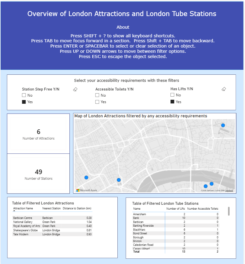
The brief was to build a screen-reader-compatible summary dashboard for London attractions and tube stations. For this to be a success, I had to meet some very specific requirements:
- Semantic ordering of all text objects.
- Accessible alt text for maps and KPIs.
- No "Tooltip-only" data (if a screen reader can’t parse it, it doesn’t exist).
- Keyboard shortcut info clearly listed in an “About” section.
The ultimate goal? Demonstrate that a screen reader user can navigate every single component and walk away with the same key takeaways as a sighted user.
Planning and Sketching
With a tight 4-hour window, I started with a quick battle plan allocating time for the brief, researching accessibility requirements, sketching, building, and most importantly leaving a buffer for the accessibility fine-tuning.
I decided to keep the dashboard simple. I didn't want to overcomplicate the data or my experience with Power BI given the time constraints. Instead, I focused my energy on the inclusive design elements.
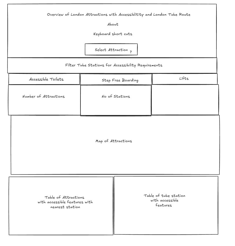
In my initial sketch, I mapped out the semantic "tab order." I started with the title and shortcut instructions, followed by the filters. I oriented the filters in a single row across the top to make tabbing feel more intuitive. Below those, I ordered the KPI summaries, the map, and finally, the detailed data tables. I placed the tables last because it acts as the 'deep dive' once the user has heard the high-level KPIs.
Accessibility Wins in Power BI
Since I was a bit of a Power BI novice, I had to learn the accessibility ropes on the fly. Here’s what I implemented to bridge the gap:
- Mastering the Selection Pane: I manually adjusted the tab ordering so the focus moves logically, not randomly.
- Alt Text Everything: I added descriptive alt text to every object on the canvas.
- Learning the Shortcuts: I researched the specific key functions needed to navigate a Power BI report via keyboard so I could explain them to the user.
- The Narrator Test: I actually turned on the Windows Narrator to test my work. I quickly realised that if I didn't put the full text of my text boxes into the Alt Text field, the Narrator would just unhelpfully announce "Object."
- Readability First: I bumped up font sizes and renamed headers to strip out jargon and abbreviations.
Final Thoughts
Building an inclusive dashboard doesn’t feel too different from my usual process; it just adds a necessary layer of consideration to basic design. Surprisingly, as much as I struggle with Power BI's formatting menus, I found its accessibility features to be the least of my problems. It turns out that good design is just good design, whether you're seeing it or hearing it.