


This blog explores a few statistical models you can easily use to give your analysis/visualisations the edge it needs to stand out.
Why use statistics at all?
In essence, statistics help turn a bunch of relatively meaningless random numbers into useful insights. This could be through identifying patterns and predicting outcomes to analysing distributions and influencing decision making. Statistics are therefore vital when it comes to data analysis and how this is visualised.
Common Metrics:
- Mean: This is the average value in a set of numbers. This can help compare values or groups to the set's "typical" value and will help evaluate performance, trends and influence future decisions. A downside to the mean is outliers can influence it and can go unnoticed.
- Median: This is the middle value within a set. This measure is not susceptible to outliers and can give a better insight into "typical" values if the dataset is skewed. A downside is the median is less useful for normally distributed models.
- Standard Deviation: Standard deviation is the square root of variance, which is a measure of how much the data spreads (deviates) from the mean. This metric offers a clearer interpretation of data to draw insights as the values are closer to those within the set (compared to variance). This measure is, however, susceptible to outliers, skewed data and small sample sizes.
How can you use them?
Top Tip: Include a reference line in each chart if you can! This is likely the most common way the mean will be used. By having reference lines in charts it gives the audience a way to understand the data that is being looked at.

The left chart shows us the West is severely underperforming whilst the North and East regions are excelling in sales. Without the use of the mean (chart on the right), we can clearly see the West is performing the worst but we cannot tell how "bad" this is in a broader sense as there are no statistics to provide this insight. This also prevents us from seeing relative performance which are all useful insights to draw and make decisions from.
Using the mean as a reference line is a good way of providing additional context to the insight you are trying to outline with your visualisation.
Boxplots: Median & Standard Deviation
Boxplots use the median and standard deviations in order to visualise the distribution of datasets, thus providing insights into the spread of the data, skewness and outliers.
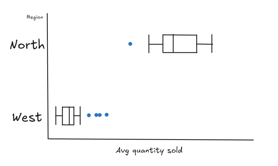
Here, North sales show a larger distribution and tend to sell quite high amounts. In contrast, the West sell really low quantities - to the point that selling higher amounts are anomalous and has a relatively small distribution (which could indicate consistent underperformance). This chart also shows us West sales fits a more normal distribution model whereas North sales are positively skewed (which could indicate an effort to optimise business performance as there are more data points on the upper side) which are all key takeaways for the business analyst to make decisions from in this example.
These are a few statistical metrics and visualisations that are used all the time to drive critical decisions from the insights they depict. This blog is the tip of the iceberg when it comes to statistical models and visuals but hopefully conveys the depth statistics brings to charts and dashboards.
Try and incorporate statistics if you don't already to enhance your findings (and charts) further!