


First day of Dashboard week for us in Germany. I'm not the biggest fan of this kind of exercise, so wasn't really looking forward to it. Luckily the data set was about the best things that exist in this world, cats. That helped. A bit.
Took a lot longer than ideal to understand it, but after lunch, I had the data prepared and ready to visualize in Tableau.
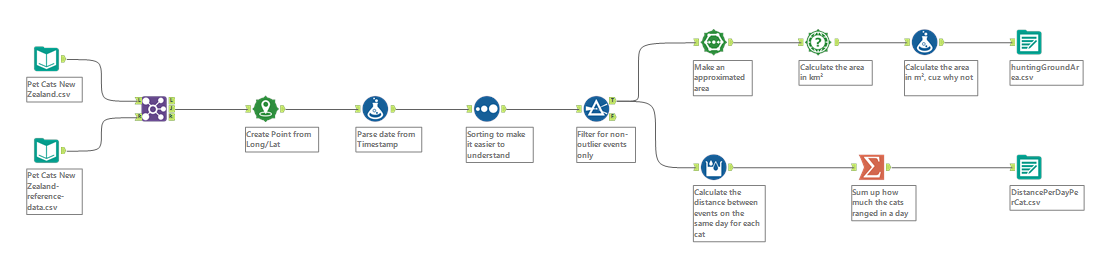
I decided to do an infographic type of dashboard, with different facts about cats in New Zealand and their habits in different categories. Also displayed a map of each cat's ranging area. You could filter for specific ones or highlight them on the map. Inserted some BAN cards with the best hunters (who brings more prey home per month), who had the largest covered area, etc. Actually, I had too many numbers. Not a single chart. That's good feedback for tomorrow, less BANs, more charts.
See you tomorrow!