The best way for me to learn something new is to try to recreate work from others! It might not be easy, but it’s very helpful.
First, try to create this chart by yourself, and only then look at the tutorial.
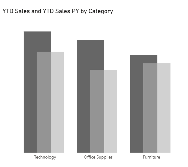
Today, we’ll see how to do it in this diagram. We will use the Superstore dataset.
- We need to create some measures that we will use:
• Date Table (see my previous blog)
• Years-to-Date Sales (Mesures)
• For the current year
YTD Sales = CALCULATE( SUM(Orders[Sales]), DATESYTD(Data[Date]))
• For the previous year
YTD Sales PY = CALCULATE( SUM(Orders[Sales]), DATESYTD(DATEADD(Data[Date],-1,YEAR))) - Choose a bar chart from the Pinterest visuals:
• place the category on the X-axis
• put the measure we created on the Y-axis.
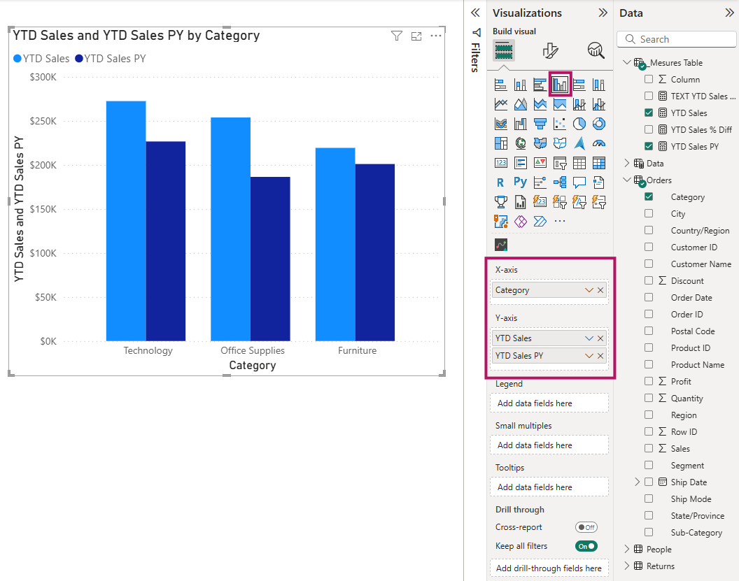
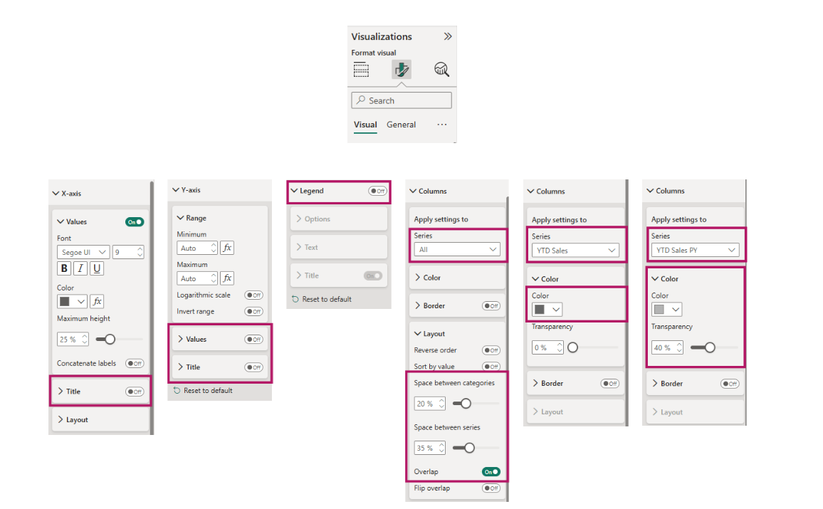
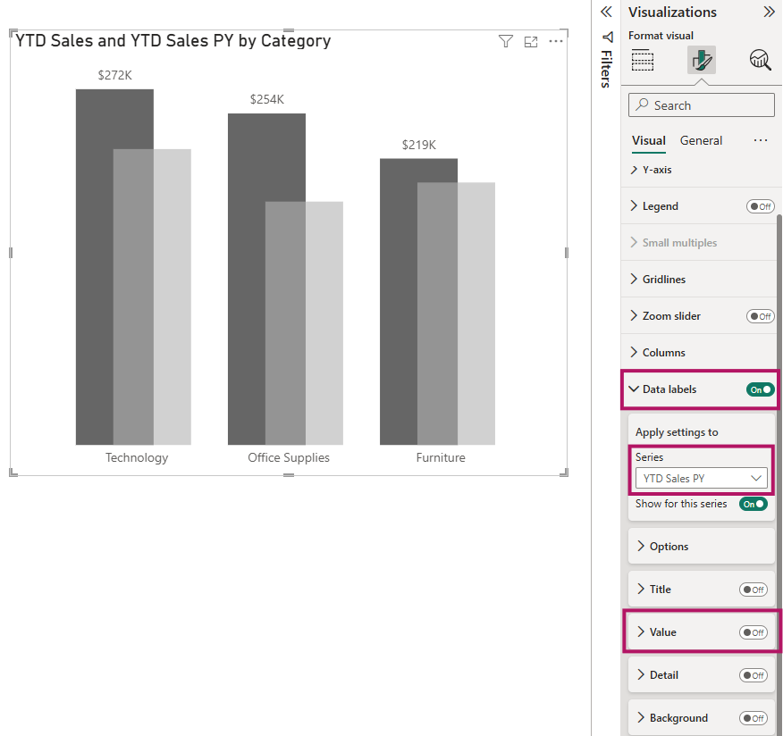
3. Make a few adjustments in the Visualization pane to make your chart look more appealing. All the changes are shown in the screenshot below.
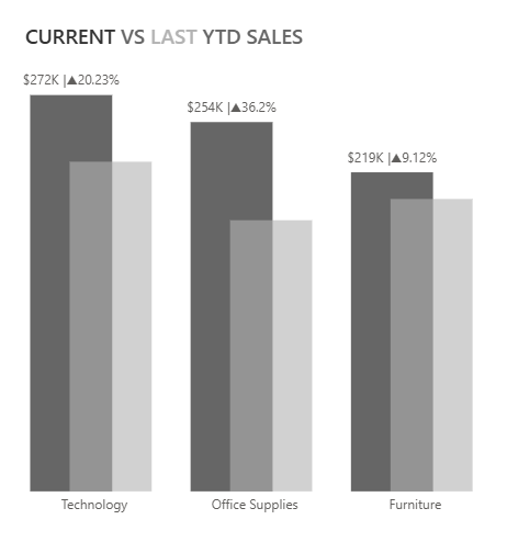
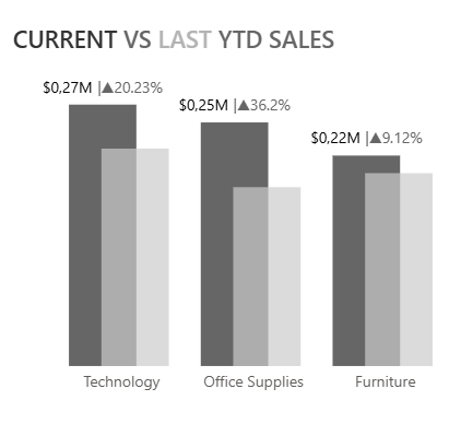
- Add data labels to all bar charts first, and then remove them from the bar charts of the previous year.
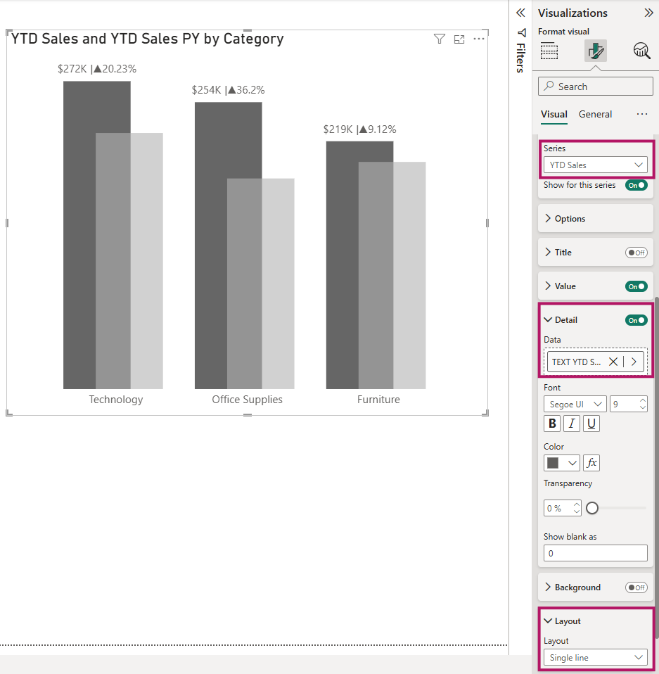
- To include percentages in the data labels, create a new measure and add it to the Details field.
TEXT YTD Sales % Diff = "|"&IF([YTD Sales]>[YTD Sales PY],"▲","▼")& round(DIVIDE([YTD Sales]-[YTD Sales PY],[YTD Sales PY])*100,2)&"%"
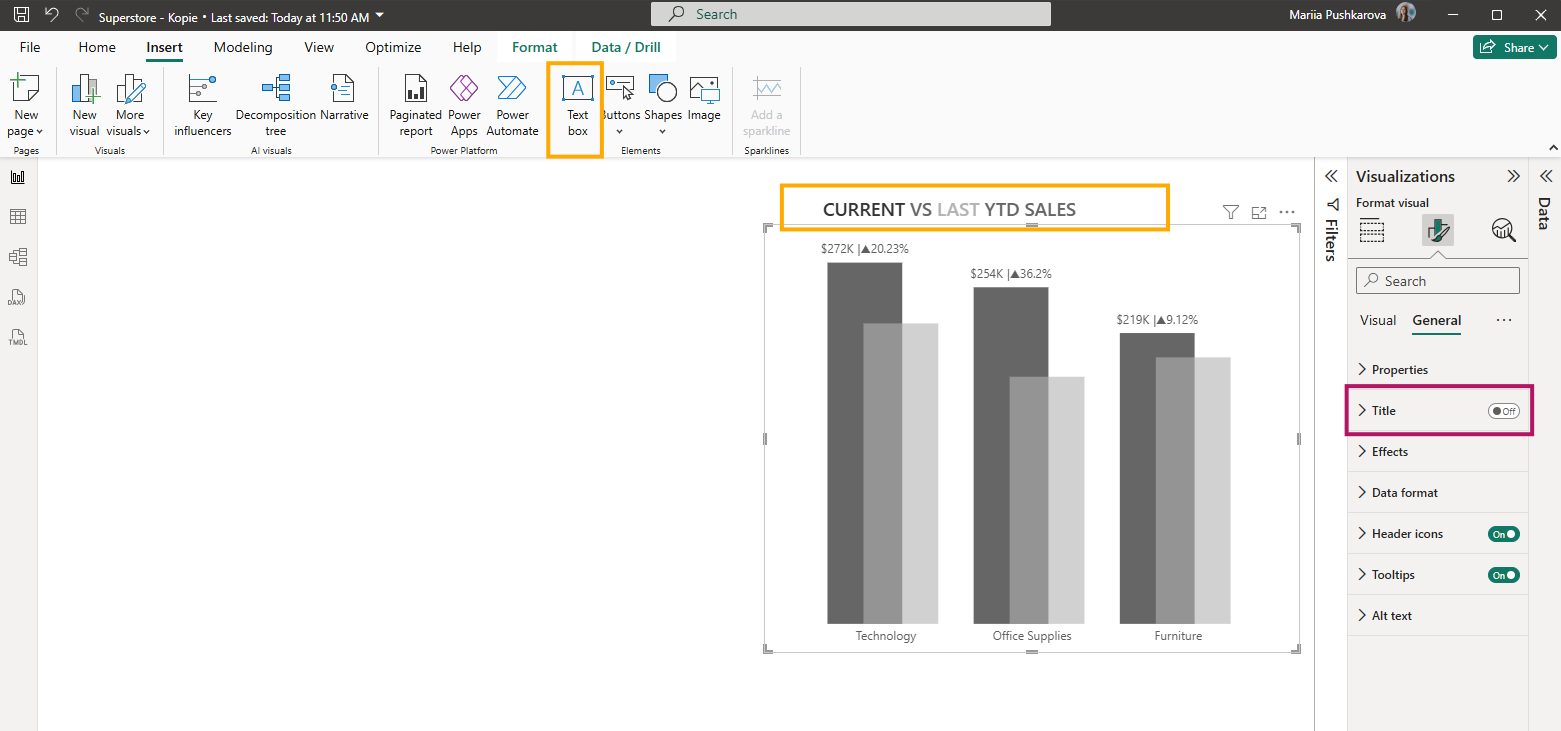
- To create a title with two colors and custom text formatting, turn off the chart’s built-in title and use a regular text box instead
Final results