The last day of training is done 😄
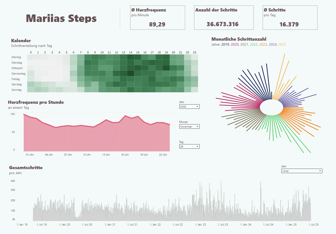
We worked on the Personal Project, which was about my steps. The idea behind it was to better understand my long-term progress over the years.
The data format was a GPX file exported from my Health app, which I prepared in Alteryx.
You can see the workflow below.
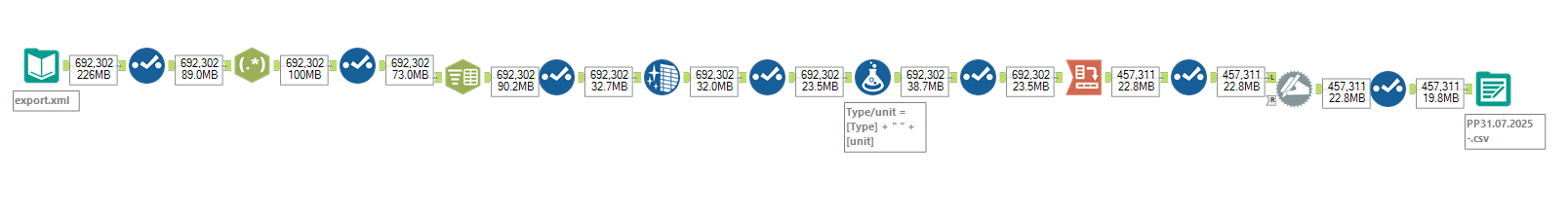
The tools I used were Tableau and Alteryx.
Challenges I faced:
- In Alteryx – Cross-Tab Issue:
When using the Cross Tab tool, you can only select one column for the new headers. But I had two: one for type and one for unit.
So, before cross-tabbing, I had to combine these two columns.
I solved this using the Formula Tool. - Creative Visualization in Tableau:
I wanted to find creative ways to visualize my data, so I experimented with circular bar charts.
For that, I duplicated my dataset.
In the end, I had to be careful with how this affected the other information on my dashboard.
Result:
You can see the result below.
(Before I started writing this blog, I forgot the language is in German – but the concept should still be understandable.)