


It's been four weeks already since the start of our cohort in early July. Might be a good time to reflect on what has been covered so far and if it has affected our data preparation and and visualization skills. One would hope that it has. This post will give a quick overview of what you can expect from the first month of Data School. As an example how the new input can be put to practice, I'll show the dashboard I originally applied with side by side with the changes I have made to it since then and the reason for each of the changes.
What topics have we touched on so far?
- Data Preparation - both using Tableau Prep Builder and Alteryx
- Certifications - So far we got the Alteryx Foundation Credential https://www.tableau.com/products/prep/download, we'll all hopefully follow up with Alteryx Core Certificate in 1 week
- Data-related challenges - Preppin' Data, Alteryx Weekly Challenge, Makeover Monday
- Tableau - by building a lot of dashboards and reconstructing examples in the training
- Visualization best practices (see examples of the learnings below)
- Presentation skills - improved through regular feedback
- Data models - tieing together data from various sources
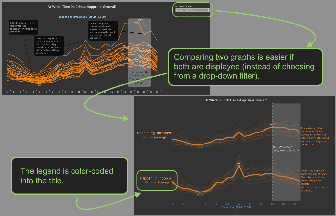
Let's pick out one of these bullet points, since the progress can easily be shown: Visualization best practices. The dashboard I initially built for The Dataschool (also my first outing to Tableau) can be found here and is built using crime data obtained via police reports from Los Angeles. The version on Tableau Public is updated already, because I've acted on some core concepts of visualization best practices already. One of them is to approach a dashboard from a perceptual perspective. Some aspects of a visualization stick out before others do. For example, difference in color are pretty salient and therefore should convey meaning. They also are more obvious than differences in the sizes of objects.
The three pictures below illustrate three slides of my original dashboard (left side) that I have since changed (right side), to - hopefully - a better way of getting the same message across. Above the pictures are the lessons I learned or some feedback I got that lead to the changes.
1) Things that are supposed to be compared should both be visible at the same time.
2) Explaining a color code can be done in the title.
3) Comparing lengths of objects is easier than comparing the size or shape of objects.
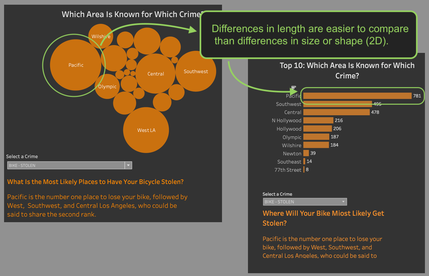
4) Differences in color are also more apparent than differences in size.
