


Introduction
We start this Blog by understanding what a Mosaic Plot is and what it's useful for:
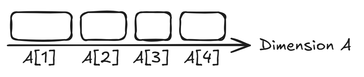
With this chart type you can visualize the distribution of a measure over two dimensions. It is in essence a 2D version of a 100% stacked bar chart:
For every category of the first dimension there is a 100% stacked bar which is divided into every category of the second dimension.
It also goes by the name Marimekko Chart or just Mekko Chart.
Think of it this way: You create a 100% stacked Bar representing the distribution of the measure in the first dimension
Then You expand these bars upwards into the second dimension and for every bar you determine the distribution in this second dimension
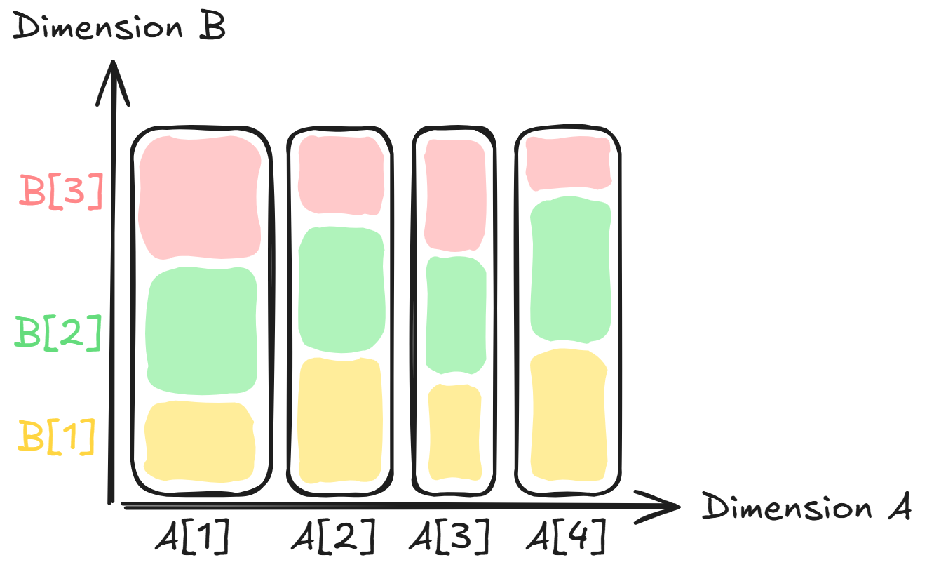
You've got yourself a mosaic plot!
Due to it's construction, the area of every rectangle is now proportional to the measure they are based on.
As you might have noticed is the chart not equally detailed in both dimension, since the thickness is determined only by the distribution in dimension one.
This means that we can actually create two different mosaic charts with the same data, simply by swapping the dimensions.
Creating it in Tableau
First we need our data in the correct format. Two columns for dimension 1 & 2 and one column for our measure.
As an example I will use "1,000 songs to hear before you die" made available by the guardian.
The two dimensions we are interested in are the theme of the song and the year of it's release.
The measure will just be the count of songs for a specific theme in a specific year.
The years before 1950 where grouped together for visual clarity.
To make this blog not too complicate, I already prepared the data to only consist of these three columns with the counting already done.
The data now looks like this:
Dimension One: "Year"
Dimension Two: "Theme"
Measure: "# of Records"
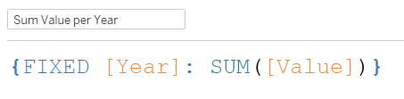
First step is writing a Fixed LOD for our dimension one, which I chose the Year for in this case.
This will be used for the thickness of the bars and also their position on the horizontal axis:
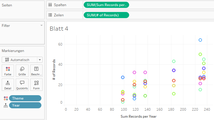
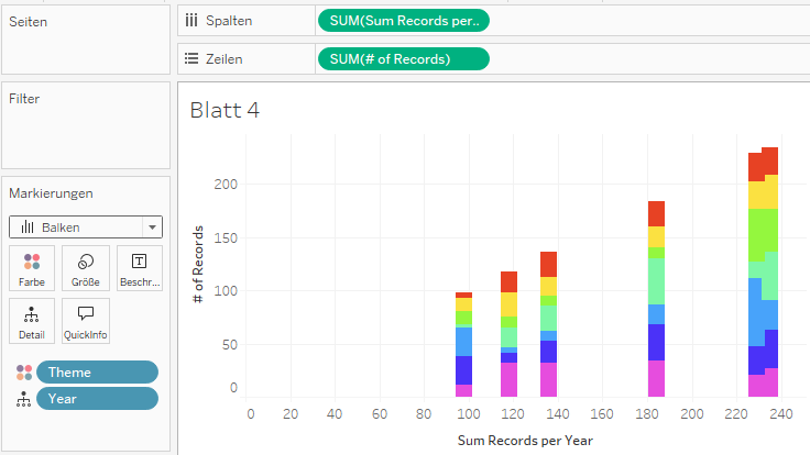
We then place this Calculated Field on the Columns shelf and the Number of Records on the Rows shelf.
The theme is placed on Color and the Year is placed on Detail.
Tableau automatically creates a Scatterplot which should look like this:
We change the Mark Type to Bars:
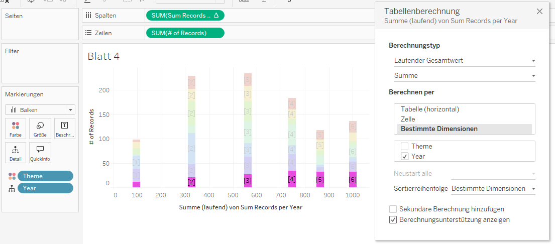
Next comes the first of two table calculations:
We calculate the running sum of our Calculated Field "Sum Records per Year" and select "Year" as the specific dimension to position our bars correctly:
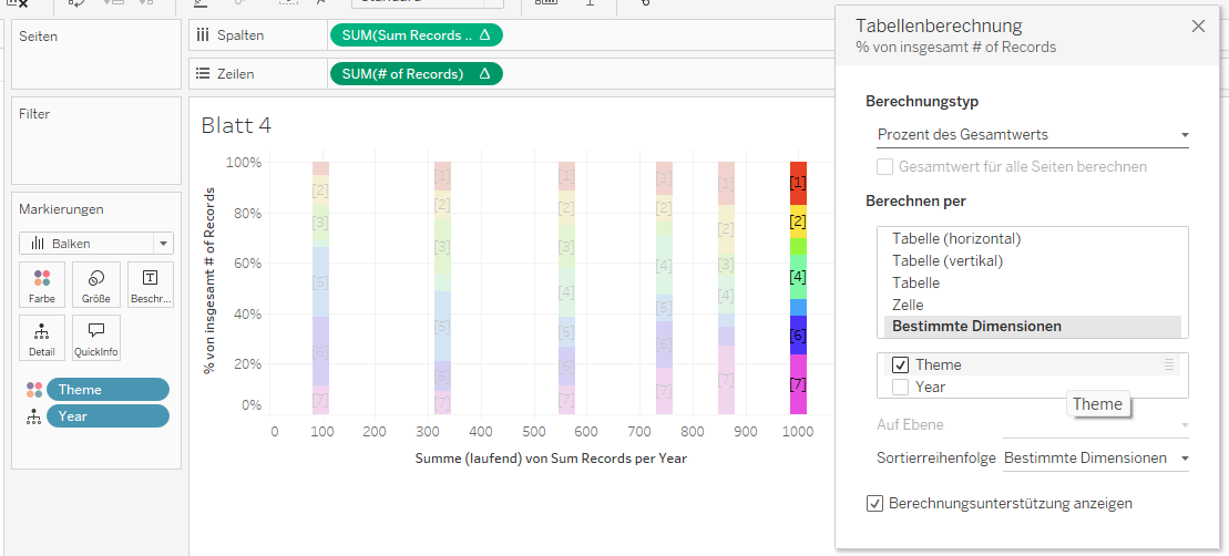
now the second table calculation:
We calculate the Percentage of Total for "# of Records" and select "Theme" as the specific dimension to get 100% stacked bars:
Last step is to drag "Sum Records per Year" on Size, select Fixed instead of Manual and select Right as Orientation:
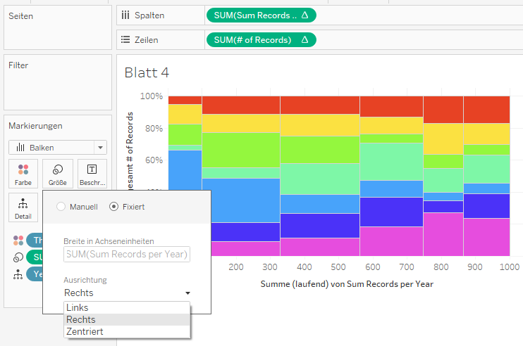
Done! We successfully created a mosaic plot.
With some cleanup and addition of labels for rows and columns, we can get something like this:

And that's it, now you know what a mosaic plot is and how to create one in Tableau!
You can check out the Dashboard on Tableau Public and download the Workbook:
https://public.tableau.com/app/profile/stefan.ladwig/viz/MosaicPlot-1000Songs/Dashboard
Sources and Inspiration:
https://en.wikipedia.org/wiki/Mosaic_plot
https://www.theguardian.com/news/datablog/2009/mar/20/1