


This week I spent all my time on improving my skills in Power BI.
After exploring Microsoft's learning path and building a simple report on my own, I challenged myself by recreating one of the most favorited Dashboards on Tableau Public: Priya Padham's Superstore Overview Dashboard
My recreation is not a one to one copy and not every element of the original is implemented, but it is very close and a good template or reference when you want use an element of it in your own report or get a better understand of the ins and outs of Power BI.
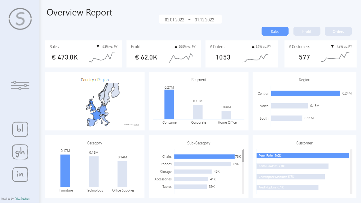
Feel free to explore the report here or download the .pbix file.
I highly encourage you to explore the following in Power BI Desktop:
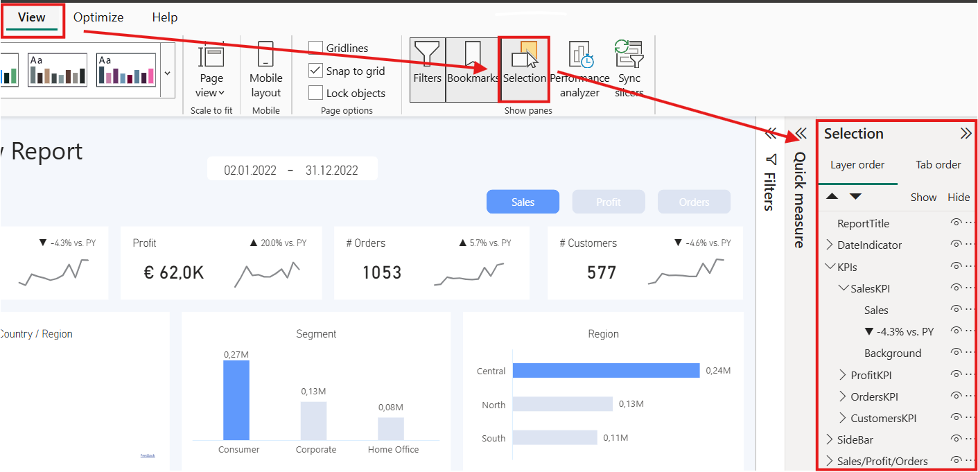
1. the structure of how the visuals are grouped,
(accessible through "View" -> "Selection" -> Selection Sidebar)
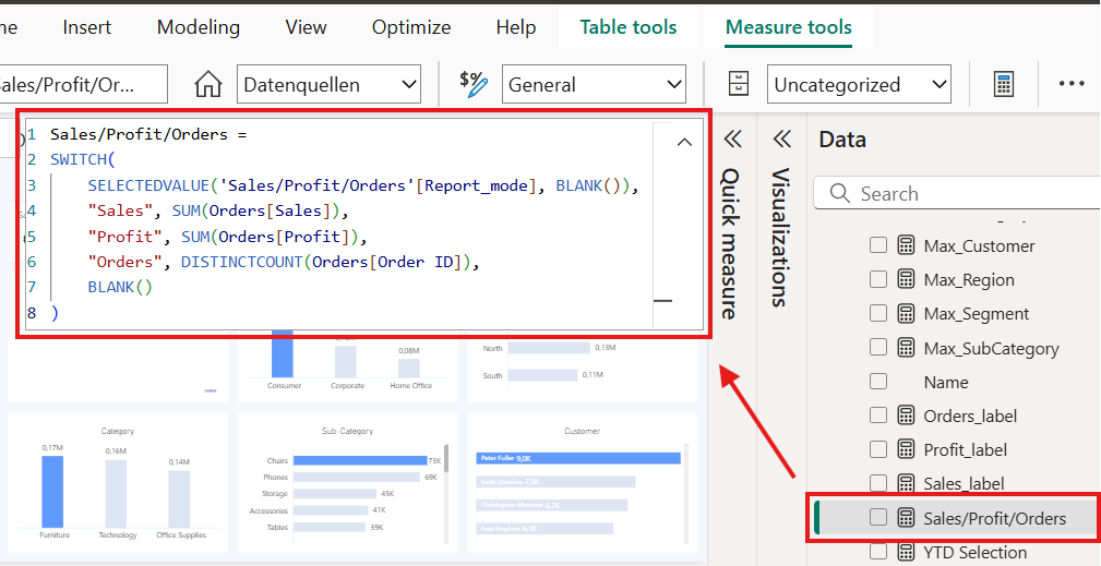
- the measures and their Dax calculations
(click on a measure in the Data Sidebar)
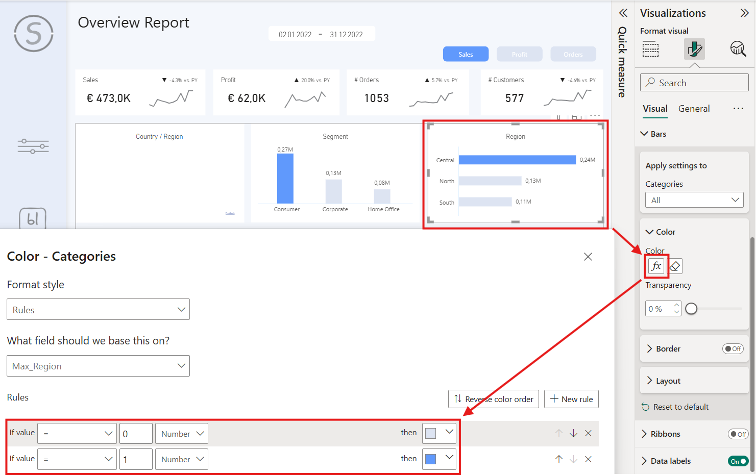
- the conditional color formatting for some visuals
(Click on a visual and got to the color settings)
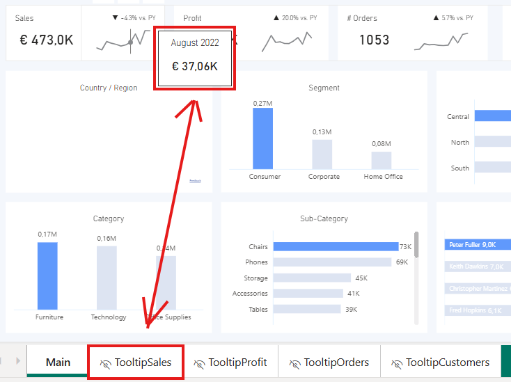
- the Tooltips with report pages as content
This just a selection, there is much more to uncover and investigate.
I might add a Blog for one or two of those topics in the future, so stay tuned for more Power BI content 🙂