


Creating dashboards in Tableau is fun, but rebuilding the same or a similar layout from scratch every time can get a bit annoying. That’s what dashboard templates are great for—they let you reuse the same structure across different projects, so you can focus on the visualisations without constantly reinventing the design. Plus, they help keep your work consistent and clean.
What exactly is a dashboard template?
It is a predefined layout that you can fill with different visual elements depending on your data. The charts change, but the overall structure stays the same. This speeds up your workflow significantly and provides a consistent user experience across multiple dashboards.
How do we proceed?
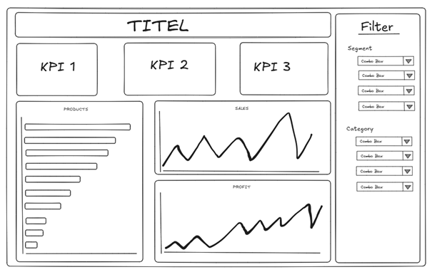
It might be useful to sketch your idea first (e.g., in Excalidraw).
If you look at the layout, you can identify four different areas: Title (red), KPIs (blue), Charts (green) and Filter (yellow). The Charts area can again be divided into two different sections (purple and pink).
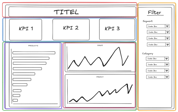
This is the basic structure I will be working with and implementing in Tableau. The plan is to use blank objects as placeholders and align them in the same pattern as the coloured containers in the sketch.
To get started with your own dashboard template in Tableau, begin by setting the size of the dashboard. I personally like to work with dimensions that fit a regular screen without having to scroll up and down or sideways.
Once the size is set, the next step is to drag a floating container onto the dashboard. It doesn’t matter whether it’s horizontal or vertical—you can adjust it later. Use the Layout menu to change the size of the container so that it is the same size as your dashboard. This will make the container fill all of the space on the canvas.
Then you can start building your dashboard. You can now add the containers you need. To make your template easier to work with, try using blank elements with a coloured border (go to the Layout menu for this). This will help you to easily identify the different areas of the dashboard. Start by adding an element for the title. If you want your title to be separated from the rest of the dashboard, you can add a line underneath it. To add dividers between sections, just drag a blank element onto your dashboard, underneath the title. Then set its background colour and height. (Right-click and select 'edit height'. 10 pixels should be enough.)
Next, you add the rest of the containers. The item hierarchy (in the left pane) is a great way to understand the structure of your dashboard. It lets you see the full structure of your dashboard, including all nested containers and elements. This is especially helpful when you’re trying to select tiny elements like the thin divider line that are hard to click directly. You can even rename containers in the hierarchy, which makes it much easier to keep things organised and maintain a clear, documented structure.
Spacing is another crucial part of good dashboard design. Using both outer and inner padding (in the layout menu) helps create breathing room between elements. This helps to give the elements some space and makes the dashboard look cleaner and easier to read.
In the end, your template could look something like this:
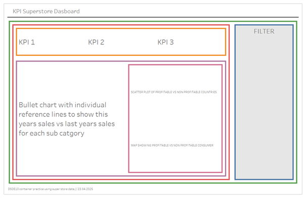
Each coloured area is either a blank element or a text element with a coloured border. This helps to identify the different parts of the dashboard. I used the text elements to note the location of each chart. From here, I simply duplicate the template and replace the blank objects with my charts.
Your final dashboard could look something like this:
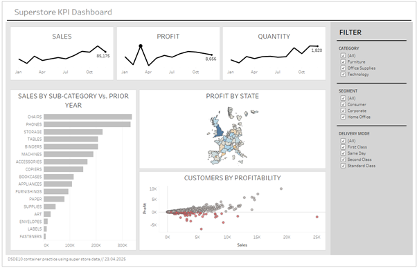
With the template ready, you can finish your dashboard in just a few minutes and make it look clean and nice. You can always adjust the colour and other small details to get the look you want for your dashboard.
Creating your own dashboard template in Tableau might take a little bit of setup at first, but once it’s done, it saves you a lot of time and keeps your work looking clean and consistent.