


Today I want to show you how to add a chart to the Tooltip Menu!
- Step: Create a sheet and a visualization (in my example, I'm going to use a map). For that, we choose the mark type Map.
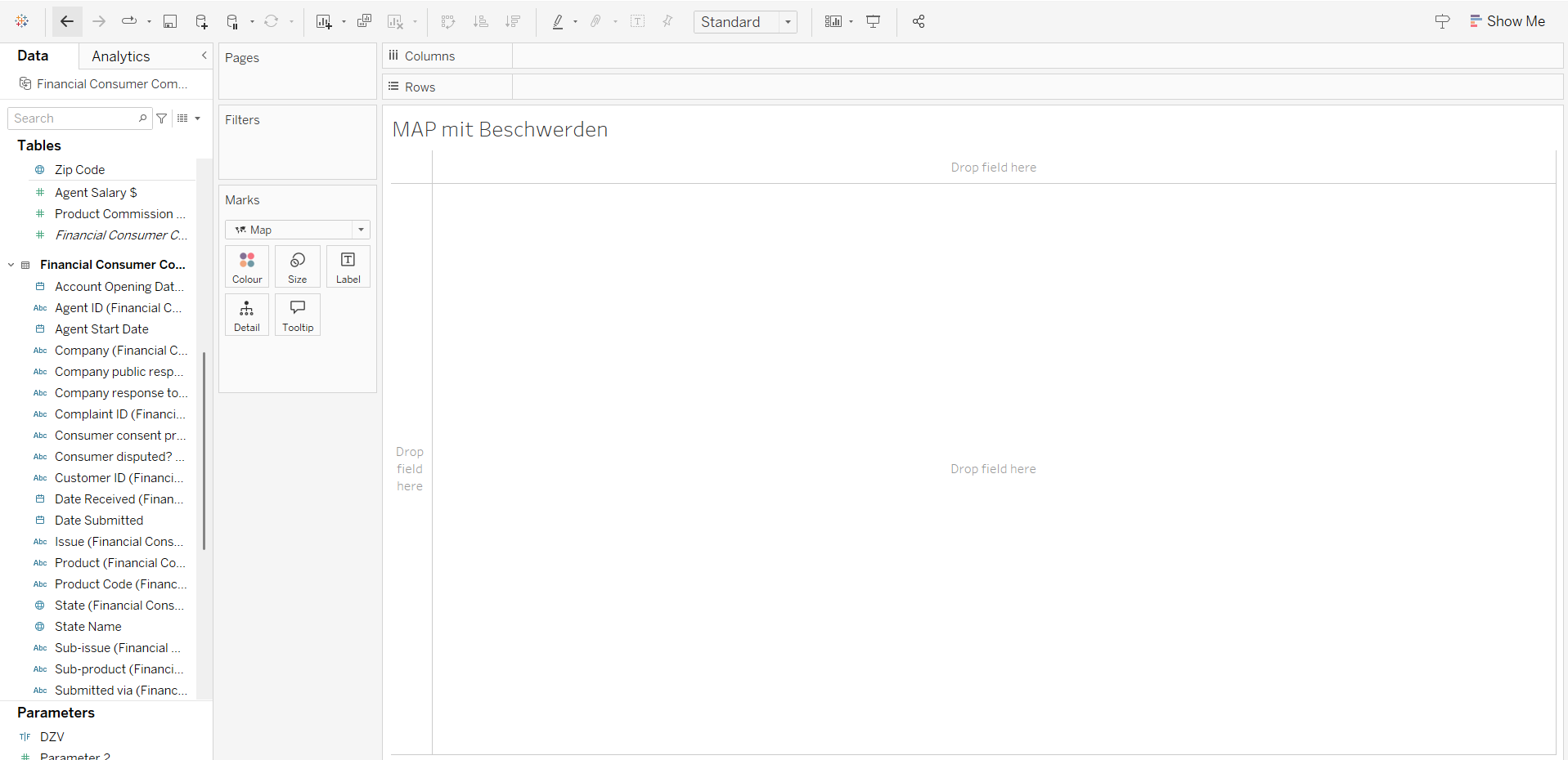
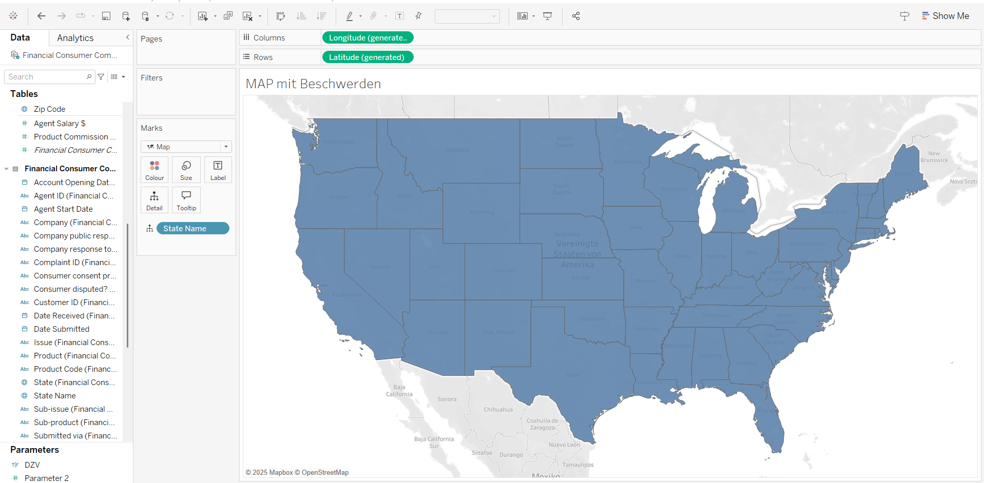
We select a geographical field and double-click on it. Now we have a map! This map will be our main page.
- Step:Create a second sheet. Just press the button marked in the following picture.

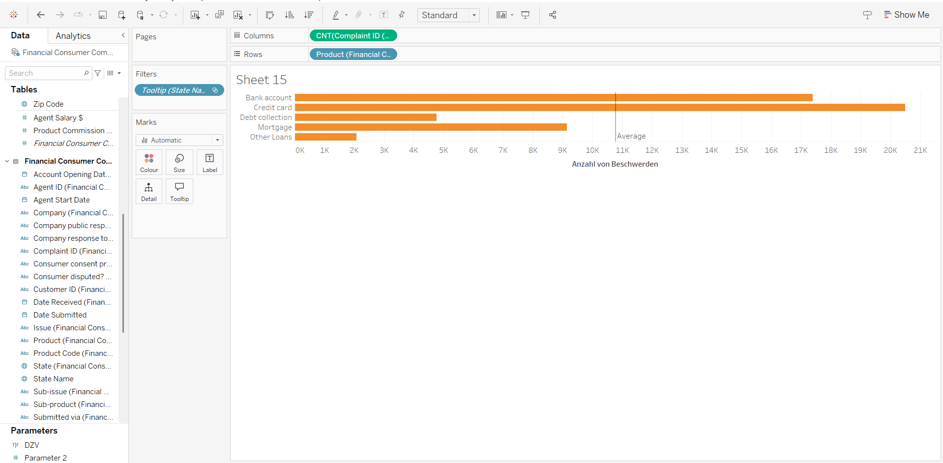
3.Step: Build a visualization that makes sense to display in the map tooltips. In my example, it's the number of complaints per product category.
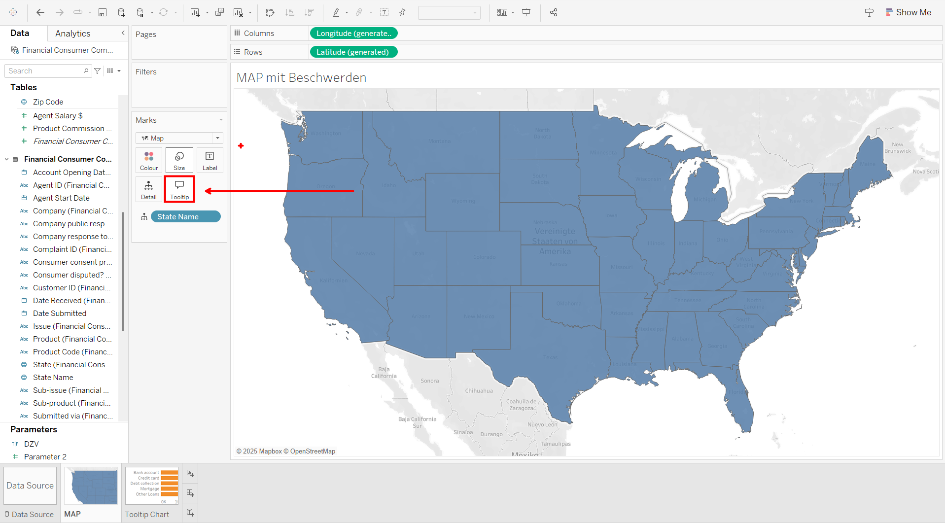
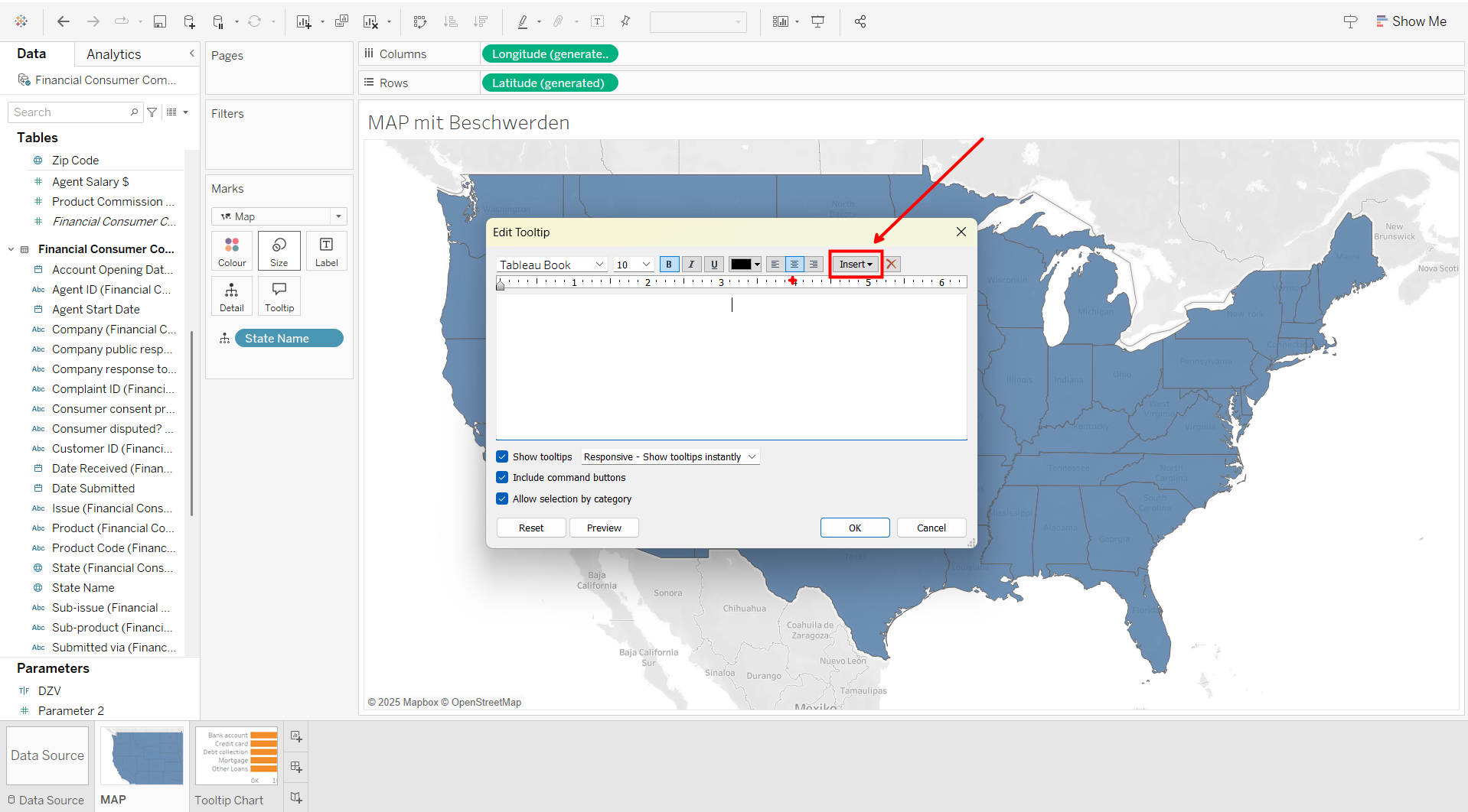
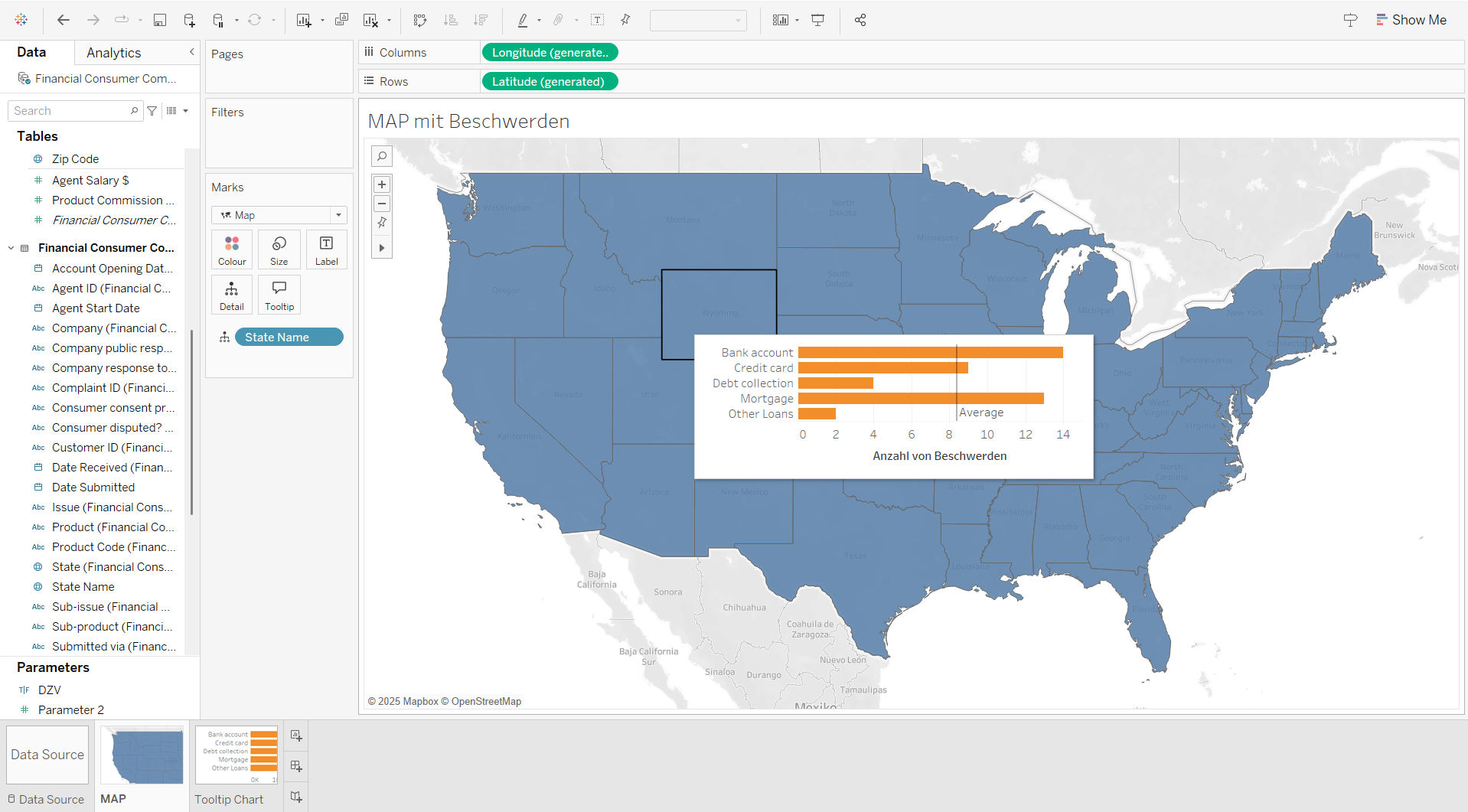
Once we have the final visualization for the tooltip ready, we move on to the last three steps. Return to the MAP sheet and press the "Tooltip" button. The tooltip window appears in the middle of the screen.
4.Step:Insert the sheet we created for the tooltip by pressing the "Insert" button.
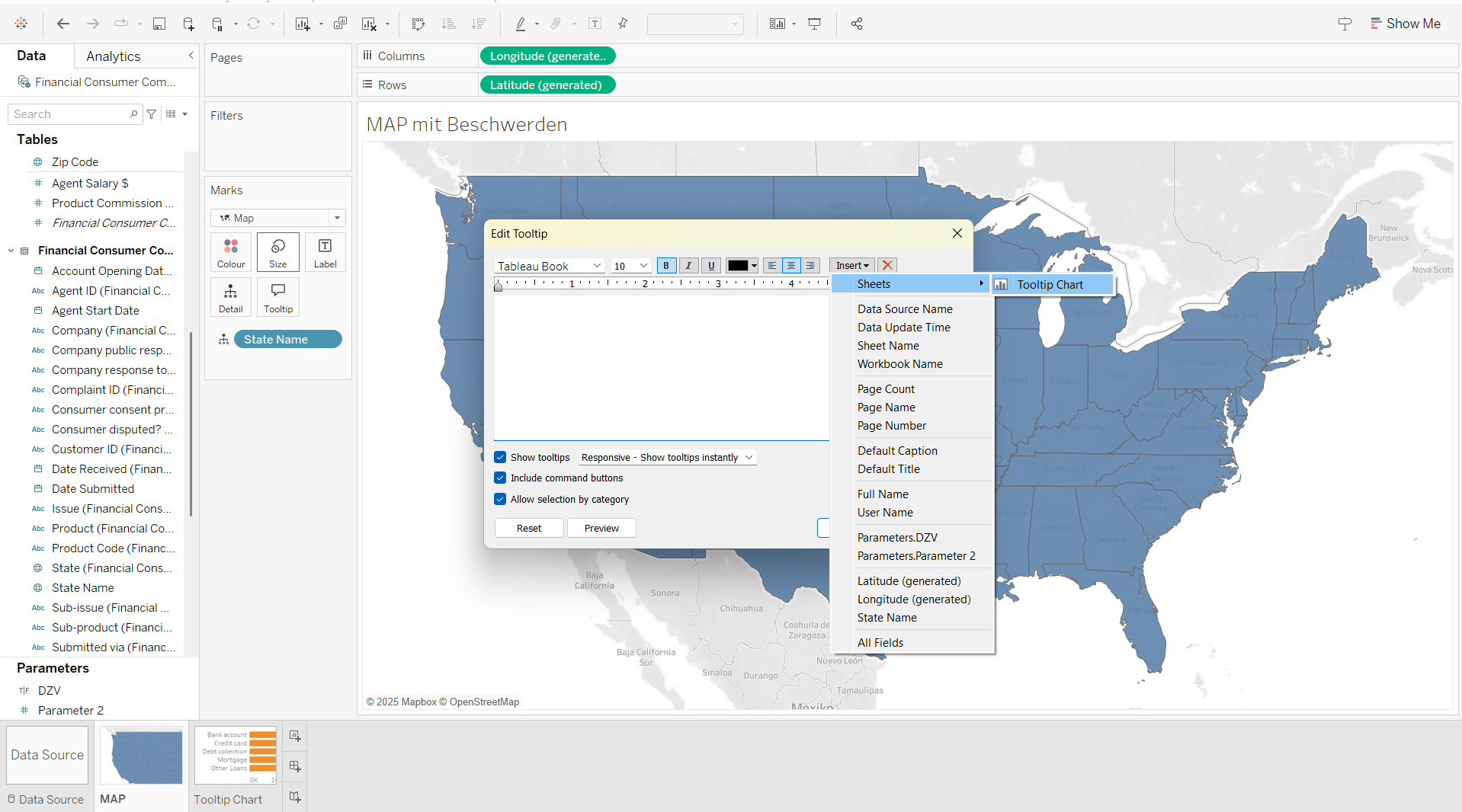
5.Step: Click on Sheets and choose the right sheet you want to include in the Tooltip (in this case, the sheet I named "Tooltip Chart").
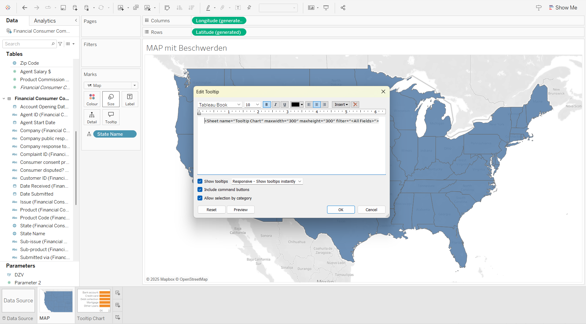
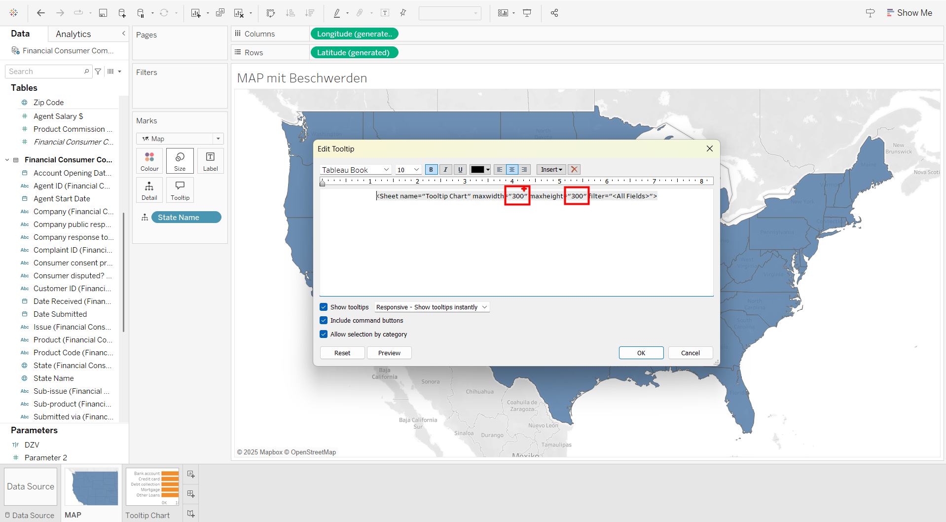
6.Step: After inserting the sheet into the tooltip, you can resize the tooltip window by changing the numbers (marked red in the following picture) to the size you want.
That's it! Now, when you hover over the states on the map, the chart in the tooltip will show more detailed information about that state.
Hope I could help you! 😃
If you want to see it as a video, just follow the link: