


Cardio Machine Screen
Welcome to this series of posts where I share dashboards I've noticed around me. This time, I found an "analog" dashboard at my gym. It's a cardio machine screen that works on the electricity produced while using it. That's why the photo is blurry — I had to keep running! 🏃➡️
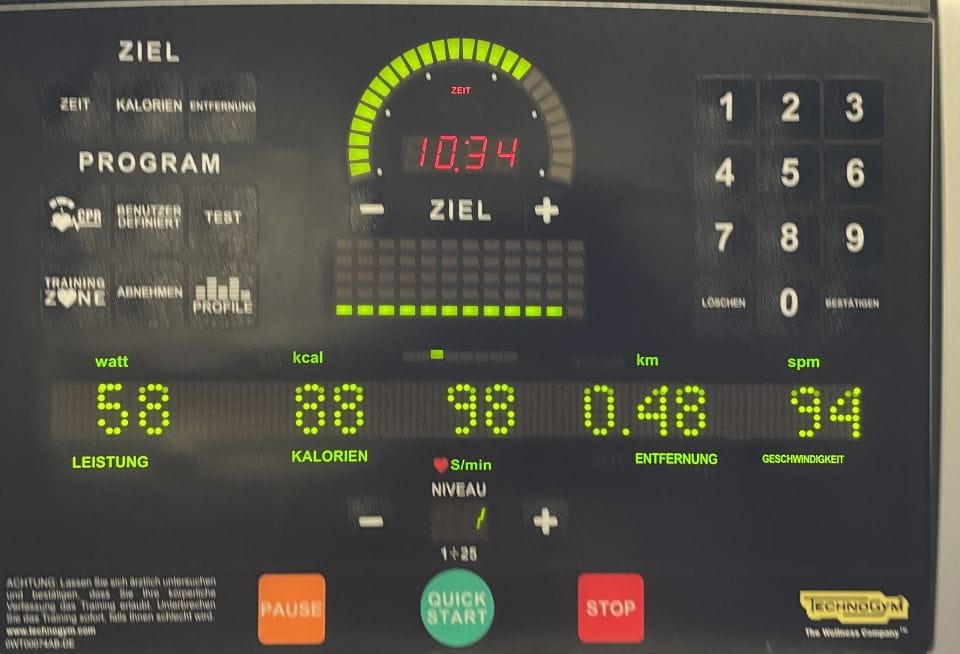
This is a pretty insightful dashboard showing the current state of your training. You can select a goal (time, calories or distance) and set a target. It not only has numbers representing time, power, calories, heart rate, distance and steps per minute, but also provides visualisations:
It's impressive how much can be shown with just one static view!
Dashboard Makeover
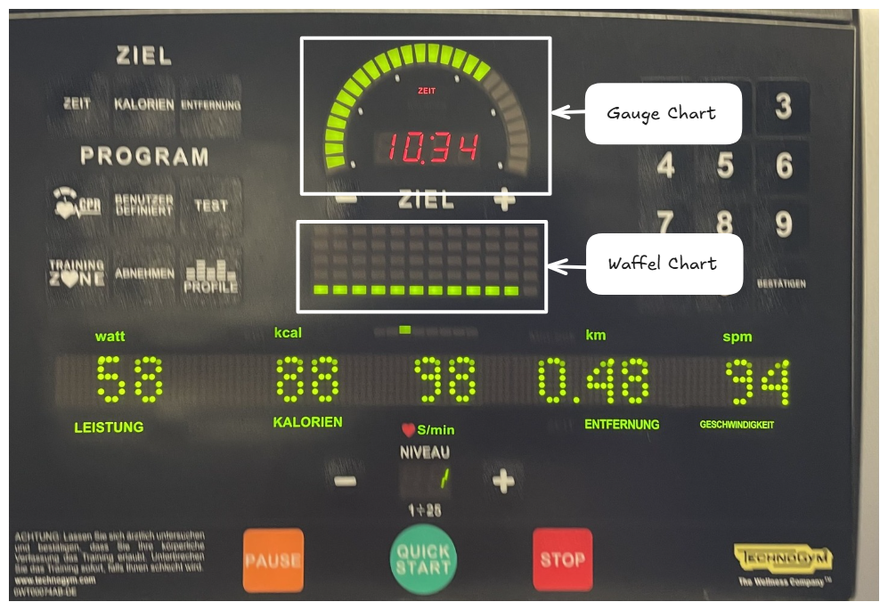
However, this screen represents the entire user interface rather than just the dashboard. We will therefore try to reorganise it into a more optimal dashboard template. Here's a sketch of the current design:
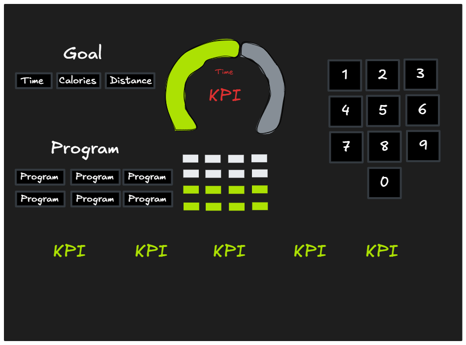
What will be kept:
- Color palette
- Waffel and Gauge charts
- Metric choice for visualisation
- KPIs
What can be improved:
- We don't really need the keyboard in the dashboard view
- Space usage can be optimised
- Chosen metrics can be highlighted
Makeover:
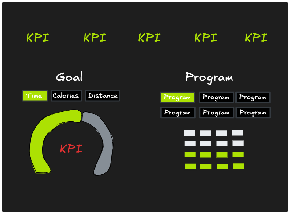
Tadaa! We have a much cleaner view while still keeping all the given metrics.
Hope you enjoyed this little discovery as much as I did 😁
See you in the next post!