


Welcome to the the day three of the Dashboard Week, when every day I exprlore something new and create a dashboard.
Today I was analyzing my Spotify listening history and made this little dashboard:
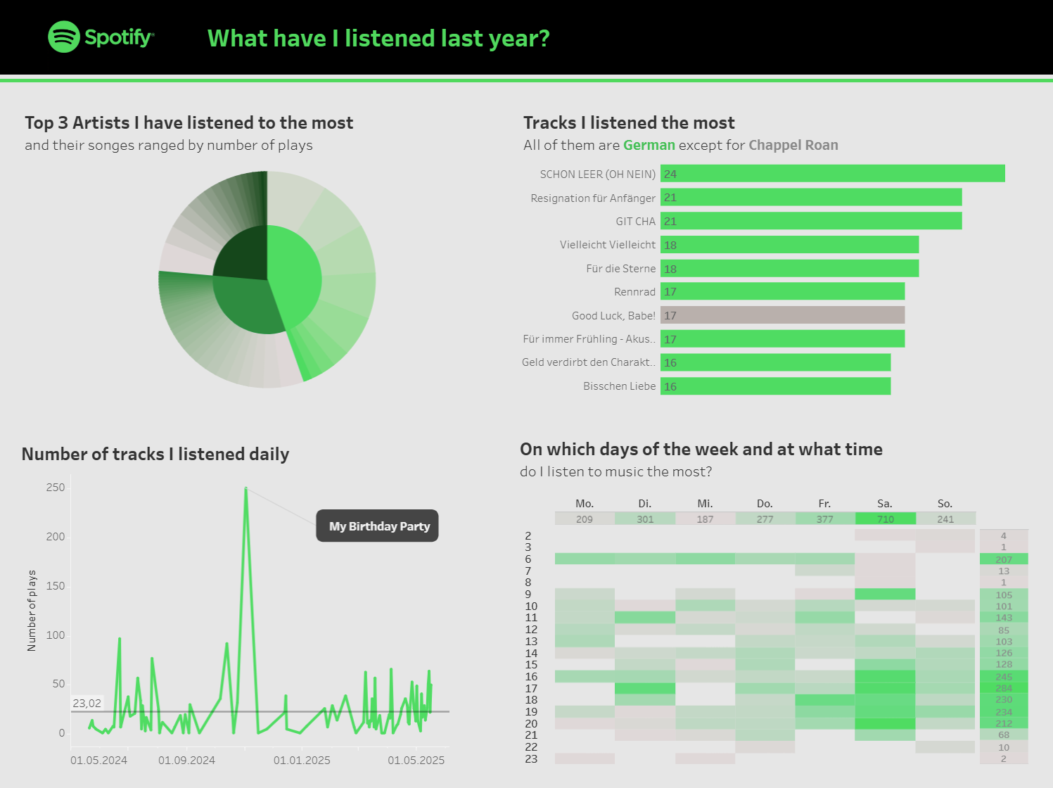
The most challenging for me today was building a sunburst chart with my favourite 3 singers and their songs I listened to. I've always wondered how to create a nice gradient for the subsections of a sunburst chart. That's why I'm happy to share the tips I found today!
This tutorial has a great explanation of how to make a sunburst chart. Unfortunately, it doesn't explain how to make a custom gradient for sections. But I will do that!
Color Palette
First, pick your colors. Coolors have many useful tools to create color palette:
- Image picker helps to pick colors from the image (can be logo, some photo for inspiration, etc.). The colored a picked automatically, but can be changed manually
- Popular Color Palettes is a ready-to-use list of palettes
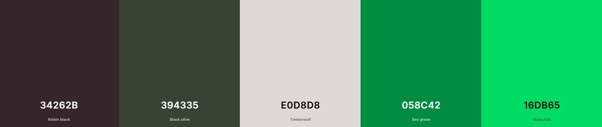
I used combination of Spotify logo colors and a green color palette:
Gradient Generator
Then choose two colors for start and end of the gradient and go to https://colordesigner.io/gradient-generator. Count number of subsections for each color and use it as number of steps.
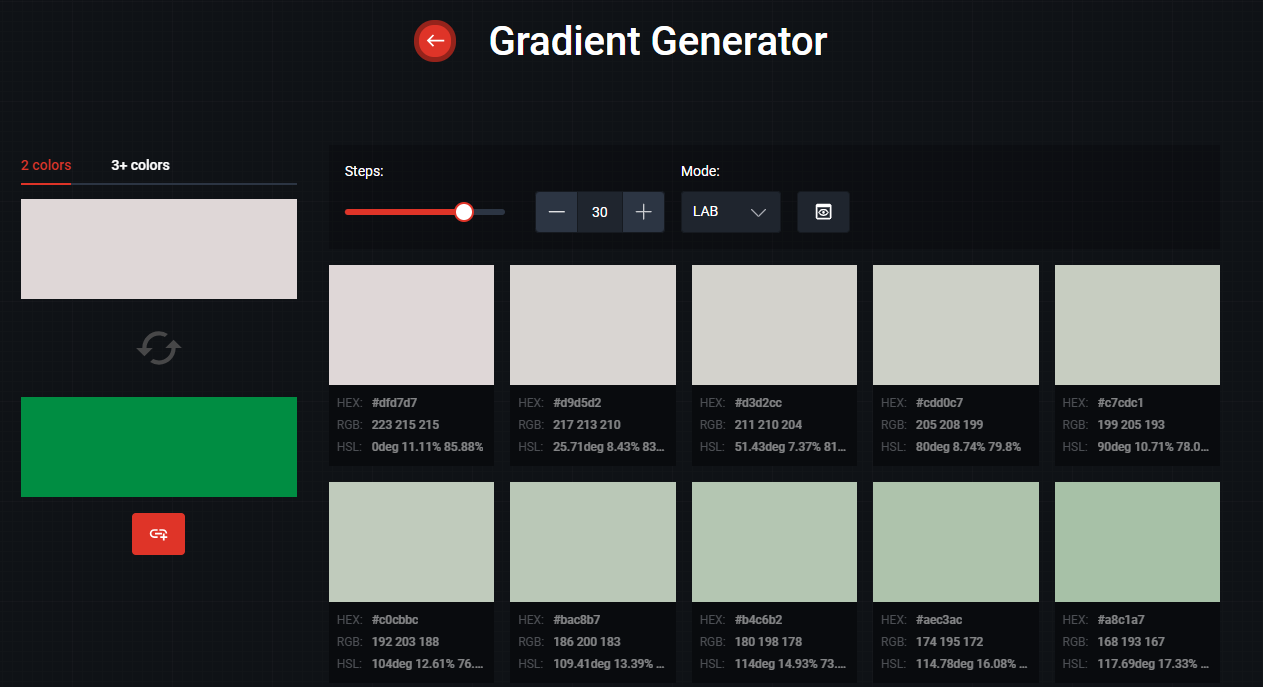
Click on Export Colors button and copy HEX codes of all of them.
Create Custom Palette in Tableau
Go to Documents -> Tableau Repository, find there Preferences file and open it in Notepad or another text editor.
If it's empty, check out Birthe Claußen's post.
Add all these colors to a palette:
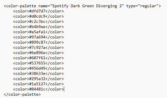
IMPORTANT: type of the palette has to be regular.
Now you can create gradients for each section color and assign them to visualisation.
I hope it was helpful, see you in the next post!