In this blog post I will describe how to create a Butterfly Chart to show the difference of two groups (population of a country, literacy of different countries, etc.) in Tableau.
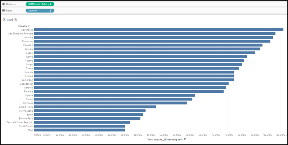
First you need to insert your data and create a bar chart.
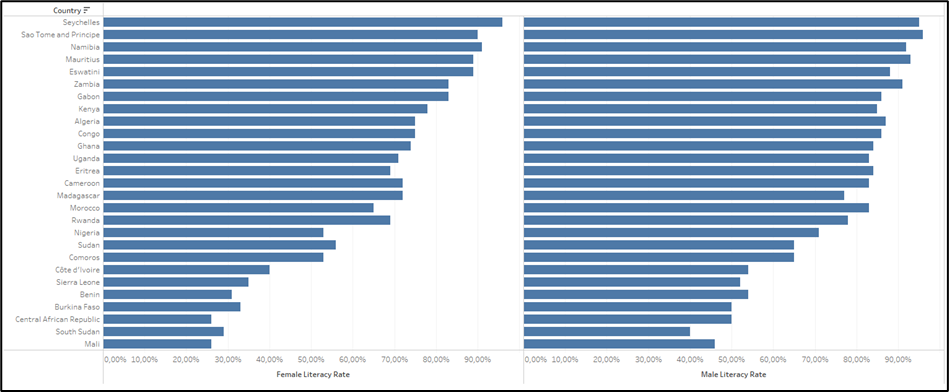
Then you need to add the second measure you want to compare with each other. Do that by dragging the second Measure into the Columns field.
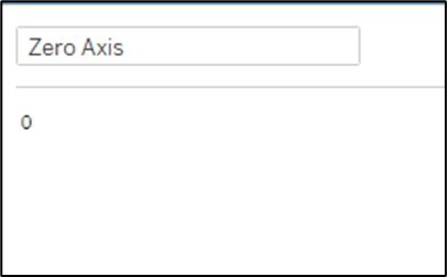
Then you need to add a zero axis. You can do this by created a Calculated Field and giving it the value of 0.
Then you need to drag the Calculated Field between the two Measures in the Columns field.
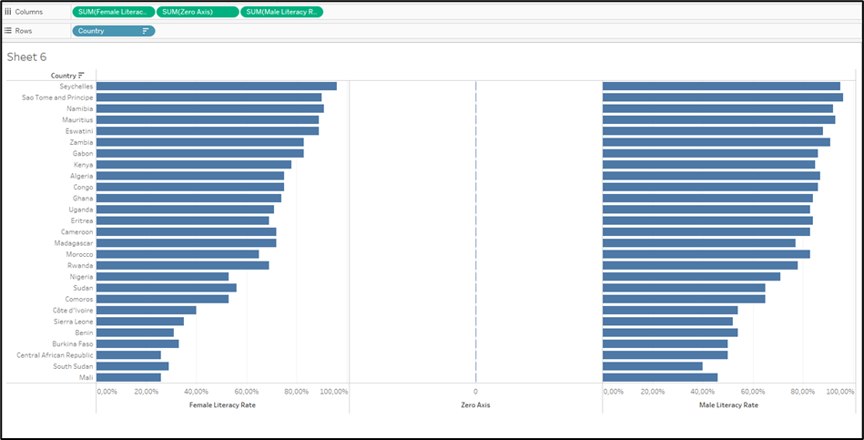
Now we need to work on formatting the sections into the way we want it to look like at the end.
First you need to draw the Measure Names to the Marks Card of the Zero Axis. This will show the Measure Names on the Zero Axis. Change the Type to Text to have the names being aligned in the centre.
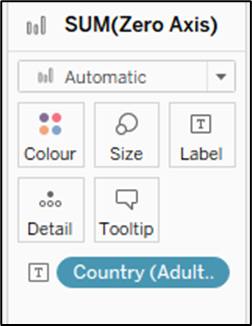
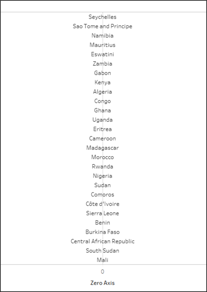
Change the left Axis to be displayed Reversed.
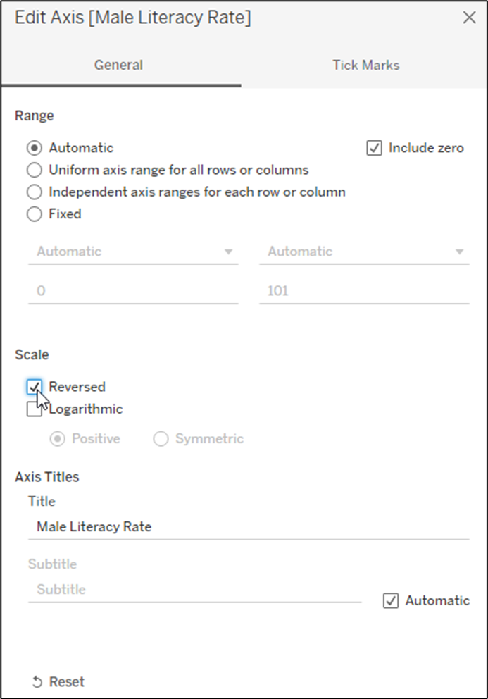
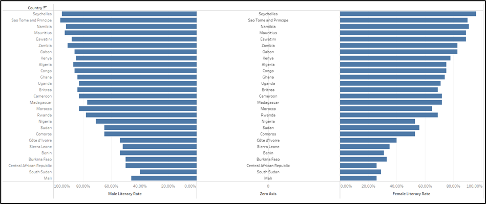
Now you have already created your Butterfly Chart and need to finish it with the formatting.
The next important step is to create a Dual Axis by right clicking onto the Zero Axis in the Columns Field. Tableau automatically changes the Types of the Visualisations making it look weird.
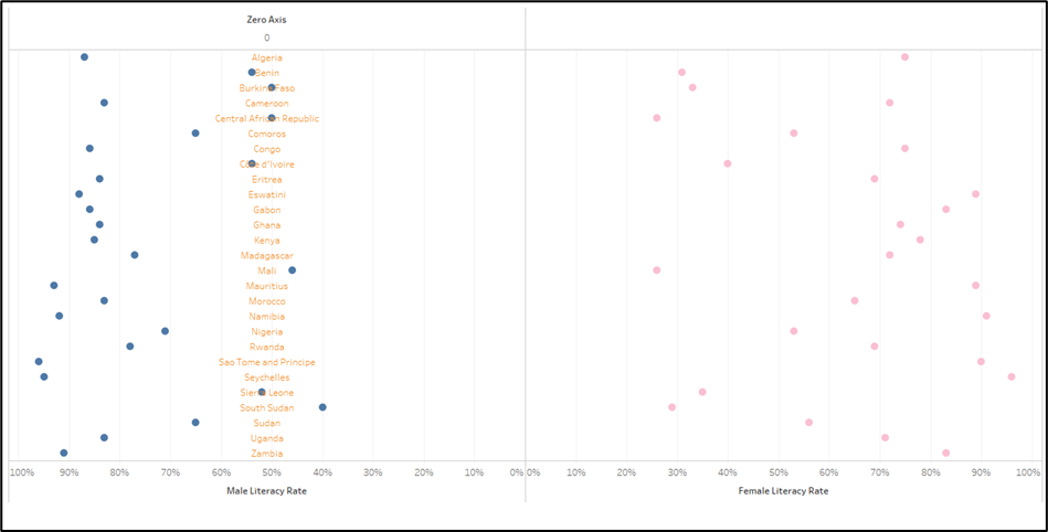
Just change the Types in the Marks Card back to Bar Charts for your two Measures.
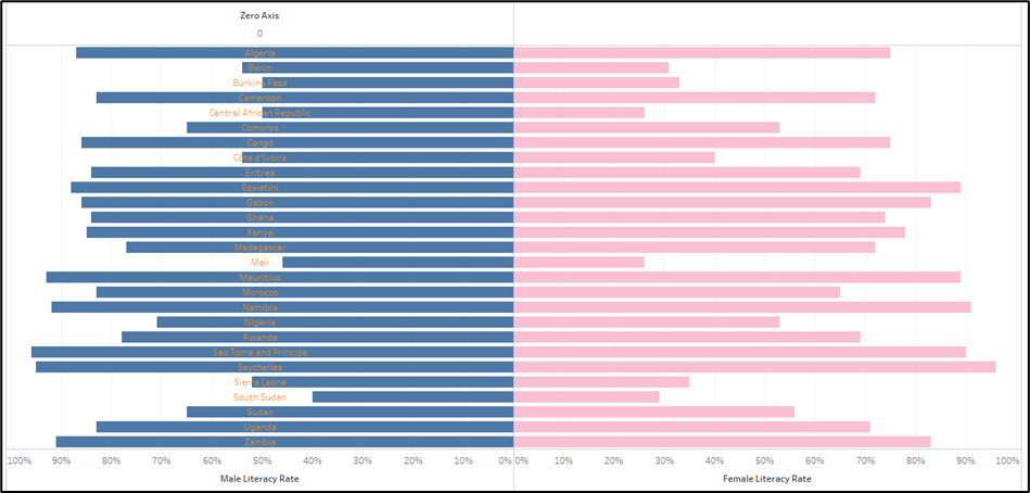
The last step will be adjusting the Zero Axis to be displayed in the middle. We do this by Synchronising the Dual Axis and setting the Fixed Start to 0 and the second Value to Automatic.
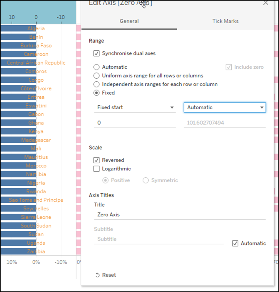
Afterwards Hide the Header of the Zero Axis.
Now you will notice the Measure Names only being display on the left part of the Butterfly Chart. To fix this you need to add a Zero Axis to the right part of the Butterfly Chart as well with the exact same steps you have done before for the left part of the Butterfly Chart.
Now you just need to finish the formatting.
I decided to do the following steps to make the chart look a bit nicer:
· Removing the Header on the left to not show the Measure Names twice
· Changing the Colour of the Bar Charts to differentiate between Male and Female
· Change the Colour of the Text of the Zero Axis
· Remove the Zero Lines and Grid Lines
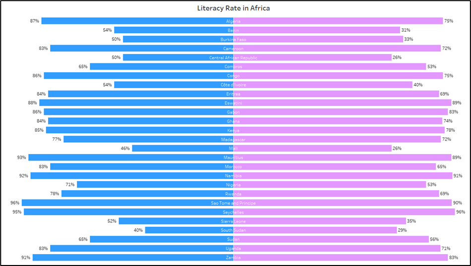
The final result looks this way:

The final version of the visualisation can be found here: https://public.tableau.com/app/profile/tobias.thormann/viz/Literacy_16397295495690/LiteracyRateinAfrica_1
