After the Dashboard’s Accessibility session with Ruth on Monday, we began our Dashboard Week with good knowledge of understanding audiences. Tuesday’s gone by exhaustingly with a dataset of Hamburg Migration from the site Gov Data. The task is freely ask yourself any question, and try to answer them with the dataset provided.
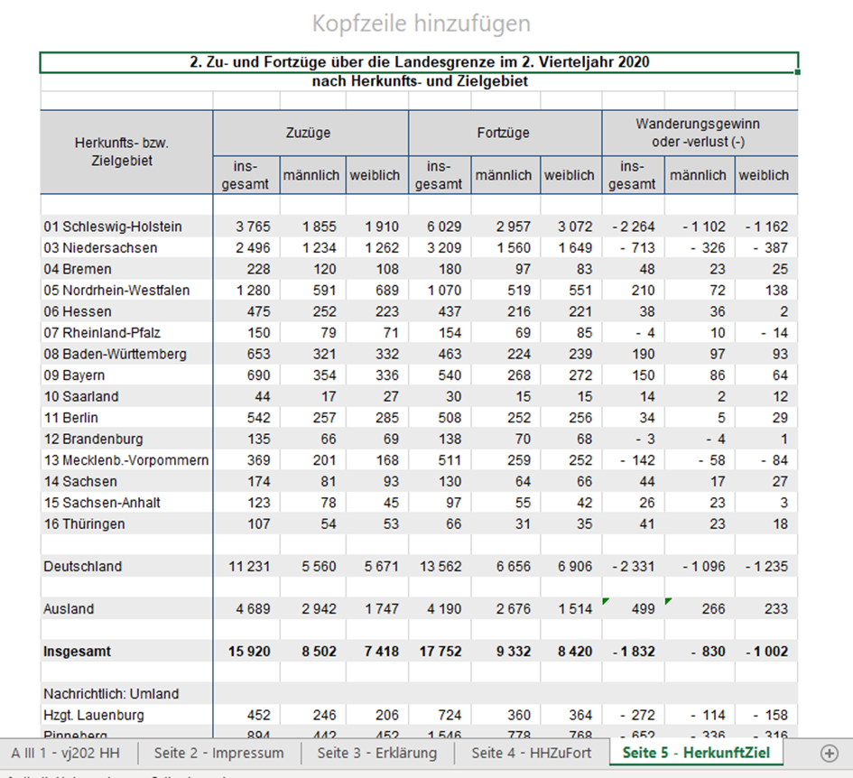
Soon did I come across the first challenge, cleaning and combining 7 similar format Excel dataset, representing each quarter of 2021 and 2020. Cleaning and restructuring one file is simple, however, when it comes to combining 7 files together my first thought as always is using batch macro in Alteryx. Some tiny differences between each file (I assume) prevents the workflow to run smoothly through batches. Fortunately, Martin was there to help me out with his own prolific experiences of the tool. First Problem solved. Then came second problem, I forgot to create another column for the file name which indicates the date time. I realized this mistake happening to me before in the last client labor project, for which I still haven’t got a feasible solution. This time my macro doesn’t update the name of the file dynamically as it did with the data. Back then I had the ideal data I wished without properly labeled date. Considering the time spent on this project, there is no point asking for help but manually repeat the process 7 times (which I never recommend in any case).
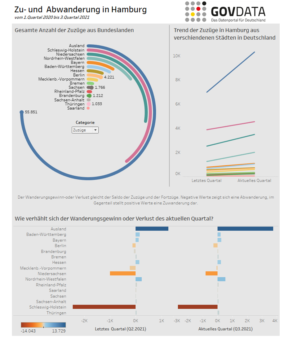
For visualization, I knew from the very beginning that I wanted to build a radial chart which I never had chance to do. I finished the chart quite fast surprisingly, which presents the share of immigrants coming to Hamburg by their original state of residence and vice versa. The second one is the slope chart which illustrates the current trend of the current quarter and last quarter, quite useful for someone who cares about the current situation and short term forecast. Because of the time constraint, the third chart of mine should be simple and clear enough to communicate the message, which addressed the net effect of immigration and migration of Hamburg city (more people moving into or out of the city). After a while of trying and failing with different chart types, I decided to simply go with a table. I knew for certain, someone out there would definitely love to see a couple of numbers.
Time’s up at 16:30 pm. We’ve got to publish the stuff in Tableau Public and showcase it to the group. I was the one to wrap up the meeting. People loved my radial chart as much as I did. Compliments were also paid about the clean and nice design of the whole dashboard. But I did receive some suggestions from the coaches on improving my table. For example, although it is stated in the original excel file as “Gain” or “Loss” of population, it is not necessarily a positive or negative value but rather a tendency, therefore the choice of a discrete color legend did not make great sense. Rather a range of color palette would do a decent job. Also I should have included explanatory caption for some metrics, so that the audiences could’ve gained insights faster. Later, I have recreated the table in bar chart to better address the points.
Bottom line is again the balance or even trade-off among function, layout, and presentation, given time limit. The expectation of us at the end of the training is raised to the next bar. Sometimes, it is so difficult to get this balance. There are so many factors which could ruin your whole work, time constraint, technical incapability, too complex or too unstructured dataset, run out of idea, just to name a few. Though my day was exhausting and stressed out, I learned some valuable feedbacks and continued to learn from the mistakes. I’m happy that I have a chance to let myself ask questions and find out the solution on my own. The sky has no limit!
Here is the snapshot of my dashboard. You can visit the Viz here.