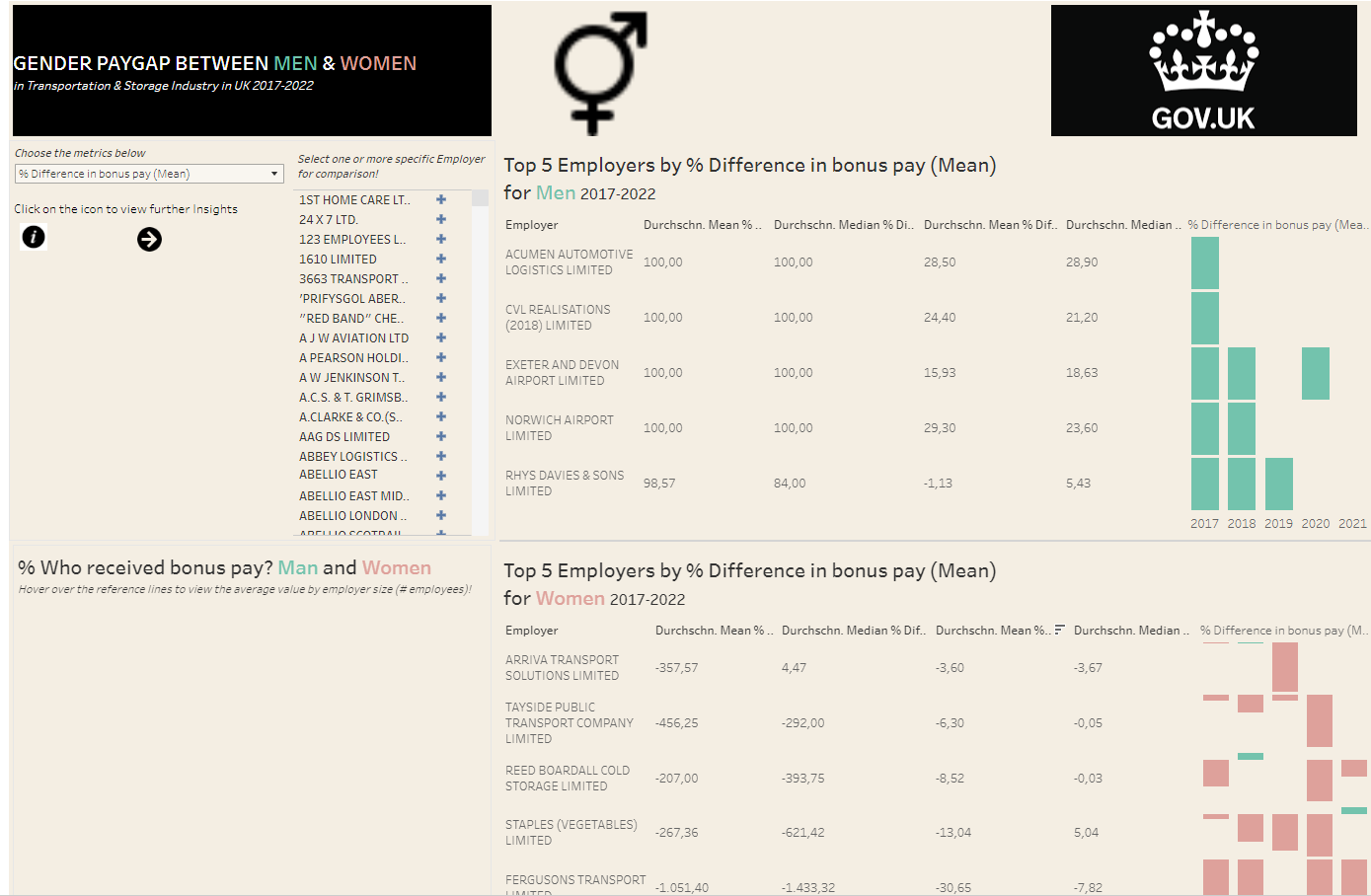
Today we received an interesting dataset from Gov.UK, the gender pay gap. Personally, I like the way the website is designed that viewers can download data of companies of their interest with some specific customized filters. Soon did I come to the decision to narrow down the scope of my project to the gender pay gap between male and female workers in Transportation and Storage Industry from 2017 to 2021. Unlike yesterday, this project today went well as per data cleaning because the data is already clean, not much you have to do to clean it.
Later on, the hard part lied in the visualization and how you delivered your message to the audience. Today, I had a lot of ideas for my dashboard. It was not about difficult multilayer calculations because all the measures have already been calculated for you at hand. You just need to visualize it in the most simple way so that the audience can get the message. That’s the main loophole today, which unfortunately I fell into.
“Simplicity and clarity helps your audience to get insights instead of getting lost” quote.
But in order to do so efficiently, I guess you’ve got to do like 10.000 Dashboards. That’s something people learn from experience. Honestly speaking, my dashboard today has less space to breath. I did not do it well enough to explain some original lengthy metrics. And I was a little bit too greedy, wanting to stuff everything into one dashboard. Therefore later I have created the second dashboard which is linked to the first one. The bright side of it is to test your tenure and work under stress again to produce huge work in a day. What made my day was also the fact that I applied the technique I learnt in the previous post this time.
Okay, the message today is to compare the top 5 men-friendly employers with other employers in the list, same thing applies to top 5 women-friendly employers in terms of salary payment. My focus was the comparison of the measures at employer’s detail level, using dashboard action for interactivity, instead of a static descriptive dashboard as often seen in the statistic agency websites about macroeconomic matters.
Long story short, just take a look at my work. I appreciate any constructive feedback, critics and even your plain feeling about it since your feedback is the inspiration for my next dashboard😊