The second day of Dashboard Week (3 days in a row that I've created 1 dashboard each). The topic today is quite easy to breath without too many calculations or specific requirements. Once again, we were allowed to exploit creativity at most. It deals with text analysis about a famous character, Elon Musk, an US billionaire, owner of Tesla and SpaceX, the only two world giant tech companies that I know ;D. The task therefore is to examine Elon’s activities in Twitter from his early days until he bought Twitter recently.
Okay, I began the task as usual with data examination. This time I tried to avoid spending too much time on tiny tasks if not necessary, in order to spend more time preparing the presentation at the end. However, things were not instantly in place as you wished they would be. Out of 12 CSV files from Kaggle, you’ve got to clean such a significant raw data, containing all sorts of tweet id, user id, time, tweet with various issues such as empty cells, special characters in tweets, and duplicated records. That is not to mention, you’ve got to understand the structure of how the tweet id works, if they belongs to a conversation thread or not. It took me incredibly more than 3 hours to figure out how they work and got the data I need from such a mess. So much effort was spent on regex because I wanted to do text analysis. Nevertheless, I found out it’s not worth digging into sentiment analysis because I just had a few hours to work on the whole project, and furthermore, I don’t know any free software well integrated into Tableau for visualization.
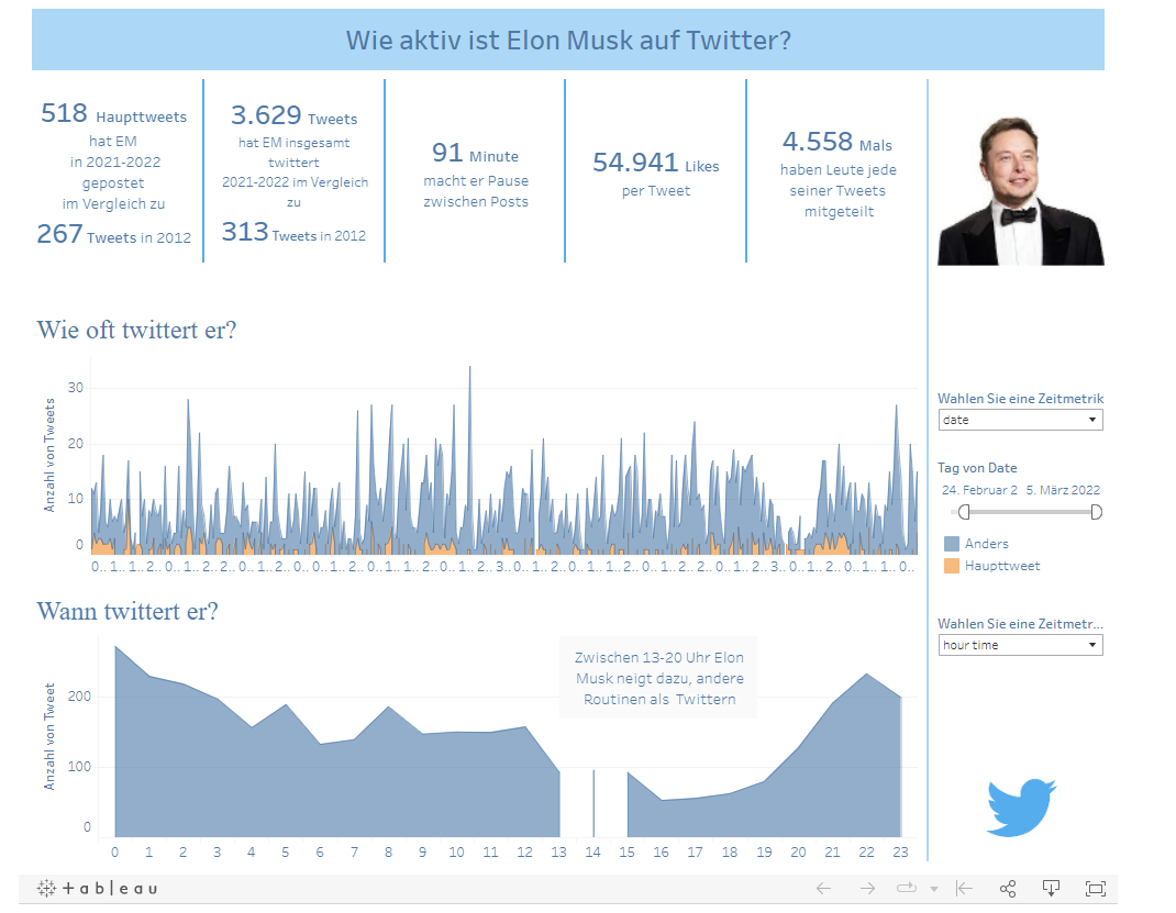
Shifting focus to Elon’s Musk tweeting habits, I come up with a few questions for the dashboard. How active is Elon Musk in Twitter? How often does he tweet? How regular does he tweet during the week?
Ideas for a further Dashboard could be about the content of his tweet, who he mentions in the tweet, what hashtags are popular...etc.
One interesting fact from the data is the underlying principle to differentiate the main post and normal comment or responds, which lies in the fact that the main tweet conversation thread ID somehow repeats itself in tweet ID. Moreover, another idea to calculate the pause that he (Elon) makes between posts come from one of the Alteryx challenges that I did in the past.
I went ahead and do my visualization in Tableau without much difficulty. This time I paid a decent attention to the quality check because I realized that the data contains many duplicated values. For this, the data investigation at the beginning pays off.
Alright, I thought to myself: just went ahead with the talkshow. Though there are still a few points for corrections in the Gantt chart (which I changed to the area chart) and the labelling. Generally, I was satisfied with my work and strategy overall.
Here is my final work!