For our penultimate day of Dashboard week we were tasked using an API of our choice from the NASA site and using this to pull data to then use in either a Tableau Dashboard, Alteryx app, or PowerBI report.
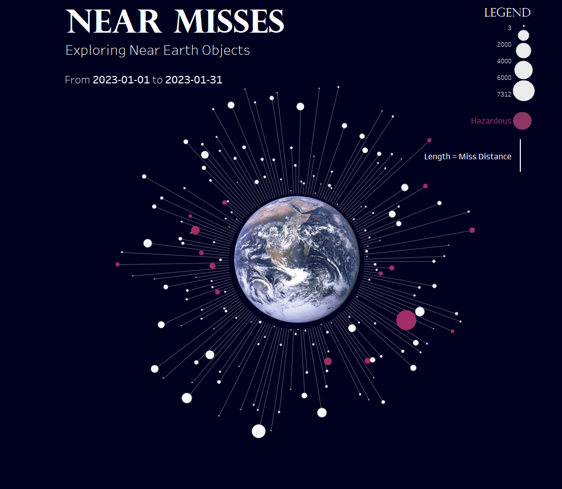
We were pretty much given free reign on what to do with our dashboards and personally I was quite excited to have such a rich and interesting dataset. I decided to look at near Earth object misses, and this gave me the opportunity to make my favourite kind of chart - one that looks like it's data.
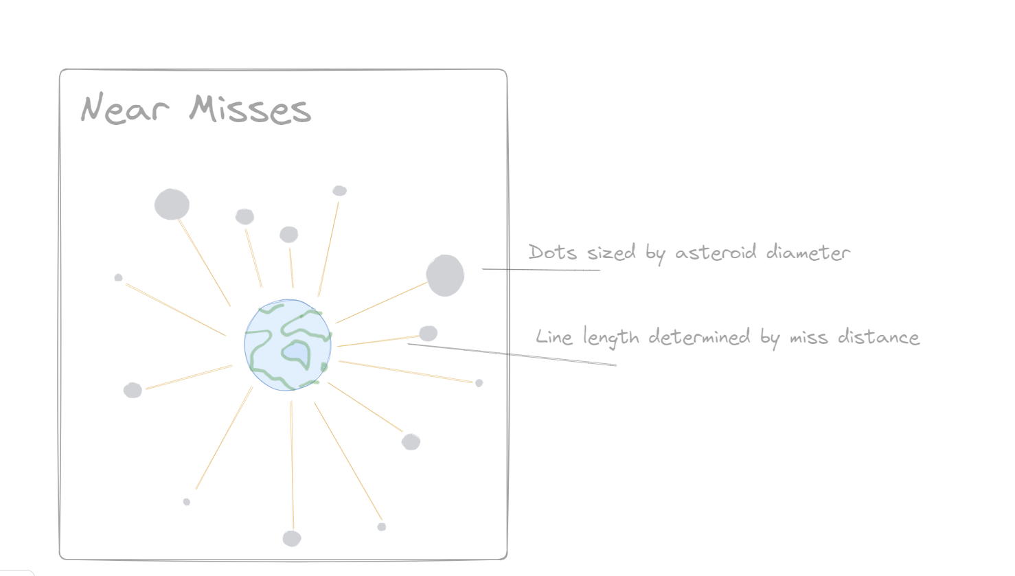
So I came up with a quick rough sketch of how I wanted my final dashboard to look, thankfully as I have made this chart quite a few times now I kind of knew where I was going.
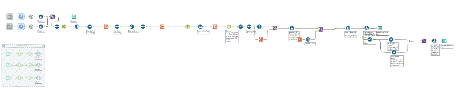
Next I went into Alteryx to begin building my workflow to pull in my data from the API. Here is a screenshot of my workflow! I can definitely improve upon my documentation with more time !
With this API data I decided to focus on a small period of 2 weeks, as the API had a limit on how many days of data I could pull in and also I vastly underestimated how many Near Earth Objects (NEOs) there are out there.
My workflow was pretty similar to previous weeks workflows were we had used other APIs, like the Rick & Morty API to pull in data, and the parse out the downloaded information. I used my knowledge from these weeks to inspire my workflow for today.
Another challenge I set myself in Alteryx today was to calculate all of my trigonometry calculations for my radial chart within Alteryx, as previously I have only managed to do this in an excel/google sheets workbook, which I have explained in a previous blog.
Once done I pulled my data into Tableau and begin to create my charts and my dashboard.