


Maybe you're halfway through building your final application dashboard...
Maybe you're feeling the deadline looming...
And maybe you're thinking you can get away with floating all your charts across your dashboard....
what does tiling matter anyway? And why bother with containers at all?
Well, you’d be thinking wrong - and I learned the hard way why so you don’t have to.
In this post, we’ll cover what containers are, how to use them effectively, and why they’ll save you a lot of time (and frustration) in the long run.
So, What are containers?
At its core, a container is an object you add to your dashboard that holds other items, like worksheets, filters, text boxes, or even other containers. Their purpose is to group these items together and control how they are arranged and resized.
A container forces all components stored inside it to fit to a specific size and shape. This is helpful because if you choose to adjust one component, all the others will adjust accordingly, never losing alignment.
There are two kinds of container in Tableau:
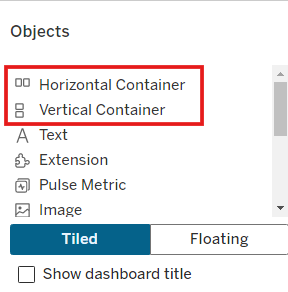
Horizontal Container
A horizontal container arranges objects side-by-side, in a single row. If you add three charts to a horizontal container, they will always appear next to each other from left to right.
Imagine a set of KPI's at the top of the dashboard - these will have been aligned within a horizontal container.
Vertical Container
A vertical container stacks objects on top of each other, in a single column. If you add a chart and its corresponding filters to a vertical container, the filters will sit neatly above or below the chart.
This may sound fairly straightforward, but this lays the foundation for controlling the alignment and sizing for complex dashboards that I promise would otherwise cause you lots of headaches...
Tiled vs. Floating Containers: What's the difference?
When you start building dashboards in Tableau, you’ll notice you can add elements as either Tiled or Floating.
- Tiled means your objects sit within a structured layout — either directly in the entire dashboard grid or inside a container. They resize and reposition automatically based on the overall layout.
- Floating, on the other hand, means you can drag objects anywhere you like, placing them on top of other elements or in precise positions.
At first, floating feels freeing. You can move things exactly where you want them, no fussing with containers or spacing. But the moment you resize your dashboard - or publish it to Tableau Public - that “perfect” layout can start to fall apart.
That’s where tiled layouts save the day.
Tiled dashboards are responsive. Everything knows its place and scales together. Once you set things up properly in containers, you’ll rarely need to adjust anything manually again - even if an individual chart changes or your dashboard is viewed on different screen sizes.
Nesting Containers
Once you get the hang of using containers, you’ll quickly find yourself nesting them - putting containers inside other containers - to create more flexible, organised layouts.
Here's an example of how this could look:
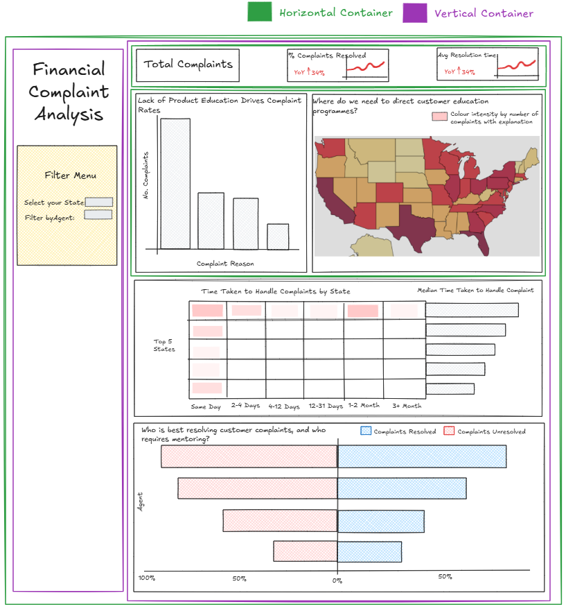
It may look like a lot, but this structure is what gives professional dashboards their clean, consistent look. Think of it like using folders to organise files - it takes a few extra seconds at the start, but saves hours later on. If any element within this dashboard were to change or needed removing, everything else would remain aligned perfectly.
Without these nested containers, the manual resizing and alignment required would waste a lot of your (and your client’s) time.
Wrapping up
Containers might not sound like the most exciting part of dashboard design, but once you understand how they work, they’re game-changing.
They keep everything neat, responsive, and easy to maintain. They’ll save you endless alignment headaches, especially when you’re tweaking layouts for different screen sizes or adding new charts at the last minute.
So next time you’re building a dashboard, resist the temptation to float everything. Drop in a few containers, play around, and see how much smoother your workflow becomes.
Your future dashboards (and your future self) will thank you.
-- Tyler