


For Day 2 of Dashboard Week, the challenge shifted from pure analysis to inclusive, accessible design. The brief was to build a Screen Reader-Compatible Public Infrastructure Dashboard using data on London’s Top Attractions and Tube Stations, with a focus on filtering by key features like toilets, lifts, and walking distance.
The goal wasn't just to visualise data, but to ensure that a blind or low-vision user could navigate the dashboard using only a keyboard and a screen reader. The requirements were strict:
- Semantic ordering of text objects (logical flow).
- Accessible Alt Text for visuals.
- No "hover-only" content (tooltips are invisible to screen readers).
- Keyboard shortcut instructions included in the dashboard.
My Approach
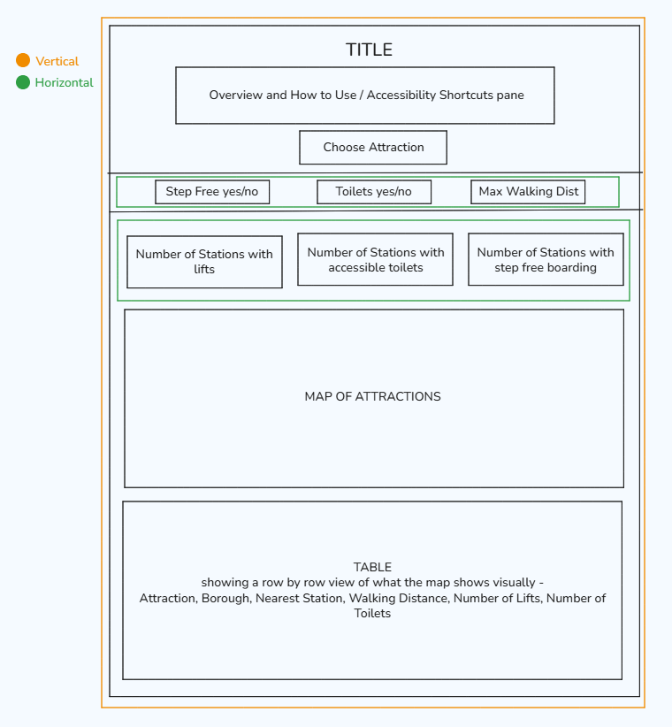
Sketching I began this project by looking over the provided datasets and then sketching how the dashboard should look. When I sketch, I usually like to plan out my dashboard containers to make building more straightforward, as you can see here:
Data Prep (Tableau Relationships) Unlike Day 1, the heavy lifting here wasn't in cleaning the data, but in connecting two disparate datasets: a list of Attractions and a list of Tube Stations. Since there was no common ID to join on, I used a Cartesian Join (1=1 Relationship) in Tableau. This allowed me to link every attraction to every station. From there, I used spatial calculations (DISTANCE, MAKEPOINT) to determine the distance between an attraction and its nearest step-free station. This was crucial: a wheelchair user doesn't care about the nearest station if it has stairs; they need the nearest accessible one.
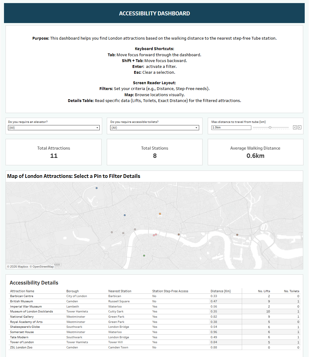
Building the Dashboard (The "Z-Pattern") Designing for accessibility meant adhering strictly to a Tiled Layout following the "Z-Pattern" (Top-Left → Right → Bottom), which matches how screen readers scan a page.
- The Controller: I placed a horizontal filter menu along the top of the dashboard with high-contrast, clear filters (e.g., a slider for "Max Walking Distance" and a dropdown for "Accessible Toilet Availability") running from left to right. This allows for seamless keyboard navigation and functionally using the tab function to move across the filters.
- The Visual: A map in the center provides the overview.
- The Engine: A large details table at the bottom acts as the "text version" of the map, ensuring that all data is readable as plain text.
The Final Dashboard
I opted for a clean, high-contrast design. The focus was on "User Agency" - allowing the user to filter out attractions that are too far from a station or lack facilities, instantly updating the list of viable options. Text is displayed in such a way as to make it easy and direct for a screen reader to read out and maximise the accessibility for all users.
Reflection / Things I Learned
The "Map Trap" (Visual vs. Functional Accessibility) My plan was to allow keyboard users to Tab through the map points and hit "Enter" to filter the details table. However, I discovered that keyboard navigation for map marks in Tableau isn't possible as a native function. You cannot simply tab through individual points on a map layer. If I were to redo this, I would deemphasise the map entirely for screen reader users. Instead of trying to make the map interactive for them, I would rely on a Dropdown Search filter. This would allow a user to type "British Museum," hit Enter, and immediately populate the table - bypassing the inaccessible map navigation altogether. Having said this, navigating map points via a keyboard is a significant accessibility function that should be implemented by Tableau.
Alt Text vs. Reality I spent time writing descriptive Alt Text for every KPI and chart, but during the demo, the screen reader software (Windows Narrator) did not pick it up consistently from the Tableau interface. It highlighted a gap between development (adding the tags) and deployment (how the browser/software interprets them). Perhaps I set up the alt text incorrectly, however reading alt text via a screen reader is an accessibility function that Tableau should implement.
Simplicity is the Best Accessibility I initially wanted complex filters for "Lifts" vs. "Step-Free Boarding." I realised quickly that this adds cognitive load, so I simplified this into a binary check: "Is it Accessible?" (combining station lifts and attraction facilities). This made the dashboard easier to navigate for everyone, proving the idea that accessible design results in better UX for all users.