


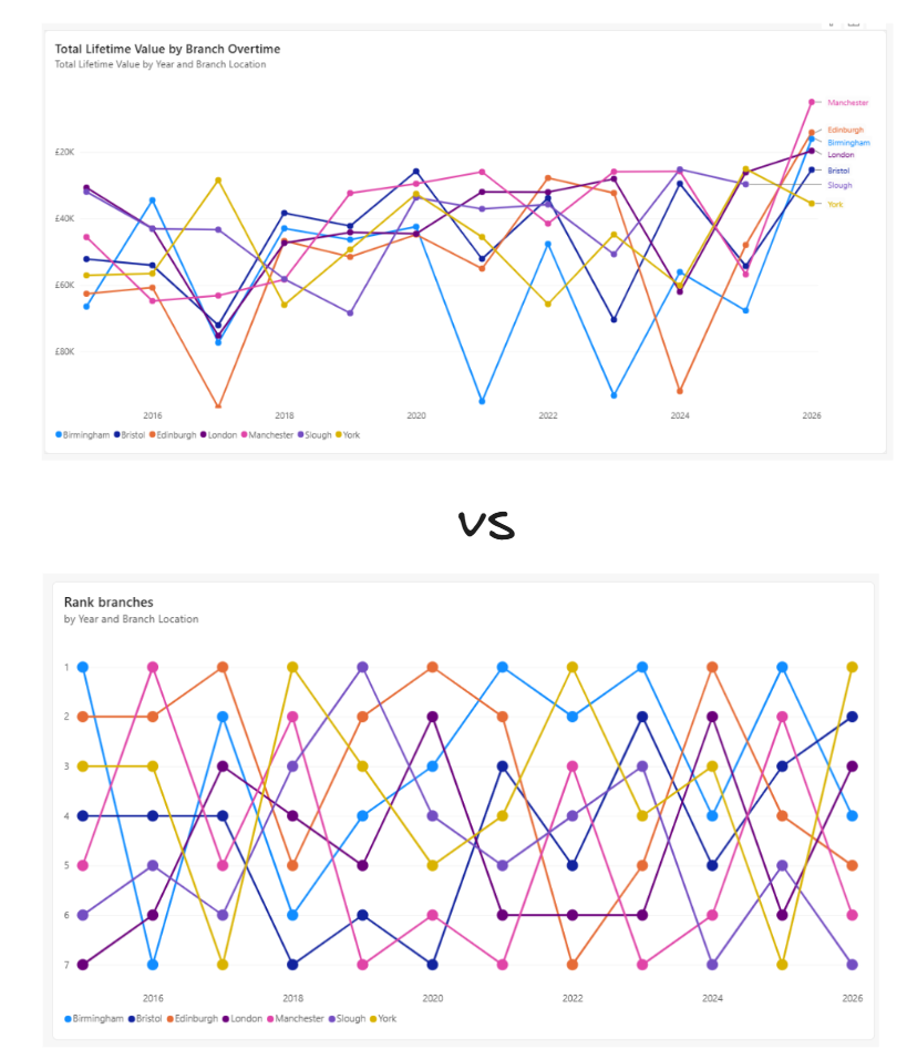
When visualising data over time, a standard line chart is usually the go-to. But what if your goal isn't just to show growth, but to show competition?
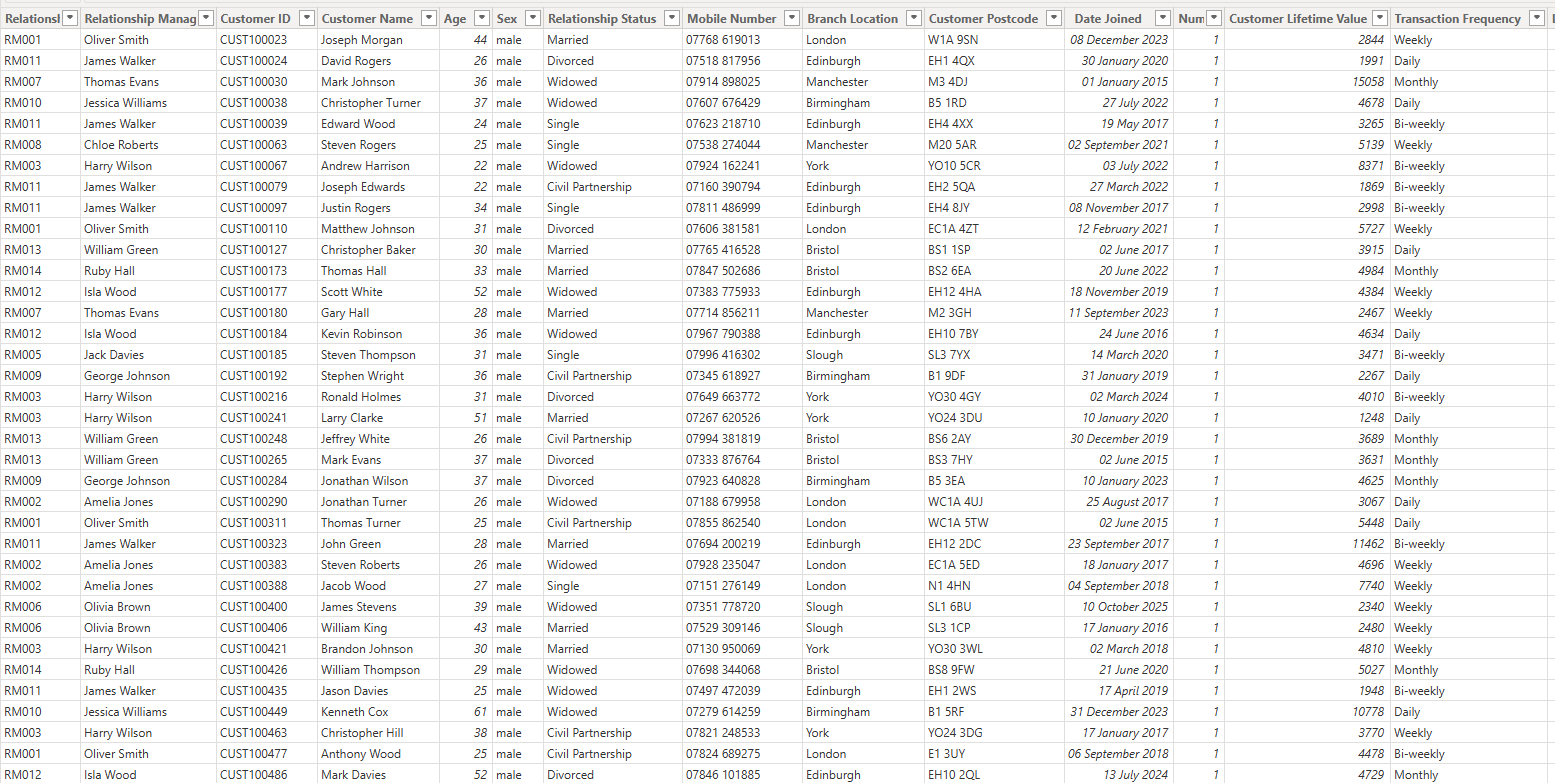
If you want to see how different business units rank against each other over time, a Bump Chart is the perfect tool. In this guide, we will build a Bump Chart in Power BI using a bank's financial dataset to track how different branches rank by Total Lifetime Value (LTV) year over year (note: you can adapt this to any time-interval of your choosing)
Why Use a Bump Chart?
A standard line chart can get cluttered when comparing dozens of categories. More importantly, it focuses on absolute values. A Bump Chart strips away the noise to focus purely on position.
It allows you to instantly see:
- Who is consistently winning (#1)
- Who is climbing the ranks and who is dropping off
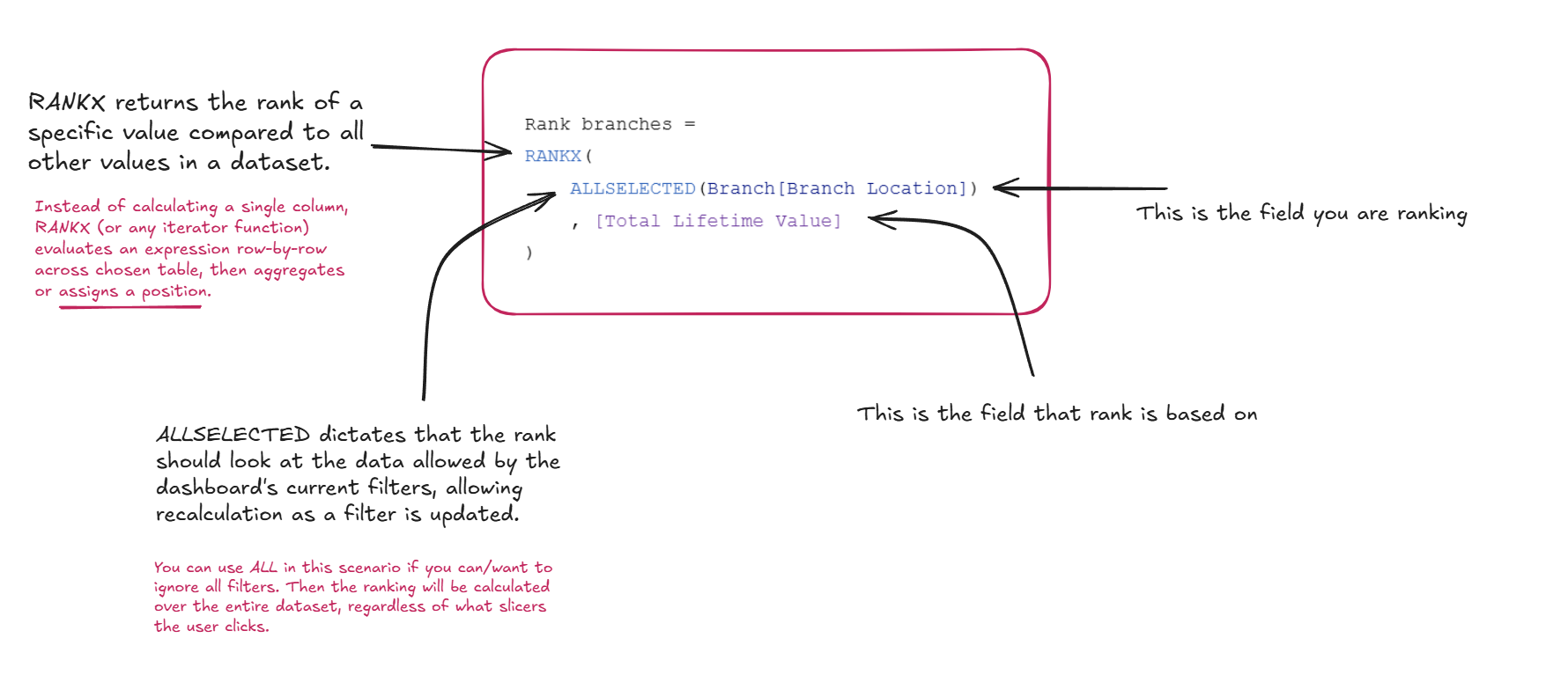
Step 1: The Data Structure
For this walkthrough, we are using a financial dataset mockup containing bank branches, dates and account values.
Our goal is to visualize the Total Lifetime Value by branch over time, but displayed as a dynamic ranking.
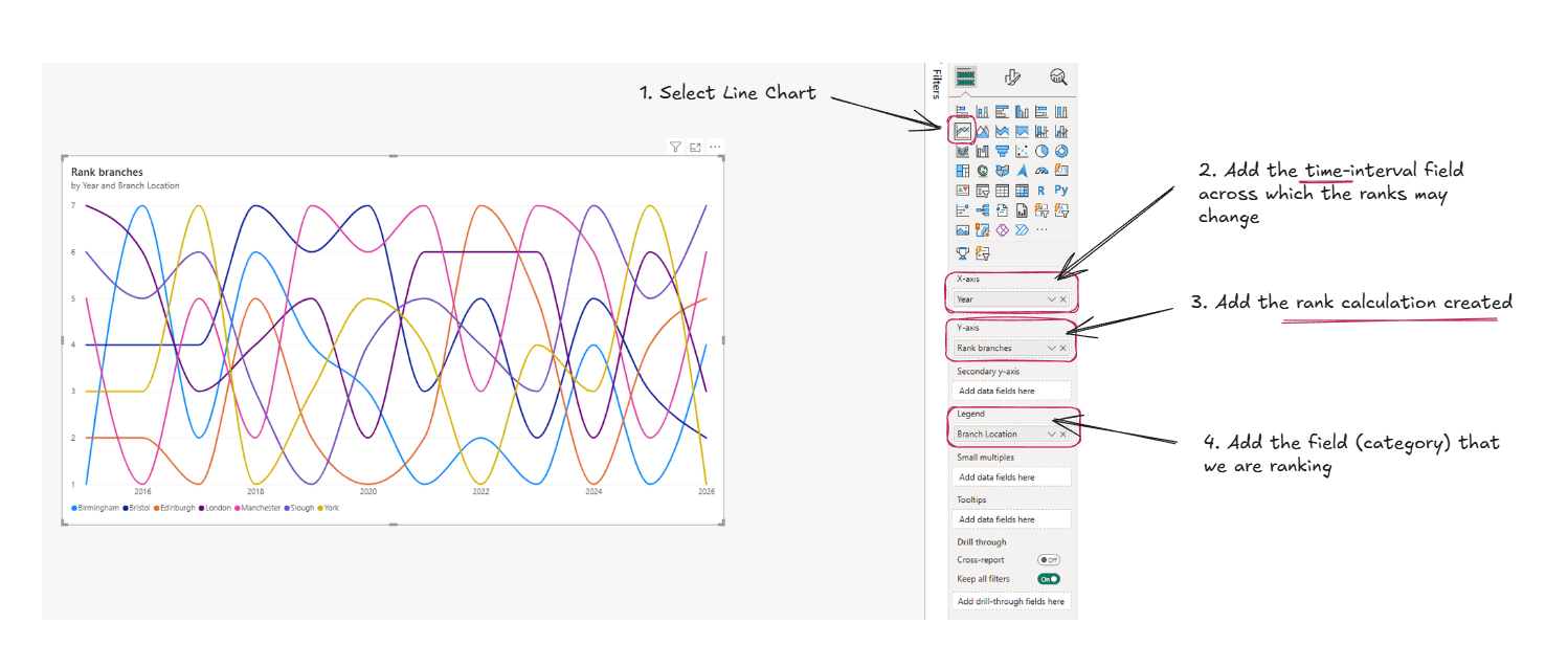
Step 2: The DAX Ranking Calculation
To build a dynamic Bump Chart, we need a calculation that ranks each branch based on its Total LTV (which is a SUM calculation I created from Customer Lifetime Value), recalculated automatically for whatever time period is on our chart. We achieve this using RANKX and ALLSELECTED.
How this DAX works
- RANKX (The Iterator): Unlike standard functions, RANKX (and other iterators like SUMX and AVERAGEX is an iterator. It loops through a specified table row-by-row, evaluates an expression (our Total LTV), sorts the results, and assigns a position.
- ALLSELECTED: This is a crucial filter modifier. It ignores the internal filters of the visual (like the specific branch in that row) but respects external slicers. This ensures your branches are ranked against each other within the currently selected time frame.
With the measure created, it's time to build the view:
Step 3: Building the Visual
Because we used ALLSELECTED, you can seamlessly swap the X-axis from Year to Month or Week, and the ranks will dynamically recalculate on the fly.
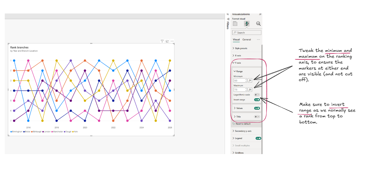
Step 4: Formatting for the "Bump" Effect
A great Bump Chart needs to be clean and easy to read. Follow these formatting steps to nail the look:
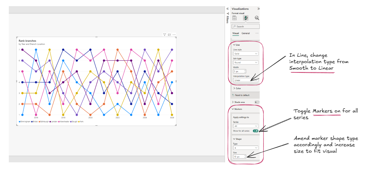
Then do the final formatting...
You now have a dynamic, interactive Bump Chart ready for your Power BI dashboards. Whether you are tracking sales reps, products or bank branches, this chart delivers immediate insights into performance hierarchy over time, and is also relatively quick to make!