


First day of dashboard week is over already!
Fotiana and I got to work together today to plan a screen-reader compatible dashboard in Power BI and Tableau. Our brief was to create an A-Level summary dashboard that prioritises the needs of users with accessibility requirements, enabling them to filter London tube stations based on features like accessible toilets, lift access, and walking distances from major attractions.
Schedule
We started out with a rough schedule:
10:00 - 10:45: Research & plan
10:45- 11:45: Sketch & preparing the data
11:45 - 12:30: Start building
13:30 - 15:30: Continue building and test out the screen-reader / alt text
Research & plan
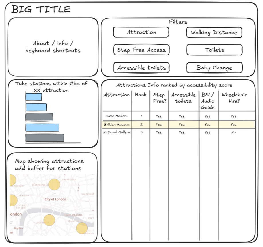
During the planning stage we made a list of things to keep in mind when designing the dashboard. This included having the information about the dashboard & keyboard shortcuts at the top, making the filters clear and navigable, and ensuring the font sizes were big enough.
Sketch
When we got round to sketching, we had our set of requirements we wanted to follow:
- Semantic ordering of text objects
- Keyboard shortcuts information in about section
- Accessible alt text and captions
- Avoid content that screen readers can’t access (such as tooltips)
- Normalising the accessibility score
- Place filters together at the top of the screen
- Font sizes should be larger for screen magnification users
This is what we ended up with
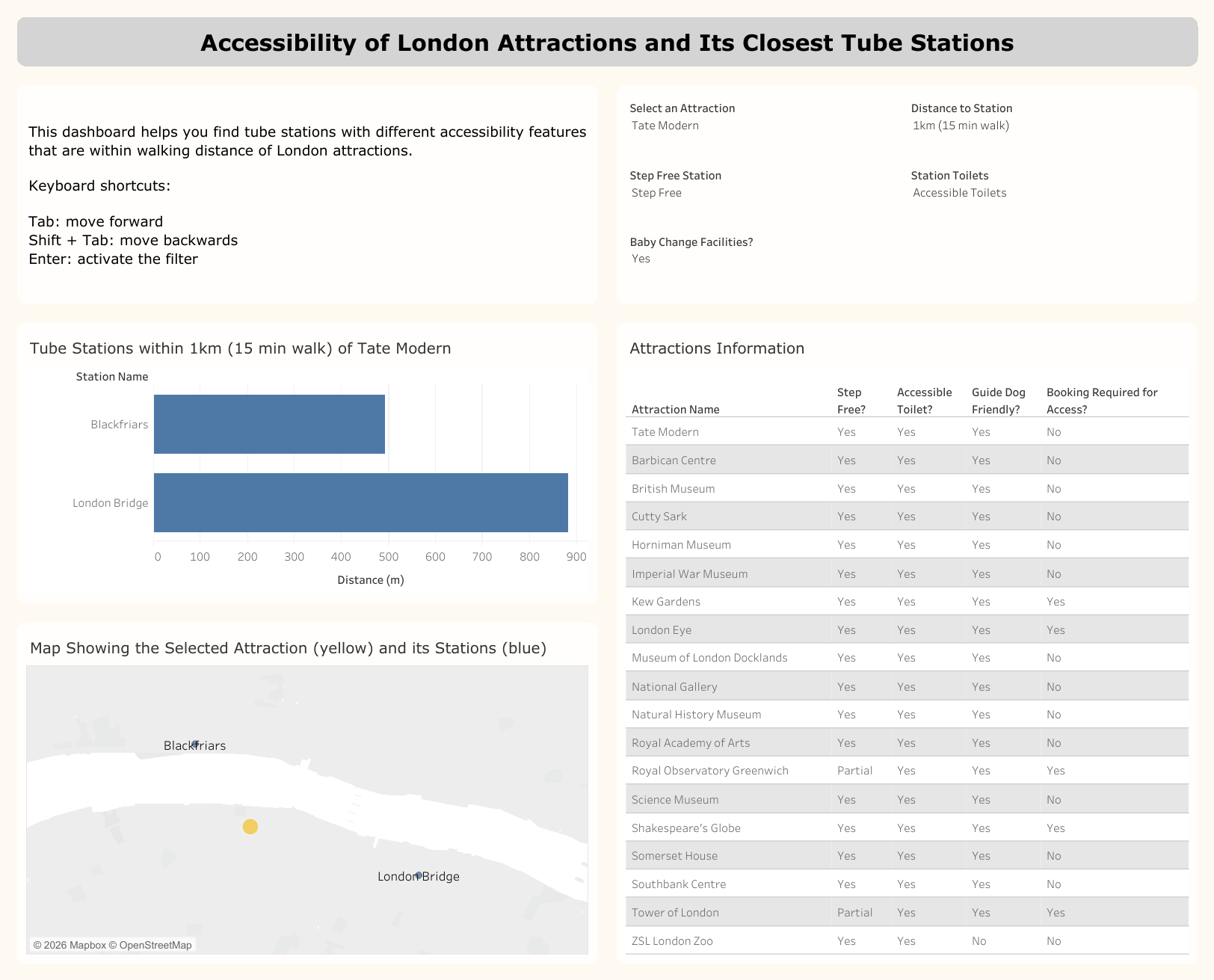
Building the dashboard
As with most projects, the final dashboard evolved as we began building. Some of the initial ideas looked good in the sketch but didn't serve the user well in practice. Firstly, there were originally 6 filters planned but the "Toilet" and "Accessible Toilet" filters were forcing the user to tab through an extra filter unnecessarily so those were merged into one filter.
Next, we had also planned to create an accessibility score to rank the attractions in the "Attractions Information Table". This didn't make sense considering the user story as it wasn't going to be an important insight for the user of the dashboard.
Lastly, because the table wasn't sorted by rank order anymore the selected attraction could now be moved to the top row. In hindsight, highlighting the selected attraction wouldn't have been the most accessible feature to a user with impaired vision. This switch to dynamic sorting ensured that the most relevant attraction would be read by the screen-reader first.
The alt text was easy to find and edit, but harder to write. The goal was to be descriptive yet concise, ensuring users get the key information without over-explaining the visualisations.
Feedback
- In general yellow isn't a great colour for marks on a map
- The table can be formatted to highlight the top row (the selected attraction)
Next Steps (and some final thoughts)
Overall I quite enjoyed the first day of dashboard week, I had definitely been building it up in my head over the past week.
Before I publish it again I need to update the colour on the map; I need to change the formatting on the table which Lorna's already showed me how to do (thank you!); and I want to finish changing the filters for example, late in the day I realised the "Baby Change Facilities" filters didn't need to be yes or no it should probably be yes or either but I didn't have the time to do the same for the "Step Free Access" filter (e.g. step free, ramp, or no requirements).
It was really interesting learning about accessibility today, there's lot of elements I hadn't considered before such as using the keyboard to navigate a dashboard (I can see how having 10 filters would be tedious to tab through). I also enjoyed watching my cohort's presentations too and learning about the different visual and accessible elements they had included in their dashboards. I'll definitely be keeping everything we learnt today in mind when creating visualisations in the future.