


The Brief
Our first day back after a long week of tube strikes started with a session on user accessibility and the different scenarios that we need to keep in mind when creating visualisations.
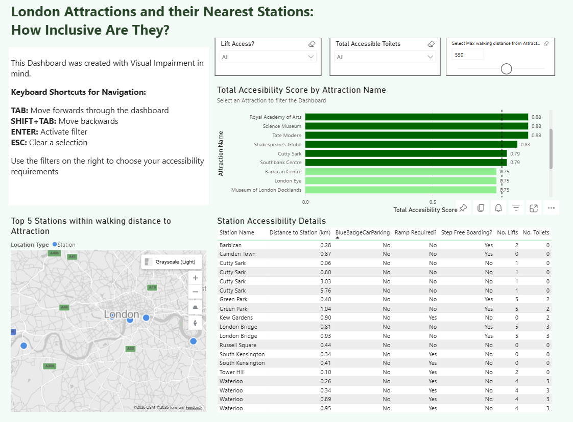
The task was to build a dashboard using two datasets (London Stations and London Attractions) taking into consideration users who are impacted by visual impairment and rely on keyboard navigation with a screen reader. The aim of the dashboard was to help them explore how inclusive are the London's top attractions and stations are.
Requirements:
- Semantic Ordering of text objects
- Accessible Alt text for Maps and KPIs
- Avoid contents that screen readers can't access
- Keyboard shortcut info in "About" section
My Approach
We were put into pairs, so I had the privilege to work with Vivien! I had a quick look at blogs from previous cohorts and did some research in using keyboard shortcuts for navigating in PowerBI. Once I had an overall idea of how this project was meant to move forward Vivien and I started exploring the data and came up with a user story.
Data Preparation
The data had information on accessibility features of the London's Top 19 Attractions and over 500 TFL stations. I used PowerQuery to standardize the data because it contained inconsistent data types and values such as 1/0 (Boolean), True/False and Yes/Some Areas/Limited/No. I ensured that these values were weighted appropriately to come up with a universal score which was out of 1. Also, I renamed some stations as they were mismatching between the two datasets.
Connecting the Two Datasets
I had a great idea of connecting the two datasets together based on their spatial fields, which I combined by appending and renaming the fields and also including a custom column that would clarify whether it was a "Station" or a "Attraction" location type. This worked for the Azure map, however, my limited knowledge of complex DAX stopped me from reaching the full potential of this project.
Final Dashboard
Challenges
I think the main challenge here was trying to calculate the distance for the additional stations (from the Stations data) from the Attraction. Although I joined the two datasets and managed to get the map to show all Stations and Attractions, I could not understand the spatial calculations in DAX to create measures like Distance from Station. So, the user would not get as much out of the insights this dashboard could offer them.
Another challenge was clicking off a filter using the keyboard shortcuts. Whenever I'd press ESC I'd be kicked out of fullscreen mode in PowerBI server.
Feedback
It was correctly pointed out that the table visualisation had multiple occurrences of the same station, so it was recommended to only show the table once a filter or Attraction was selected.
The screen reader worked well in this visualisation! I've used windows+ctrl+enter to open the Narrator which read the alt text from my PowerBI charts and text inputs. I think if PowerBI is good for something, user accessibility is definitely one of them.
Personal Reflections
I'm happy with today's effort by pivoting as soon as I hit a brick wall. If I hadn't done that I'd be focusing on the details of the dashboard rather than the goal of this project which was demonstrating how we'd design a dashboard to cater for users impacted by visual impairment.
It's easy to take basic things for granted sometimes, but this project was an eye opener to how difficult it is for those users to navigate and explore data when data should be accessible to all.
Key Takeaways:
- Keep things simple - clutter is not adding any value
- Practice keyboard shortcuts and write out clear alt text for your charts